
Thanks Pierre, this looks good. Is it possible to use a bam file with multiple read groups as an input here?
• 0 views
•
link
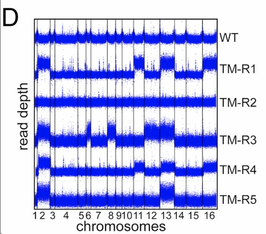
In a paper I was reading i have found the attached image. It shows the duplication of specific chromosomes in different yeast strains after treatment with antibiotics.
I was wondering how can one plot the whole genome in such a way? Are there any tools or R packages to get such a result?
thanks
Thanks Pierre, this looks good. Is it possible to use a bam file with multiple read groups as an input here?
you meant that there is only more that one sample ? everything would be merged here, but I can add an option to only select a defined sample.
What I meant is, if there is a possibility to take a bam file with multiple samples, defined by separate read groups and use it as an input.
I have a concatenated bam files I have merged from several single samples, for several reasons. Now I would like to plot this bam file, but to get the coverage separated by the single samples (e.g marked by the read groups). This should be something like the the facet_wrap in the R command ggplot. One row should represent one read group instead of a whole bam file.
Would this be possible?
I've just added an option --samples http://lindenb.github.io/jvarkit/WGSCoveragePlotter.html
thanks, I'll give it a go as soon as as possible and come back to you
Hi!
You can use also check out the python program bam2plot, which I have developed.
Install via pip install bam2plot, and run:
bam2plot my_bam.bam
It produces one png and one svg for each reference (e.g. chromosome) in the bam file.
Check it out here: https://github.com/willros/bam2plot
Regards, William
I think that it can be useful to learn to plot this using R, from code. there is a crucial sort of "realization" i had with this is that you create a "cumulative base pair" transformation, so if all your chromosomes are 1000bp long, then you make chr1 occupy the number space 1-1000, then then chr2 is 1001-2000, chr3 from 2001-3000. there are some nice one liners in R that do this, and afterwards, you can tell R to draw the chromosome labels at these given coordinates.
I created simulated reads for yeast, then calculated coverage with mosdepth (https://github.com/brentp/mosdepth), and then loaded the resulting coverage into R with simple read.table commands and plotted with ggplot2
Here is the "setup"
Create a "quickalign" script that aligns paired end reads and outputs mosdepth coverage
the quickalign script
#!/bin/bash
# quickalign_paired.sh ref.fa 1.fq 2.fq out.cram
# produces out.cram and out.regions.bed.gz containing 100bp window mosdepth coverage
# based on http://www.htslib.org/workflow/fastq.html for the one-liner fastq-to-cram
samtools faidx $1
minimap2 -t 8 -a -x sr "$1" "$2" "$3"  | \
samtools fixmate -u -m - - | \
samtools sort -u -@2 - | \
samtools markdup -@8 --reference "$1" - --write-index "$4"


mosdepth $4 -b 100 -f $1 $4
Run quickalign over some simulated reads, generated by wgsim
wgsim GCF_000146045.2_R64_genomic.fna a1.fq a2.fq
wgsim GCF_000146045.2_R64_genomic.fna b1.fq b2.fq
wgsim GCF_000146045.2_R64_genomic.fna c1.fq c2.fq
quickalign_paired.sh GCF_000146045.2_R64_genomic.fna a1.fq a2.fq out1.cram
quickalign_paired.sh GCF_000146045.2_R64_genomic.fna b1.fq b2.fq out2.cram
quickalign_paired.sh GCF_000146045.2_R64_genomic.fna c1.fq c2.fq out3.cram
R session for plotting coverage
library(tidyverse)
x1=read.table('out1.cram.regions.bed.gz')
x2=read.table('out2.cram.regions.bed.gz')
x3=read.table('out3.cram.regions.bed.gz')
colnames(x1)<-c("chr","start","end","score")
colnames(x2)<-c("chr","start","end","score")
colnames(x3)<-c("chr","start","end","score")
chrom_sizes=read.table('GCF_000146045.2_R64_genomic.fna.fai')
colnames(chrom_sizes)<-c("chr","size")
chrom_sizes=chrom_sizes[,c(1,2)]

data_cum <- chrom_sizes %>%
  group_by(chr) %>%
  summarise(max_bp = max(size)) %>%
  arrange(-max_bp) %>%
  mutate(bp_add = lag(cumsum(as.numeric(max_bp)), default = 0))

process <- function(df) {
  df %>%
    inner_join(data_cum, by = "chr") %>%
    mutate(bp_start_cum = start + bp_add) %>%
    mutate(bp_end_cum = end + bp_add)
}
data1 <- process(x1)
data2 <- process(x2)
data3 <- process(x3)
data1$id <- "id1" #labels used for each row in the plot
data2$id <- "id2"
data3$id <- "id3"
df <- rbind(data1, data2, data3)

axis_set <- data_cum %>%
  group_by(chr) %>%
  mutate(center = bp_add)

# plotting using small geom_point
p<-ggplot(data = df) +
  geom_point(aes(x=bp_start_cum, y=score),size=0.1,alpha=0.2) +
  scale_x_continuous(label = axis_set$chr, breaks = axis_set$center) +
  facet_grid(rows = vars(id)) +
  theme(
    axis.text.x = element_text(angle = 60, size = 8, vjust = 0.5),
    axis.title.x=element_blank()
  )

ggsave('out.png',width=10,height=4)
Note: I adapted some code I wrote for this answer How to create a graph that shows pairwise Fst values at single SNP loci across the all chromosomes in R
Hi, I want to map depth data too. The only difference is, I already have my depth data as a text file, output from bedtools genomecov. It has 3 columns: chromosome name, location (within that chromosome), and depth. I can probably adapt your code for my data, but I'm confused what the mosdepth output looks like. Can you share a small bit of the mosdepth output, via screenshot or copy-paste or whatever? Thanks!!!
e - also, is there a reason you re-order all chromosomes by their size in the data_cum step?
the regions.bed.gz that i read in in the R script is the raw output from mosdepth and it looks like this
NC_001133.9     0       100     2.30
NC_001133.9     100     200     4.99
NC_001133.9     200     300     6.67
NC_001133.9     300     400     7.56
NC_001133.9     400     500     9.73
NC_001133.9     500     600     12.84
NC_001133.9     600     700     8.27
NC_001133.9     700     800     12.80
NC_001133.9     800     900     13.99
NC_001133.9     900     1000    12.36
NC_001133.9     1000    1100    8.05
...
just a bed file with chr, start, end, and score (which is the average coverage, in this case, in 100bp windows since mosdepth was run with -b100 flag). there is also per-base output from mosdepth if needed
the chromosomes are just ordered by size since it is common but alphabetical or alphanumeric sorting or no sorting is fine too. i think the arrange(-max_bp) line is what orders it by size
Thanks! Solved it for my file format too. Sharing the code here in case someone comes by a few years later :)
library(tidyverse)
library(zoo)

chr_sizes=read.table("genome.fa.fai")
depth=read.table("perbase.txt") #generated by bedtools genomecov -d
Genomic location processing
chr_sizes=chr_sizes[,c(1,2)]
colnames(chr_sizes)=c("Chr","Size")
colnames(depth)=c("Chr","Loc","Depth")

#Get a cumulative locus coordinate, which would run along the whole genome rather than each individual chromosome.
cumsize=cumsum(chr_sizes$Size)
cumsize=cumsize[1:length(cumsize)-1]
cumsize=c(0,cumsize)
chr_sizes$cumsize=cumsize
comb_df=inner_join(depth,chr_sizes,by="Chr")
comb_df$cum_loc=comb_df$Loc+comb_df$cumsize
Processing the depth file
#Normalise depth
reldepth=comb_df$Depth/mean(comb_df$Depth)
comb_df$reldepth=reldepth

#Get rolling average
rollmeandepth=rollmean(reldepth,10000,fill=1)
comb_df$rollmeandepth=rollmeandepth
Remove rDNA locus on Chr XII, which is known to have variable copy number. (USEFUL FOR YEAST)
pos1=451450
pos2=468950

rDNAchr=chr_sizes$Chr[12]
pos1=which(comb_df$Chr==rDNAchr & comb_df$Loc==pos1)
pos2=which(comb_df$Chr==rDNAchr & comb_df$Loc==pos2)

comb_df=comb_df[-c(pos1:pos2),]
Final plot
#Keep only every nth position, for ease of visualisation; here n = 40
df_new = comb_df[seq(1, nrow(comb_df), 40), ]

ggplot(data=df_new) + geom_point(aes(x=cum_loc, y=reldepth),size=0.2,alpha=0.2) + ylim(c(0,5)) + scale_x_continuous(label = df_new$Chr, breaks = df_new$cumsize) + theme_bw() + theme(axis.text.x = element_text(angle = 60, size = 8, vjust = 0.5),axis.title.x=element_blank())
Log in to answer this question.

tbh, it looks like a CNV caller worked here =) the plots looks too uniform - which means they were likely GC/library size normalized before plotting
or it is a rolling median across the coverage precalculated in some windows (e.g. 50kbps)
yes, This is true, but it doesn't really answer the question. The question was how this plot was done. can some please help me too?
You can calculate the coverage per some window, smooth it with rolling median and plot in R - this is what I would do