Awesome! It worked perfectly.
Thanks for your help.
Cheers
• 0 views
•
link
Dear all, I want to ask a very basic question. I am making a bubble plot using ggplot2 having table structure:
   GO term    Number    Class      Type
   1. Metabolism    5     start duf    BP
   2. Photosynthesis 10   hzs          BP
   3. Nucleus      15     hs           CC
   4. Kinase       16     hs           MF
I want to make a bubble plot having Number on x axis, GO term on y axis, bubble color should be based on Class and background color will be based on Type. My R code is:
ggplot(bubble_plot, aes(x=Number, y=GO term, size = Number, col = Class)) + geom_point(alpha=0.7)
With this I am getting the desired plot except the background color, When I am using "fill = Type", I am not getting the background color based on the BP, CC or MF based on the " Type" column in the table.
The desired plot should look like:

Please help.
Thanks in advance
So with your data that seems to look something like this:
structure(list(GO_term = structure(c(2L, 4L, 3L, 1L), .Label = c("Kinase",
"Metabolism", "Nucleus", "Photosynthesis"), class = "factor"),
    Number = c(5L, 10L, 15L, 16L), Class = structure(c(3L, 2L,
    1L, 1L), .Label = c("hs", "hzs", "start_duf"), class = "factor"),
    Type = structure(c(1L, 1L, 2L, 3L), .Label = c("BP", "CC",
    "MF"), class = "factor")), class = "data.frame", row.names = c(NA,
-4L))
You could work with geom_tile and set its width = Inf to get something akin to that plot you're trying to emulate. The use of forcats::reorder() within aes() is important in order to group the Y-axis values together on the basis of your Type column.
library(ggplot2)
library(forcats)

ggplot(mydat, aes(y = reorder(GO_term, as.numeric(Type)), x = Number, size = Number)) + geom_point(aes(color = Class), alpha = 1.0) +
  geom_tile(aes(width = Inf, fill = Type), alpha = 0.4) +
  scale_fill_manual(values = c("green", "red", "blue"))
Which yields:
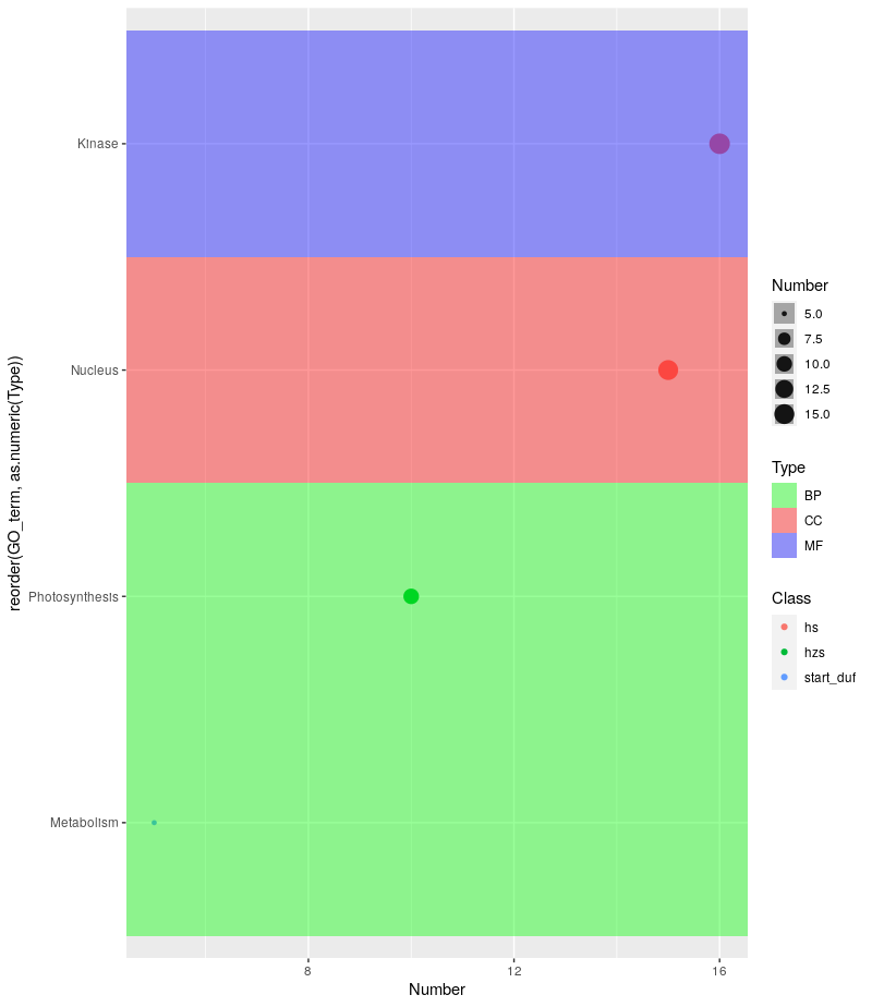
The problem you'd probably run into is having to pass the appropriate number of colors to scale_fill_manual for your actual dataset.
Awesome! It worked perfectly.
Thanks for your help.
Cheers
Please accept the answer (green check) mark to provide closure to this thread.
Hi, Sorry to disturb you again. I am getting the desired result with your code but getting some strips darker than others. Is there any way to keep it uniform?
I am getting something:

Hi, no worries! Could you please perhaps share your code with me? It looks like that transparency for the tiles (alpha) is being set conditionally? It could also be because of the Type variable (I'm not sure what that's being passed as to ggplot()).
Thanks for your response. I am using the same code that you have mentioned:
ggplot(mydat, aes(y = reorder(GO_term, as.numeric(Type)), x = Number, size = Number)) + geom_point(aes(color = Class), alpha = 3.0) + geom_tile(aes(width = Inf, fill = Type), alpha = 0.2) + scale_fill_manual(values = c("green", "red", "blue"))
When I am reducing alpha in geom_tile, I am getting some strips darker than others.
Thanks again
Hmm I think I know what's happening. Since every point on the plot is getting its own geom_tile(), the colors are darker in cases where there is more than one point in the same row (because successive tiles of the same color are being overlaid one on top of the other). I didn't realize that would happen because my little toy dataset did not have datapoints that fell in the same Y-axis "row".
So I have a workaround for you. I'll use my original toy example, modified with an additional point in the Photosynthesis row to illustrate how this works. Basically what we'll do is create a new column called typefill that will be used to set the fill for geom_tile(). Since each "row" can have overlapping geom_tile()s we are going to set the value in typefill conditionally. The condition is this: we will group all the rows (of the data.frame()) together that have the same GO_term (Y-axis value) and Type (our original geom_tile() fill value). Now for each of these groups of rows, we assign the Type value of the group as the typefill value of the first row of that group; all other rows just get an NA. The result is that when we plot the data now, and pass typefill to geom_tile()'s fill parameter, we will no longer have overlaid colors as we saw in your output as the fill is being set only once.
library(ggplot2)
library(dplyr)
library(magrittr)
library(tidyr)
library(ggplot2) #for plotting
library(forcats) #for plotting

#Toy data.frame
mydat <- structure(list(GO_term = structure(c(2L, 4L, 3L, 1L, 4L),
                                            .Label = c("Kinase", "Metabolism", "Nucleus", "Photosynthesis"),
                                            class = "factor"),
                        Number = c(5, 10, 15, 16, 20),
                        Class = structure(c(3L, 2L, 1L, 1L, 2L),
                                          .Label = c("hs", "hzs", "start_duf"), class = "factor"),
                        Type = structure(c(1L, 1L, 2L, 3L, 1L),
                                         .Label = c("BP", "CC", "MF"),
                                         class = "factor")),
                   class = "data.frame", row.names = c(NA, 5L))


#First we group by Type and GO_term, and assign a "yes" to the first row
#and "no" to every other row of the grouping
mydat %<>%
  group_by(Type, GO_term) %>%
  mutate(typefill = if_else(row_number() == 1, "yes", "no")) %>%
  ungroup()
#Then in the whole data.frame, typefill = "yes" will be replaced by the Type value
#from that row, and typefill = "no" will be replaced with NA
mydat %<>% mutate(typefill = ifelse(typefill == "yes", as.character(Type), NA))


#Plotting, now pass typefill to geom_tile's fill parameter instead of Type
ggplot(mydat, aes(y = reorder(GO_term, as.numeric(Type)), x = Number, size = Number)) + geom_point(aes(color = Class), alpha = 1.0) +
  geom_tile(aes(width = Inf, fill = typefill), alpha = 0.4) +
  scale_fill_manual(values = c("green", "red", "blue"))
And this is the result:
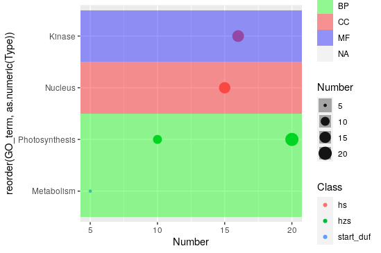
Of course, you now have that one extra NA column in the legend, but that can be hidden quite easily.
Great! Thanks. It now works perfectly. Sorry to disturb you so much.
Thanks again
Oh not at all, I am glad I could help. Don't hesitate to ask if something goes sideways again!!
Hello Dunois
I would really appreciate if you help me in reordering the y-axis using reorder function. I used the same code as you suggested but I am unable to replicate it. Please see this link: enter link description here
Hello
What is 'Class" in your tabular data? Is it specific to your data or it's some kind of general representation in GO classification? My data only has GO terms, count, and GO category?
how about this, https://tinyurl.com/Ontology-Bubble upload your data as csv
Log in to answer this question.