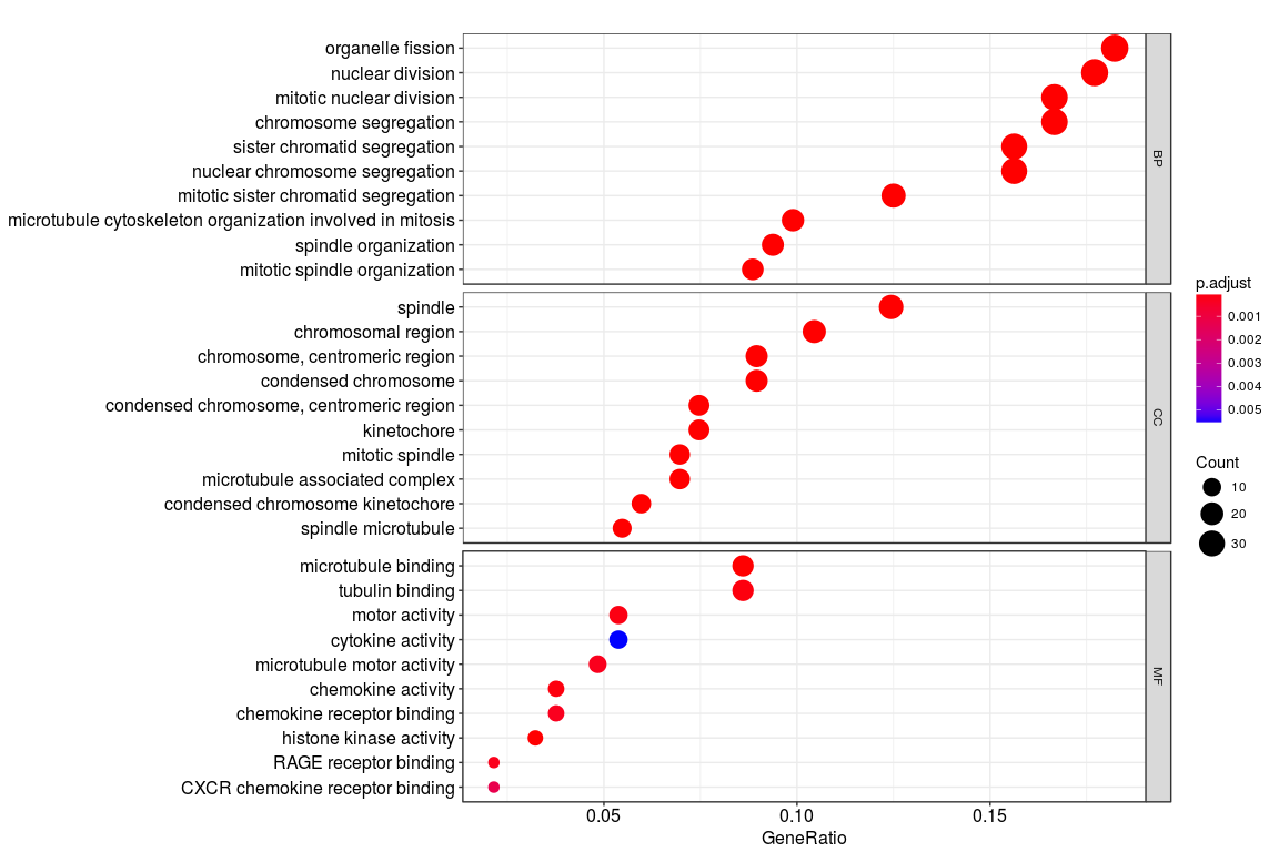
I was trying to plot the gene ontology (BP; CC; MF) terms for a set of genes as shown in the figure below. The codes used to generate the plot is
go <- enrichGO(de, OrgDb = "org.Hs.eg.db", ont="all")
dotplot(go, split="ONTOLOGY") + facet_grid(ONTOLOGY~., scale="free")
However, instead of the gene ontology names (such as organelle fission), I want to plot the GO codes (GO:0048285) on the y axis. Is there any way to do that?
Also, my second question is regarding the x axis. What does "Gene ratio" represent here? Is it the number of genes enriched for that particular term divided by the total number of genes?
1 answer
Hi,
if I read the source code correctly then the Description column is unfortunately harcoded.
The easiert workaround would simply be to replace this column by the one you want.
library(clusterProfiler)
library(DOSE)

#/ Some example data:
data(geneList)
de <- names(geneList)[1:100]
go <- enrichGO(de, OrgDb = "org.Hs.eg.db", ont = "all")

#/ Make a copy to keep the original and replace description with ID:
go2 <- go
go2@result$Description <- go2@result$ID
dotplot(go2)

You could of course also extract the results and make a custom plot.
For the gene ratio question maybe see ClusterProfiler : What is GeneRatio and BgRatio? but this is most likely explained somewhere in the vignette / manual.
Log in to answer this question.
Hello banerjeeshayantan!
We believe that this post does not fit the main topic of this site.
Please ask this on the bioCoonductor support forum: https://support.bioconductor.org/
For this reason we have closed your question. This allows us to keep the site focused on the topics that the community can help with.
If you disagree please tell us why in a reply below, we'll be happy to talk about it.
Cheers!