Hmmm, indeed, dittoSeq looks nice, thank you for reminding me of it. Didn't knew it could be used directly with data matrices instead of a Seurat object. Thank you!
• 0 views
•
link
Hello,
I'm searching for a way to plot something like this but for RNA-seq data: so having for exemple as x a set of genes, y the different groups and the expression plotted by the rlog transformed values for example of the DESeq RNA-seq data.
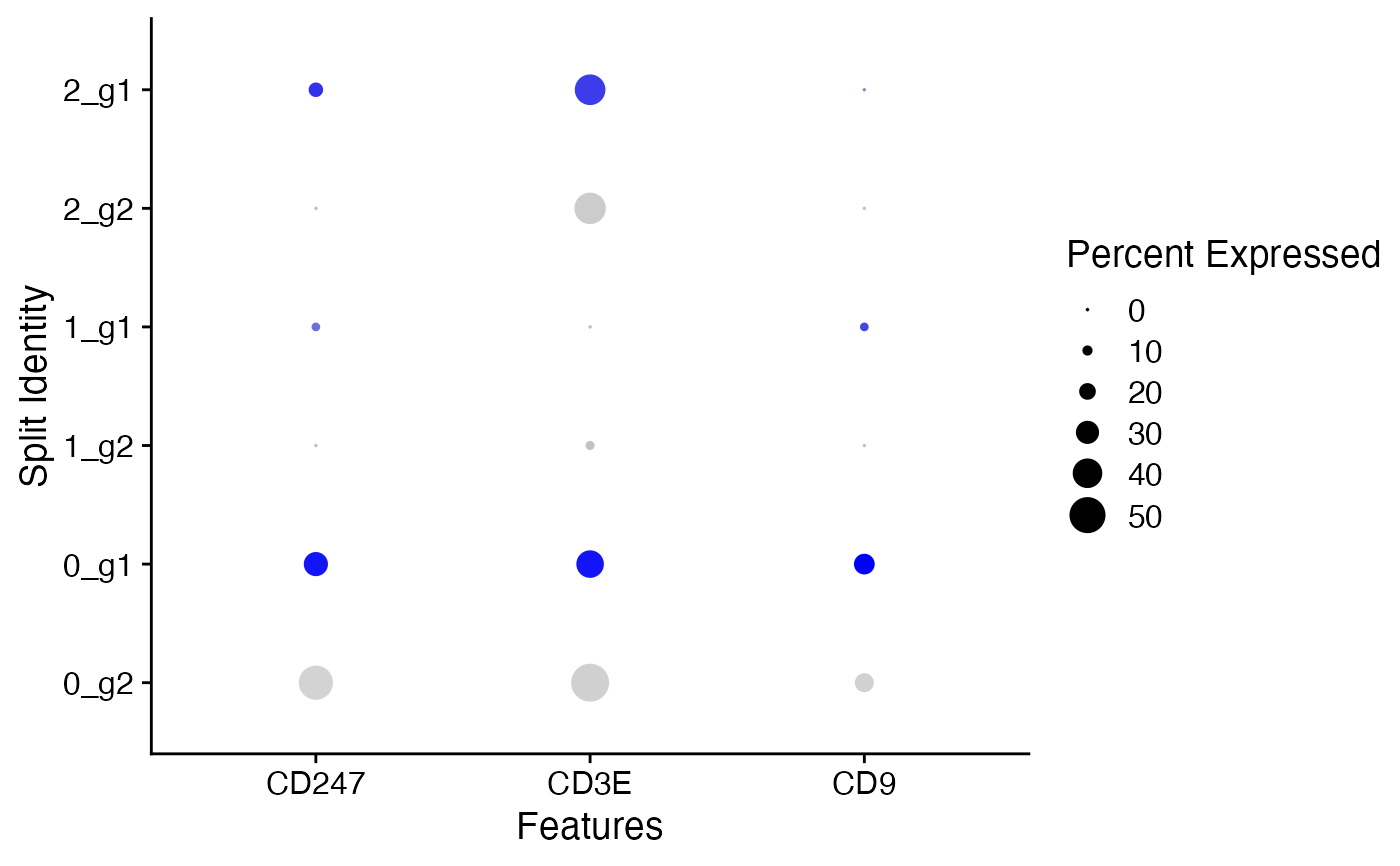
I kind of found a way to do it using plotCounts and then ggplot but for a single gene ... I would like something that allows me to plot multiple genes and their counts number in a single plot.
Do you have any idea of something like that already existing as a package or if there's an easy way to do it?
dittoSeq has a dotplot function that will work with a SummarizedExperiment.
Add your rlog counts as an assay and provide it to the function if you want them to be used, something like:
library(dittoSeq)

assay(dds, "rlog") <- rlog.counts
dittoDotPlot(dds, c("your", "genes", "here"), group.by = "your_grouping_variable", assay = "rlog")
There are lots of other options for controlling size, etc. Though for bulk data, I really find a heatmap to be more informative than a dotplot.
Hmmm, indeed, dittoSeq looks nice, thank you for reminding me of it. Didn't knew it could be used directly with data matrices instead of a Seurat object. Thank you!
Log in to answer this question.
It's just ordinary ggplot, basically all of these plotting functions you find in Seurat or Bioconductor are just ggplot wrappers. Can you provide some data that can be copy/pasted into R, maybe with dput()?
Yeah I know all of this, it's just easier to use something that's already coded out and pretty, especially when I want to show some basic stuff to use in R to colleagues who don't know how to code or use ggplot.
I can't really use dput() now as it's confidential data but the data just looks like any other RNA-seq data, treated/untreated, several batches etc ...
You mean something like this?