Hello everybody,
I ask for help to plot the results from a fastPHASE analysis. The output deriving from these analyzes looks like this:

each row represents a single SNP for a single sample of interest, and the columns are the membership of each SNP to 15 different clusters.
What I would like to plot is something like this:
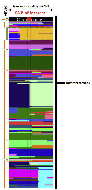
What I would like to see specifically, is whether the same haplotypic group occurs in various accessions of arabidopsis in the regions around my SNP of interest (77 specifically)
What would be the best way to get to this kind of graphical representation?
I hope I have been clear enough
Thank you!
1 answer
I think that the same folks who made fastPHASE also created a software for visualizing the results. Check out Haploscope. Here is the link: http://haploscope.scheetlabsoftware.org/
Log in to answer this question.