Really helpful, thank you very much for the support
• 0 views
•
link
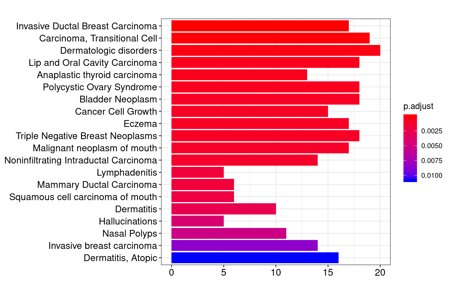
Hi everyone and happy holidays, I wondered if there's a way of graphical representing DE analysis in terms of logFC, in particular I've a list of differential expressed miRNAs, each of them associated to a specific logFC and P-values. How can I use thebarplot function to associate a bar for each miRNA, having the length of the bar proportional to the corresponding logFC value and the color with p-value? I would like to have a result similar to this, something I can easily get with an enrichment analysis.
Do you recommend representations? It is important to me to compare different logFC values through the miRNAs.
Thank you very much.
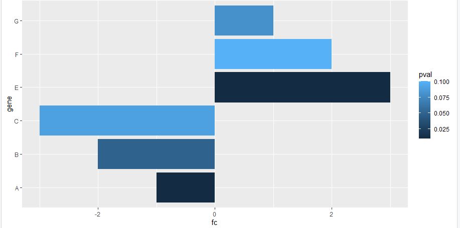
This would create what you asked for, BUT for gene expression visualization bar plot is NOT a smart way to do so. Please follow @ATpoint comment (volcano plot) for visualization. Here is sample code for making volcano plot using ggplot package.
df <- data.frame(gene = c("A", "B", "C","E", "F", "G"), fc = c(-1,-2,-3,3,2,1), pval = c(0.01, 0.05, 0.09, 0.01,0.1,0.08))
ggplot(data=df, aes(x=gene, y=fc, fill = pval)) +
geom_bar(stat="identity") +
coord_flip()
Really helpful, thank you very much for the support
Log in to answer this question.
Please google for volcano plots.