This is a test version of Biostars. For the public version, visit https://www.biostars.org.
Can someone explain in detail the meaning of a gseaplot in GSEA

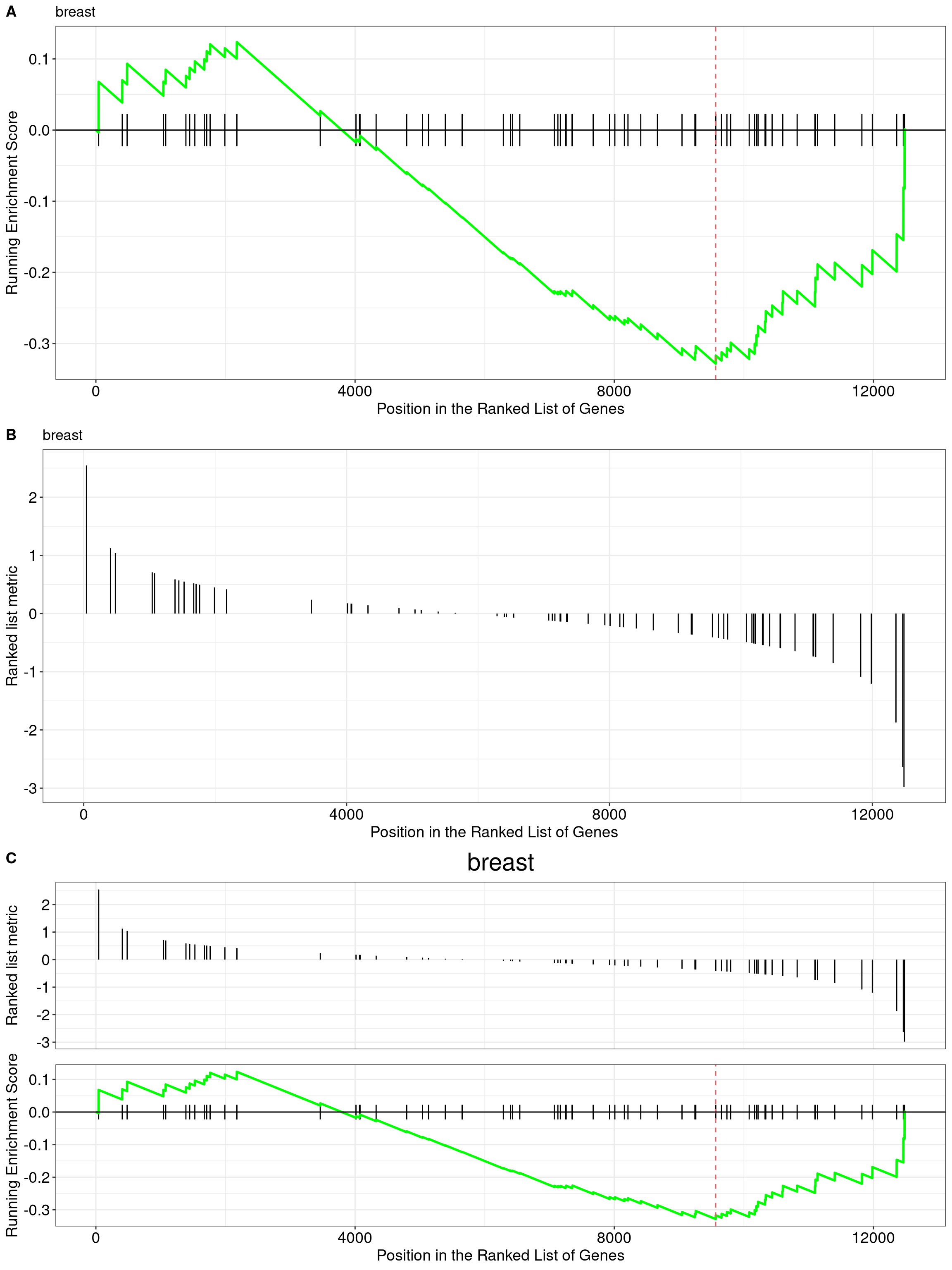
Can someone explain in detail the meaning of a gseaplot in GSEA https://yulab-smu.github.io/clusterProfiler-book/clusterProfiler_files/figure-html/gseaplot-1.png

gseaplot

Thanks genomax, this was very helpful!

1 answer

The x-axis is dependent on and represents your input list of ranked genes - exactly how you have ordered the list is important for the interpretation of the plot's overall result. For example, are the most statistically significant genes on the left or right?; or, are those with largest fold-change on the left or right?

The black vertical bars along the x-axis are those genes from your input list that feature in the gene-set / signature that is being enriched.

The green line is the enrichment of this gene-set / signature, and it can be positive or negative.

Kevin

For example, are the most statistically significant genes on the left or right?; or, are those with largest fold-change on the left or right? This is an example I found online. In my case, I'm using the log2foldchange and ranked in decreasing order so high to low.

I understand from your answer, the x-axis but I still don't understand the green line and the meaning of the "running Enrichment score" value. Thanks!

The order of left|right will depend on how you have ordered the input gene list, I think. Left would be index position 1; right would be index position n, where n is the final gene.

The enrichment score used by GSEA is a unique score that was devised by the authors of the program. I think that it is explained via the link provided by my colleague, genomax, though.

Log in to answer this question.