How to create an upset plot with a count of genes per pathway in cluster-profiler?
I'm plotting an upset plot of KEGG enriched pathways using DOSE and clusterprofiler which works fine like this:
kk <- enrichKEGG(gene = gene_ids,
                 organism     = 'hsa',
                 pvalueCutoff = 0.05,
                 pAdjustMethod = 'fdr')

upsetplot(kk)
The plot given looks like this:
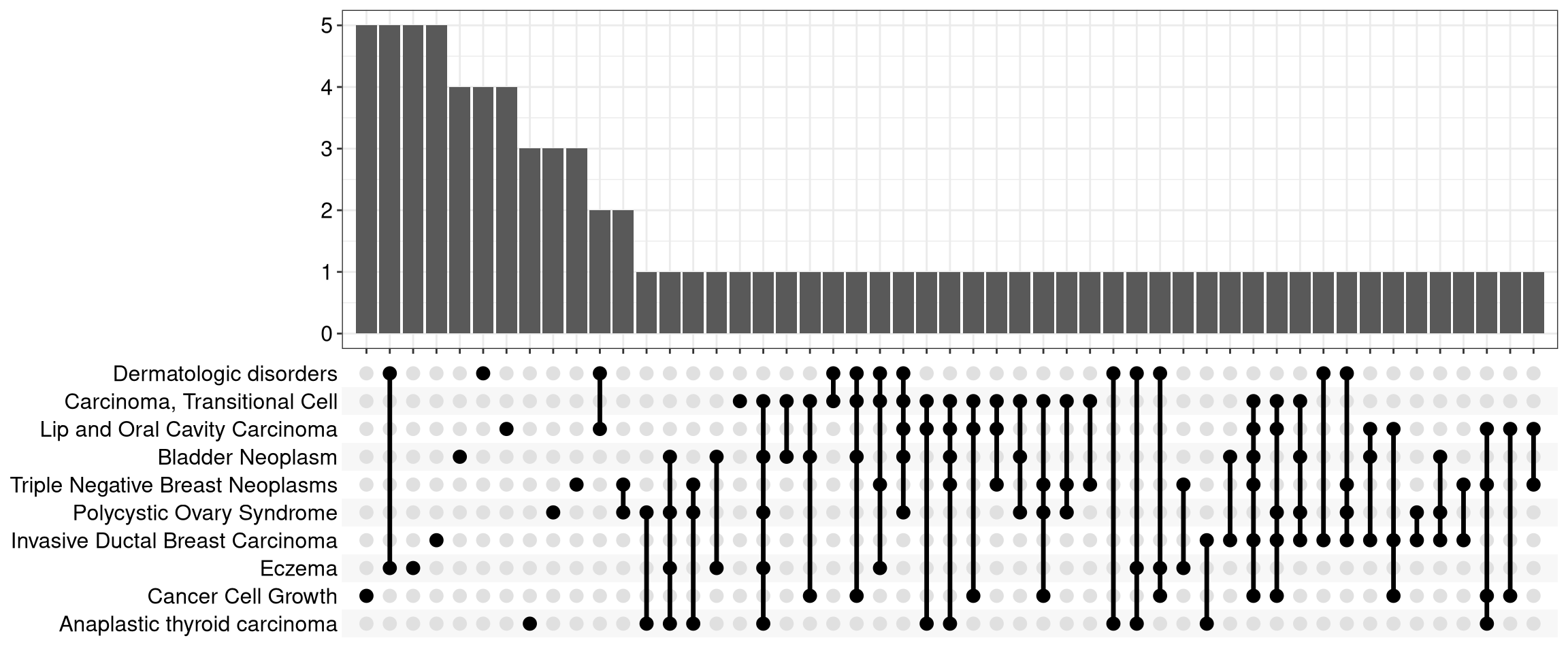
I'm wondering if there's a way to expand this plot on the left to have a bar chart of the number of genes enriched per pathway? So the style of the plot would expand to look like this:
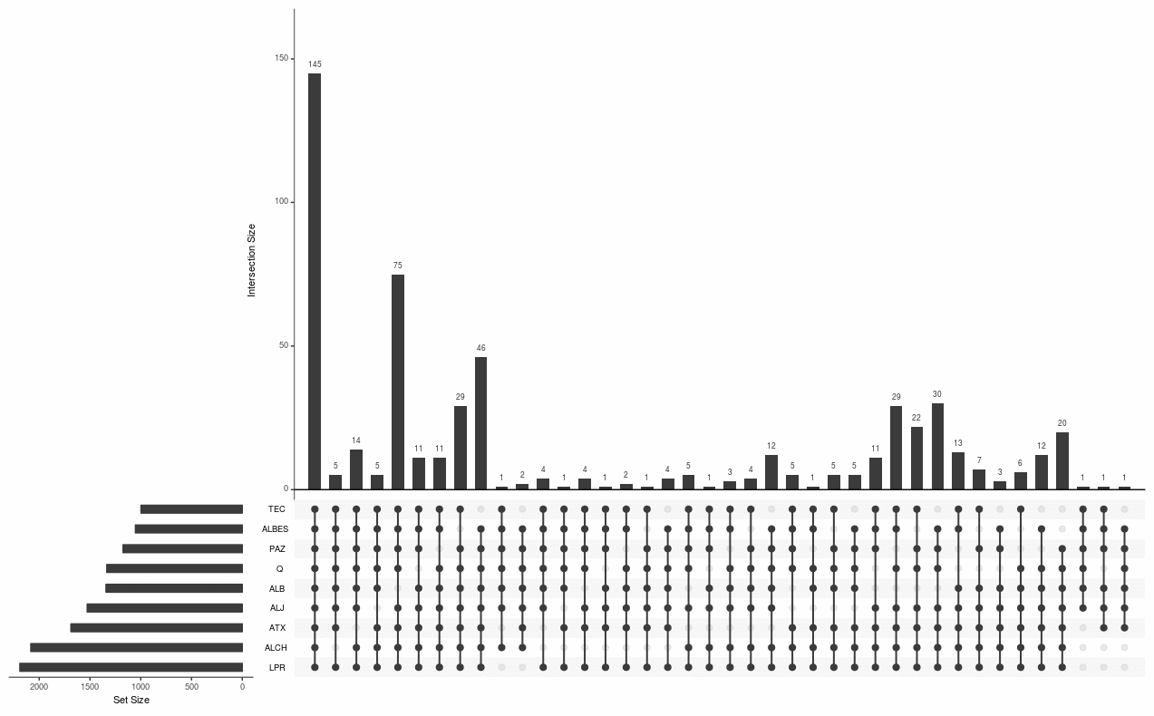
Is this possible using the upsetplot() function? Or would I need to try plotting the kk data with another package like UpSetR?
• 2,333 views
•
link
0 answers
No answers yet.
Log in to answer this question.