This is a test version of Biostars. For the public version, visit https://www.biostars.org.
Why does my TOM network heatmap for WGCNA display red background and golden modules, showing opposite colors to the Tutorial?

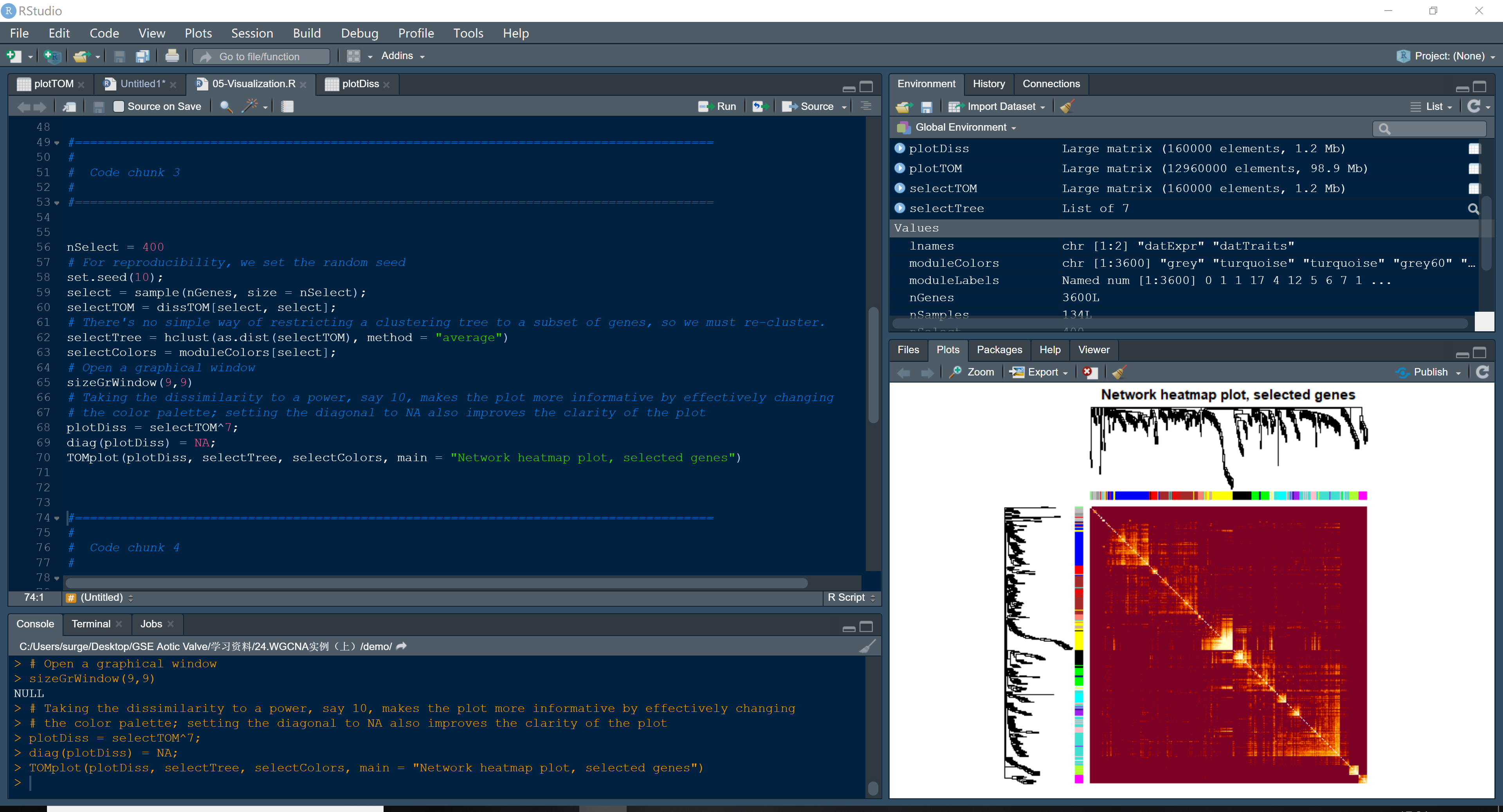
Dear guys, I tried to replicate the WGCNA tutorial step by step (https://horvath.genetics.ucla.edu/html/CoexpressionNetwork/Rpackages/WGCNA/Tutorials/FemaleLiver-05-Visualization.pdf) Therefore I used the code exactly the same as the tutorial. However I got the TOM heatmap like this, with red background and golden modules. It's so wired that the colors are opposite to the figure in the tutorial. I googled a lot and found no similar phenomenon. How could I get this TOM heatmap like the tutorial? Thanks very much. code and plotenter image description here

![the TOM plot with red background and golden modules][3]

wgcna tom heatmap red background golden modules
remove.packages('WGCNA')

restart R

BiocManager::install('WGCNA')

reload data and redo TOMplot() still the red figure

In TOMplot() you can use additional arguments such as those of the heatmap() function. Use the 'col' argument to set the color palette of the heatmap

Thanks. I still don't know why I need to use 'col' argument while the others including the tutorial does not. Could you please give detailed code example that how to use 'col' argument in TOMplot()?

I have been encountered the same problem. But I guess the aforementioned solution, which just simplily revert the color mapping, may not be correct.

I did inspect the TOM matrix and TOMplot function. The former consists of a larger proportion for Bigger Number(such as 0.8+ 0.9+),and The latter.,I found , call the built-in function — heatmap to draw the results, which will map the higher value with dark color and lower one with light color.

Any advices welcomed ! I have been stucked for moren than one month.

Hi Derek,

In plotTOM() you are plotting a dissimilarity matrix dissTOM = 1-TOM

2 answers

Try this

library(gplots)
myheatcol = colorpanel(250,'red',"orange",'lemonchiffon')
TOMplot(plotTOM, geneTree, moduleColors, main = "Network heatmap plot, all genes", col=myheatcol)

It worked! But before your useful advice, I never changed 'colorpanel' to something like

'myheatcol = colorpanel(250,'gold',"orange",'darkred')'

I mean, if now I set the colorpanel like (250, 'gold',"orange",'darkred'), I can get that blood-smear-like figure again, not exactly the same, which is that the golden module is not as bright as the figure with default 'col'. Does this mean that the figure got by set the col = colorpanel(250,'red',"orange",'lemonchiffon'), also shows some different details from the tutorial figure? enter image description hereenter image description here Anyway, problem solved,,, almost. I will go on trying to find what's wrong with the default argument in my TOMplot(). Thank you so much!

I could be wrong but If you followed every step of the tutorial, I would not bother too much about the default color palette used in TOMplot(). It could be a version problem. Those tutorial were made in 2014

Yes u r right. Then I won't bother either. Thank you!

Please Accept an answer (and up-vote it) if it has helped to solve the issue.

for my opion, this step just reverts mapping process, in wich higher value tends to be "lemonchiffon" (ligher), while lower value tends to be "darked". So it's still hard to address the paradox: different modules have higher similarity than memebers in one module.

There is no paradox. In TOMplot() you are plotting a distance matrix distTOM = 1-TOM. Therefore, genes in different modules have higher dissimilarity

Hi Andres, I may ask how to suppress the dendrogram of the above heatmap? I could not see any parameter for that.

Thank you!

enter image description here

Log in to answer this question.