Plotting and Visualizing large number of genes into chromsome
2
2
Entering edit mode
9.1 years ago

Hello....

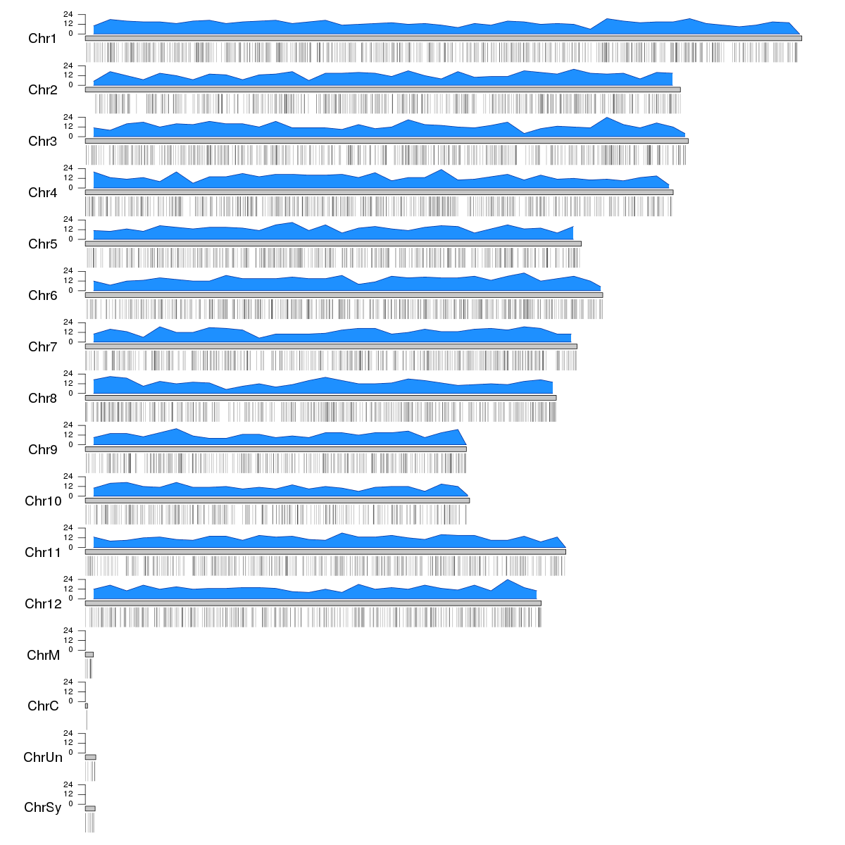
I have a list of around 5000 rice genes. I would like to display those genes in rice chromosome. I tried with Rcircos, tool is good but it can map up to a few genes. So I am in trouble.!! I know about circos but it is beyond my limit to execute. Do anyone of you have an idea about method/any software suit which can be used to visualize large number of genes to chromosome?

It is ok for me if I can represent genes as even dots (rather than with gene label). My aim is to make a distribution plot chromosome.

rice chromosome visualization rcircos • 3.9k views
ADD COMMENT
1
Entering edit mode

Do you really want to show all 5000 at once? Realistically, that's going to be such a busy plot that it'll be quite difficult to get anything out of it. Presumably you're looking to show some kind of connection between genes, so likely using just a subset of genes will suffice.

ADD REPLY
0
Entering edit mode

I thought there might be some tools which provide a scattered plot kind of mapping (I mean many dots) onto chromosome. My list is having 3450 genes. In this case, I am not using connector to link genes@Devon Ryan

ADD REPLY
0
Entering edit mode

I would plot the density of genes along the chromosome as a line. dots is still not simple enough

ADD REPLY
0
Entering edit mode

"I know about circos but it is beyond my limit to execute" tell us what's the problem or ask the circos mailing list.

ADD REPLY
0
Entering edit mode
What do you mean by plotting a gene? Do you want to plot the gene body (exon-intro structure), or do you have a value for each gene and you want to plot them as points, or anything else?
ADD REPLY
1
Entering edit mode
7.2 years ago
bernatgel ★ 3.4k

In R you can use the Bioconductor package karyoploteR to create the ideogram and plot the genes. You can plot all genes individually (either as regions or as points...) or compute the gene density over the genome using a non-overlapping sliding window, using kpPlotDensity. To create this plot you'll need to have the BSgenome.Osativa.MSU.MSU7 package installed, wich would not be necessary for human, mouse and some other organisms.

As an example we can create 5000 random "genes" and plot them. Above the ideograms we'll plot the gene density and below them the actual genes using a semitransparent color to show the accumulation of genes in certain regions.

library(karyoploteR)
library(regioneR)

#Create 5000 regions as mock genes
genes <- createRandomRegions(5000, length.mean=3000, genome="MSU7")

kp <- plotKaryotype(genome="MSU7", plot.type=2, cex=1.6)
kp <- kpPlotDensity(kp, data=genes, col="dodgerblue")
kpAxis(kp, ymin=0, ymax=kp$latest.plot$computed.values$max.density)
kpPlotRegions(kp, data=genes, data.panel=2, col="#00000044")

enter image description here

You can then customize the appearance of this plot, change its colors, etc... and combine it with any other karyoploteR function. You can find all the information needed in the karyoploteR tutorial

ADD COMMENT
0
Entering edit mode
8.9 years ago

Hi, perhaps you can use a Manhattan plot? :) I don't really know what you can use for the Y axis, but...
http://www.gettinggeneticsdone.com/2014/05/qqman-r-package-for-qq-and-manhattan-plots-for-gwas-results.html

ADD COMMENT

Login before adding your answer.

Traffic: 3040 users visited in the last hour
Help About
FAQ
Access RSS
API
Stats

Use of this site constitutes acceptance of our User Agreement and Privacy Policy.

Powered by the version 2.3.6