Please note that further spamming will get your account suspended.
• 0 views
•
link
Hello,
I recently got myself into Circos. It is an amazing tool to visualize data. However, I am a bit lost and I require some help understanding how to proceed. I have RNA-seq data of differentially expressed genes (Log2 fold change) and I would like to plot them on Circos.
I would like to have a plot like the following figure if possible.

What type of data representation should I choose for Circos plot in order to obtain such representation ?
Thank you in advance.
Maybe you want to try shinyCircos. It's an interactive APP. https://github.com/venyao/shinyCircos http://shinycircos.ncpgr.cn/
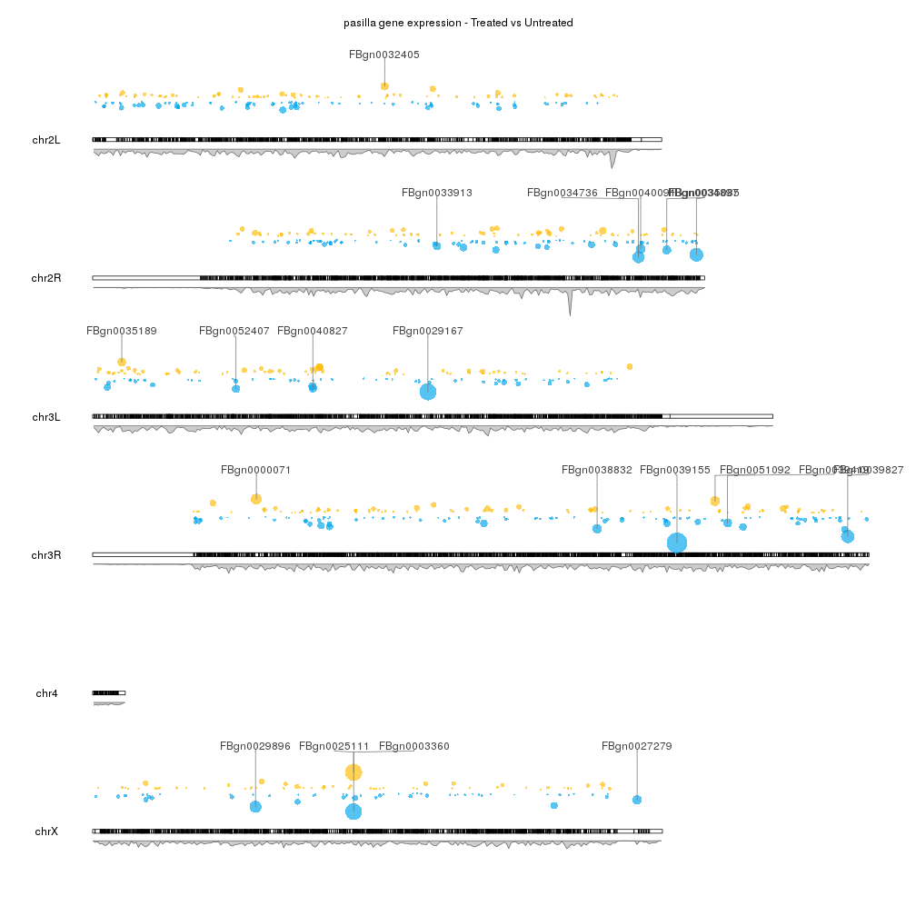
As @jrj.healey said, circos plot are pretty but they are not always your best bet, specially with lots of data. If you want a whole genome view of your data and position on the genome is important to you, you can use karyoploteR to create non-circular genome plots.
There's a specific example at the karyoploteR examples page on visualizing the results of a differential gene expression analysis that creates a plot like the one below. You can easily zoom-in to specific regions if you need a detailed view.
Log in to answer this question.
hello badredda, but you have not attached the image properly. Please refer this post for adding image to biostar post.
have you seen the circos manual they have some proper documentation ...you have to make your datafiles as such given in the tutorial with chromosome number circos
Without wishing to rain on your parade too much, I've never really seen a Circos visualisation that was actually useful.
They look good on posters and stuff maybe, but if you're actually trying to show something, consider other alternatives like labelled volcano plots or something.
@badredda if you considering volcano plot then this is an elegant way to show volcano plot
Hello,
Thanks everyone for your feedback.
@toralmanvar, I have edited the image. I hope it is showing now. @krushnach80, Yes, I checked the documentation in Circos and I tried to produce a similar plot like the on in the picture but I couldn't find any tutorial to plot similarly to the example mentioned above. @jrj.healey, yes I agree that a Circos plot may not be useful to interpret but when you are working on big data, it is nice to have a plot to see how all your samples behave.
Thanks all.
Maybe it's obvious to others, but what do the different tracks in the figure represent? e.g. What are the dots, and why are they different colours? What are the peaks? What format is your data in?
@ badredda In addition, add some data.
@Russ, In the plot, the first outer-ring shows genes that are over-expressed and under-expressed relative to their position on the circos plot. The inner rings shows the density of the points.
You're trying to draw a scatter plot of log2 values of gene expression, correct? Have you looked at this tutorial? It explicitly defines the format your data should be in.
To change colours based on criteria (ie over- or under-expressed) you can create rules, explained here.
@Russ, thanks for the link, I will check it up and come back later with updates.
@cpad0112, sorry for late reply, my data looks like the following table:
And some downloadable data: https://goo.gl/pBvd3F
Thanks !
@ badredda
I am not sure of density plot inside circos as I do not see multiple points at any given coordinate (like SNPs or any other quantifiable information). However histogram and line plots are possible. P-values cannot be drawn unless they are transformed. with example data and Rcircos: