Hello everyone, With the clusterProfiler package implemented in R, I made gene ontology analysis with enrichGO function and KEGG analysis with enrichKEGG function. Gene ontology I used for my gene list was "ALL". I need to make a plot for both of the analysis but I couldn't find the right commands for them. Is there anybody who can help? Sorry for inconvenience, thank you. Mervenur
3 answers
You are forgiven, clusterProfiler isn't the easiest (collection of) package(s) to get acquainted with. To be fair, though, most of what you'll need is somewhere in this book As you can see in the figure on the starting page, you should be able to use cnetplot(), heatplot(), emapplot() and so on with the output of enrichXXX()
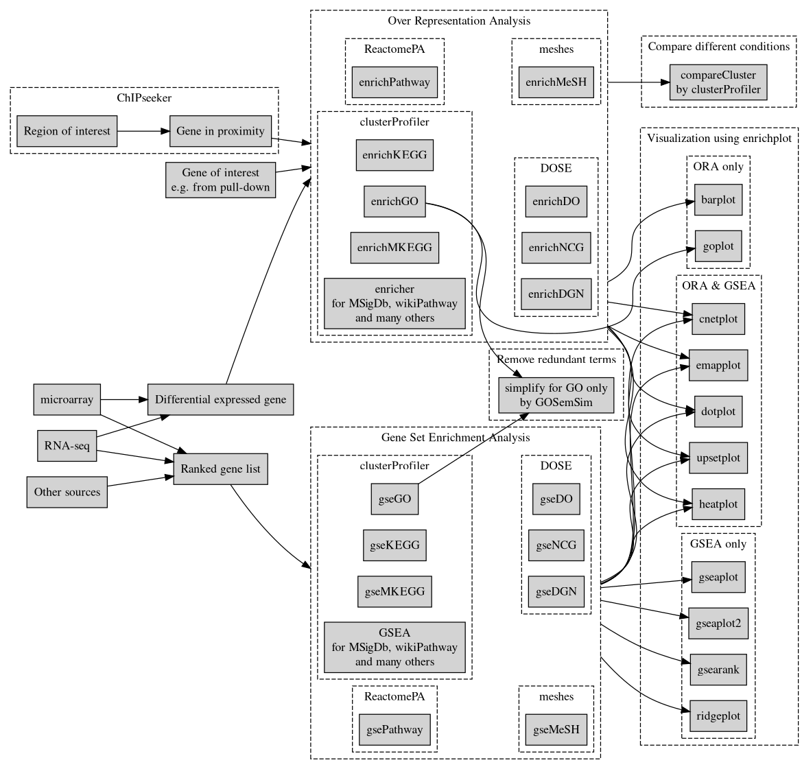
I suggest you to review the vignete of clusterProfiler in order to have a detailed explanation for plotting the output of ORA from enrichGO and enrichKEGG. Also, for a complementary example with code employed for ORA in clusterProfiler visit this page. You will find there the best plots to represent your results.
As long as you have the correct data-structure (dataframe or matrix) you should be able to produce any plot with help of different R libraries. You don't need to use clusterProfiler if you find it difficult to work with.
Log in to answer this question.