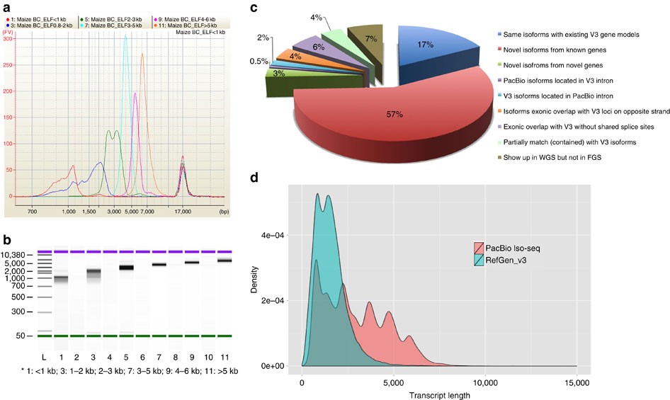
This plot was made in R with ggplot2. If you are asking about the data used you would need to find it yourself. RefGen is likely the standard reference annotations (available here). You would need to look for the source for the PacBio iso-seq data and whatever format it is in.
library(reshape2)
library(TxDb.Hsapiens.UCSC.hg38.knownGene)
library(ggplot2)

## my genome resource (human)
tx <- TxDb.Hsapiens.UCSC.hg38.knownGene

## get a vector of all transcripts lengths by gene
b <- width(transcriptsBy(tx,by='gene'))

## split randomly into two halves and sum the transcripts lengths for each gene (this is just an example and probably not the ideal way to calculate lengths)
tx.half1 <- sum(b[1:13000])
tx.half2 <- sum(b[13001:26000])

## merge both into a data.frame
tx.df <- melt(list('set1'=tx.half1,'set2'=tx.half2))

## plot (I also force the x-axis to stay within the limit pictured in your reference plot)
ggplot(tx.df,aes(x=value,fill=L1)) + geom_density(color='black',alpha=0.5) + xlim(c(0,150000)) + xlab('Transcript length') + ylab('Density')