It is perfect! But how to add a line to aplot like in the qqman example above?
• 0 views
•
link
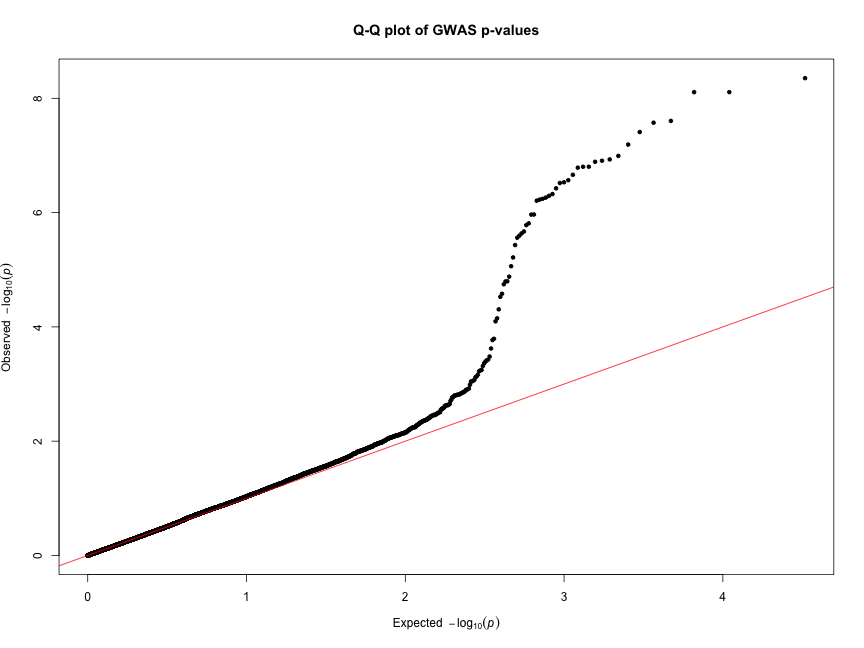
Hello everyone! I am trying to make a Q-Q plot to visualise p-values obtained from different models afterr runing GWAS analysis. The key thing is that I want to reflect p-values from the different models in one chart. I tried qq function in qqman package however it takes only a vector of one model as an input, so as a result, I get the following picture:
And what I am trying to should look like this:
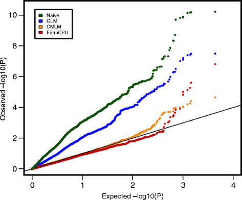
You could plot it outside any qq plotting functions. The following will generate the same graph:
Generate p-values:
p<- runif( 10000 )
Using qqplot:
qqplot( -log10( ppoints(p ) ), -log10( p ) , col="red" )
Using plot:
p.sorted <- sort(p)
plot( -log10(ppoints(p.sorted )), -log10(p.sorted) , col="red")
(same as above). Then if you want to add another data set:
p2<- runif(5000)
p2.sorted <- sort(p2)
points( -log10(ppoints(p2.sorted )), -log10(p2.sorted) , col="blue" )
You may have to play with the xlim and ylim argument of the plot function to include all values of subsequent datasets.
Log in to answer this question.
I don't understand the desired plot. The QQ plot use the mean and variance of the vector you inserted to plot it against a normal distribution, I don't see how you can compare different vectors with different means and variances. Having said that, you can use the returned values from qqnorm to plot multiple vectors in one figure.
For normal distribution it is always possible to do standartization (Normal => Standard Normal), so this is not a big problem. QQ plot does not require the distribution to be normal - sample quantiles of, e.g., exponential distribution, may be plotted against theoretical quantiles (https://stat.ethz.ch/R-manual/R-devel/library/stats/html/qqnorm.html , there is an example of chisq at the bottom).
But I agree with your answer to the question.