Tutorial: Heatmaps in R
As heatmaps in R are a recurring theme, I thought I'd collect information here:
1. List of heatmap functions (and packages) in R:
- heatmap
- heatmap.2 (package gplots)
- heatmap.3 (package GMD, not on CRAN anymore)
- heatmap.plus (not on CRAN anymore)
- aheatmap (package NMF)
- pheatmap
- ggheat (code in this blog post)
- heatmaply
- d3heatmap (not maintained, not on CRAN anymore)
- ComplexHeatmap
- Superheat
- Heatplus
- iheatmapr
2. Tutorials:
- Using heatmap()
- Using heatmap.2()
- Using ComplexHeatmap
- Using Superheat
- Guide to heatmaps in R
- Using EnrichedHeatmap for visualization of NGS experiments
3. Biostars posts:
EDIT 2017-02-03: Added more heatmaps. Thanks to people contributing below.
EDIT 2017-03-14: Added another one.
EDIT 2019-05-28: Added another one.
EDIT 2019-09-06: Added tutorial for EnrichedHeatmap (thanks to ATpoint)
EDIT 2020-08-14: Update: GMD and d3heatmap not on CRAN.
EDIT 2022-05-04: Update: heatmap.plus not on CRAN.
• 40,822 views
•
link
0 answers
No answers yet.
Log in to answer this question.
We need to modify this xkcd strip to replace "standards" with "heatmap functions in R".
...or "pipeline frameworks written in python." :) I find it is interesting there are so many tools/packages in the same application space, especially when they are implemented almost the same way.
Also add corrplot for correlation heatmaps.
Tutorials are here,
https://cran.r-project.org/web/packages/corrplot/vignettes/corrplot-intro.html
And also ComplexHeatmap https://bioconductor.org/packages/release/bioc/html/ComplexHeatmap.html
nice
Someone mentioned to me in the office that the list is missing d3heatmap and superheat.
Don't forget aheatmap from the NMF package. I also often roll my own with image() and layout(), and it is TERRIBLE!
I do it with ggplot2 and it is awful, but I like the flexibility it gives me with the layout.
Heatmaps in R are a curious beast as they do a lot more than "just" draw the heatmap.
They promote that endemic and flawed ideology that is very common of R based software. Instead of breaking down the steps into their logical units that one can easily build upon:
They give you one "convenient" function with lots of parameters - but all that leads to is a misleading simplicity. It is really not clear what takes place and whether those steps are universally applicable. Hence the many options - neither of which takes on what the real problem is - overly tightly coupled concepts.
The majority of the people that use heatmaps probably do not fully understand how these heatmaps were created and that there are essential data processing steps involved that fundamentally alter what the heatmap will look like.
This reminds me of the "Quilt plot" paper a few years ago. This paper received a lot of hate but it proposed a much simpler implementation of the heatmap function in R (without clustering). I think such a paper would never have existed if the base R function was more intuitive/simple.
I just wrote up a post for heatmap, check here http://rpubs.com/crazyhottommy/a-tale-of-two-heatmap-functions
Hi Jean-Karim Heriche,
I haven't tried it (yet*) but this one looks pretty: Superheat: An R package for creating beautiful and extendable heatmaps for visualizing complex data. Also on github
*PhD-student-slang for "I would certainly like to but never will"
Hi Jean-Karim Heriche, I am wondering how can I make cluster heatmap, where I can assign samples to per-defiend clusters? thanks!
Just reorder the matrix as per your clustering. If you're working with hierarchical clustering, you can do something like this with base R:
Check also the various heatmap packages. For example pheatmap and ComplexHeatmap allow to split a heatmap based on clusters.
Here one for EnrichedHeatmap: Using EnrichedHeatmap for visualization of NGS experiments
Missing heatmap3 (github, CRAN).
Useful tutorial at http://compbio.ucsd.edu/making-heat-maps-r/ that covers and compares heatmap, heatmap.2, aheatmap, pheatmap, heatmap3, and annHeatmap2 (heatplus). It also carefully points out the difference between heatmap3 and heatmap.3, and notes that the latter is associated not just with the GMD package as listed here but also several other implementations that collide on the name.
I have developed a new heatmap package, ggalign, built upon ggplot2, which enables the creation of heatmaps as complex as those in ComplexHeatmap, while adhering to the grammar of graphics.
in the documentation you should start with an example of what problem the new software solves.
like before and after images,
otherwise people can't quite tell what does it mean when you say:
Thank you for your suggestions! I will include a more detailed description in the README. For your convenience, I'll provide a few minor examples here
ggalignextends ggplot2 by providing advanced tools for aligning and organizing multiple plots, particularly those that automatically reorder observations, such as dendrogram. It offers fine control over layout adjustment and plot annotations, enabling you to create complex, publication-quality visualizations while still using the familiar grammar of ggplot2.Why use
ggalign?ggalignfocuses on aligning observations across multiple plots. It leverages the"number of observations"in the vctrs package orNROW()function to maintain consistency in plot organization.If you've ever struggled with aligning plots with self-contained ordering (like dendrogram), or applying consistent grouping or ordering across multiple plots (e.g., with k-means clustering),
ggalignis designed to make this easier. The package integrates seamlessly with ggplot2, providing the flexibility to use its geoms, scales, and other components for complex visualizations.Getting Started
The usage of
ggalignis simple if you're familiar withggplot2syntax,ggalignworks with a simple workflow:ggheatmap()orggstack().align_group(): Group layout axis into panel with a group variable.align_kmeans(): Group layout axis into panel by kmeansalign_reorder(): Reorder layout observations based on statistical weights or allows for manual reordering based on user-defined criteria.align_dendro(): Reorder or Group layout based on hierarchical clusteringggalign()orggpanel(), then add ggplot2 elements like geoms, stats, scales.Basic example
Below, we'll walk through a basic example of using
ggalignto create a heatmap with adendrogram.Compare with other ggplot2 heatmap extension
The main advantage of
ggalignover other extensions like ggheatmap is its full compatibility with the ggplot2 grammar. You can seamlessly use any ggplot2 geoms, stats, and scales to build complex layouts, including multiple heatmaps arranged vertically or horizontally.Compare with ComplexHeatmap
Pros
ggplot2ecosystem.ggplot2plots by panel area.Cons
Fewer Built-In Annotations: May require additional coding for specific annotations or customization compared to the extensive built-in annotation function in ComplexHeatmap.
More Complex Examples
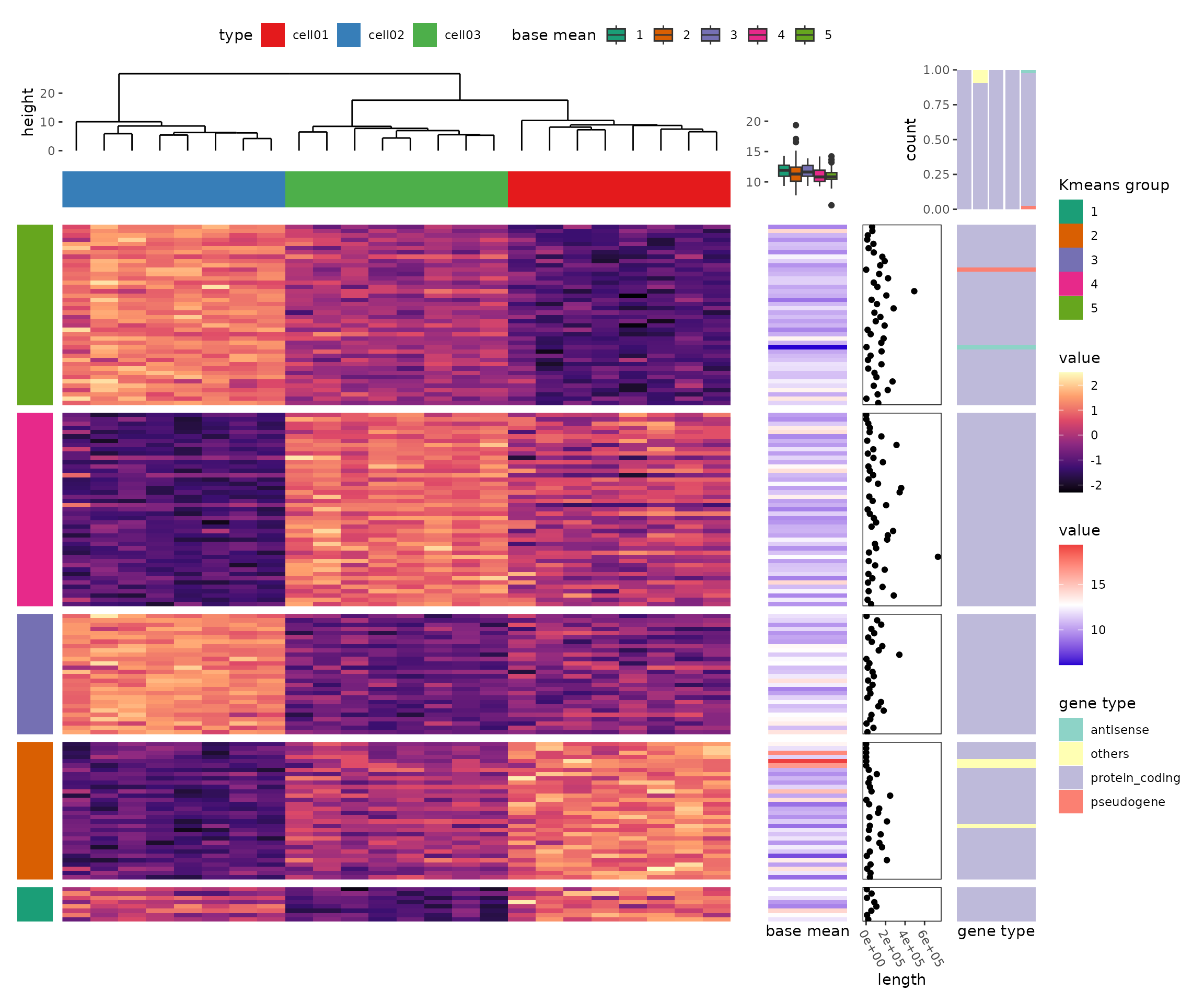
The package's seamless integration with ggplot2 allows for the creation of more complex heatmaps and visualizations using ggplot2 syntax: