neat visualization!
• 0 views
•
link
I thought biostars may be a good place to ask this question.
I have a large database of similar protein sequences with one to multiple amino acid substitutions and a phenotypic value for each of these protein sequences. What would be a good way to visualize the relationship between the single or multiple amino acid substitutions and its effect on phenotypic change? Currently I have a graph such as below but it does not capture the protein sequence.

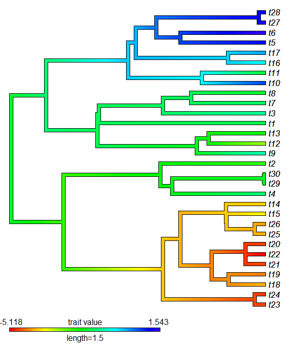
What about creating a phylogeny of the protein sequences and color coding the branches by phenotype?
Something like this:
neat visualization!
I'm totally going to have to find an excuse to make a dendrogram like that. What program did you use?
ummm...I used google image search ;)
I should have credited the source in my answer, here is the blog post it is from: http://blog.phytools.org/2012/11/mapping-reconstructed-value-of.html
The author uses a package called phytools
Thanks Katie. It is written in R too.
Draw two graphs, one of top of the other, at the same width:
Repeat for each amino acid sequence; tile the figures if they can be put into a group.
This doesn't seem to work with phenotypic measurements on proteins with multiple mutations.
You may also be able to use the "genotype network" formalism, creating a separate network for each phenotype. In a genotype network, a vertex represents a sequence and edges connect vertices if their corresponding sequences are separated by a single, small mutation. For more information on this formalism, see Wagner (2008) Nature Reviews Genetics, 9:965-974. For the foundations of this formalism, see Schuster et al. (1994) Proc. R. Soc. Lond. B 255:279-284.
Log in to answer this question.