that is a "WOW"!
• 0 views
•
link
Hi,
I'm putting together some slides on visualisation of results and since I'm in a bioinformatics lab most of the figures will be to do with bioinformatics results.
Therefore, I want to ask - what's the best image you've all seen in a bioinformatics paper (talk if you can find the image) and why?
Are there simple rules to follow? Are there simple rules to avoid? What made this image so good? (Is this sort of question appropriate for the community wiki?)
I suggest you have a look at the posters presented at the VizBi 2011 conference:
http://vizbi.org/2011/Posters/Collection/

I also like this interactive visualization of some haplotype blocks : http://benfry.com/isometricblocks/

that is a "WOW"!
Something about that haplotype blocks image reminds me of "Napolean's March" http://en.wikipedia.org/wiki/File:Minard.png
@Simon see also XKCD: http://xkcd.com/657/
@Simon - the color scheme?
I mildly disagree with the suggestions so far. The iPath and OntologyMaps pictures clearly look stunning, but (like many other images from the 'systems biology' field) thea are mainly intended to impress, not to inform. After looking at these pictures, you don't know more than you knew before, except maybe that 'this is all very complicated'.
I probably represent a minority here, but I prefer images that convey a clear message. One example is a heatmap display of gene regulation during the cell cycle (from a 2008 paper of Orlando et al) or this tree of eukaryotes from the blog skeptic wonder. They both look visually appealing (to me, that is) and at the same time are informative.
One of my favourites is from the Bork lab in Heidelberg by (I think) Takuji Yamada, presumably others too:

I think this is a complex diagram that does really help get across information that would be difficult to represent in other ways. In text, this would take an age to explain and yet relatively intuitively at least some of the information is available.
After looking around I see they have made it into a tool called iPath.
Hello,
I might be out of scope given your meaning of bioinformatics and previous answers, but here is my favourite (structural) bioinformatics research picture.
[?]
This image by Adrian H Elcock represents the crowdness of a bacterial cytoplasm. This is a dense mixture of proteins and nucleic acids. Impresssive when you consider that most of our in silico approaches study just a couple of biomolecules at a time.
I've always been a fan of this image that came out of my grad-school lab, showing rearrangements in the genome of the MCF-7 breast cancer cell line.
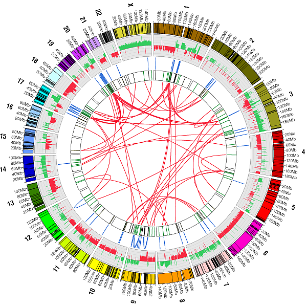
Circos plots are now used by lots of labs to represent structural variants, but my colleague Oliver Hampton was the first to do so, AFAIK.
Circos is really great. I like it and learn to use it at 2008. I usually recommend it to my friends and workmates,and also create Chinese discussion group ,translate the lessons to Chinese and open it to all.
Circos's website is circos.ca ,and is free software with GPL . It's author is Martin Krzywinski from BCGSC ,Canada .
Best image in Bioinformatics? Well for my money it's this one:

Which may not be strictly on topic, but for sheer impact is hard to beat.
On a related note, the Interactive Tree of Life is pretty cool, and lets the user visualise the data in the way they want.

Log in to answer this question.


