It is fine; it took a while for the installation, but once done it provides nice maps.
• 0 views
•
link
Hello everybody. Making a poster, I had the need to represent graphically a series of genes with their splicing in a simple way. I have a series of cDNA variants aligned against their correspondent genomic strand, and I was thinking about summarising the information displaying each genomic region as a thin line, the exons as thicker parts on the genomic region and the introns as graphical hairpins connecting exons (nothing new, very classical way). Is there a software that, given an alignment between a genomic region with its cDNAs (or at least some of them), outputs something like this? I started to do it manually, but the process is both slow and inaccurate.
See also
Batch Viewing of UCSC Browser Graphic
here is a XML returned by the UCSC for the table knownGene:
$ mysql --user=genome --host=genome-mysql.cse.ucsc.edu -A -D hg19 -X -e 'select * from knownGene limit 2'
<resultset statement="select * from knownGene limit 2
" xmlns:xsi="<a href=" http:="" www.w3.org="" 2001="" XMLSchema-instance"="" rel="nofollow">http://www.w3.org/2001/XMLSchema-instance">
<row>
<field name="name">uc001aaa.3</field>
<field name="chrom">chr1</field>
<field name="strand">+</field>
<field name="txStart">11873</field>
<field name="txEnd">14409</field>
<field name="cdsStart">11873</field>
<field name="cdsEnd">11873</field>
<field name="exonCount">3</field>
<field name="exonStarts">11873,12612,13220,</field>
<field name="exonEnds">12227,12721,14409,</field>
<field name="proteinID"></field>
<field name="alignID">uc001aaa.3</field>
</row>
<row>
<field name="name">uc010nxr.1</field>
<field name="chrom">chr1</field>
<field name="strand">+</field>
<field name="txStart">11873</field>
<field name="txEnd">14409</field>
<field name="cdsStart">11873</field>
<field name="cdsEnd">11873</field>
<field name="exonCount">3</field>
<field name="exonStarts">11873,12645,13220,</field>
<field name="exonEnds">12227,12697,14409,</field>
<field name="proteinID"></field>
<field name="alignID">uc010nxr.1</field>
</row>
</resultset>
if you write your data in that format, you can process the XML file with my XSLT stylesheet to produce a SVG file
$ mysql --user=genome --host=genome-mysql.cse.ucsc.edu -A -D hg19 -X -e 'select * from knownGene limit 2' | xsltproc <(curl -s "https://raw.github.com/lindenb/xslt-sandbox/master/stylesheets/bio/ucsc/ucsc-sql2svg.xsl") - | head
<svg:svg xmlns:svg="<a href=" http:="" www.w3.org="" 2000="" svg"="" rel="nofollow">http://www.w3.org/2000/svg" xmlns:xsi="http://www.w3.org/2001/XMLSchema-instance" xmlns:xlink="http://www.w3.org/1999/xlink" width="900" height="41" style="stroke-width:1px;">
<svg:title>select * from knownGene limit 2 </svg:title>
<svg:defs>
<svg:linearGradient x1="0%" y1="0%" x2="0%" y2="100%" id="grad">
<svg:stop offset="5%" stop-color="black"/>
<svg:stop offset="50%" stop-color="whitesmoke"/>
<svg:stop offset="95%" stop-color="black"/>
</svg:linearGradient>
<svg:linearGradient x1="0%" y1="0%" x2="0%" y2="100%" id="vertical_body_gradient">
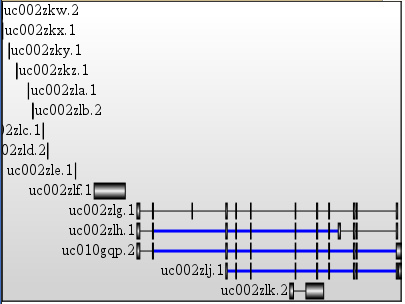
and a result visualized in firefox:
I have heard that the sushimi plot is a new, useful way to visualize splicing events:
http://genes.mit.edu/burgelab/miso/docs/sashimi.html
I haven't had a chance to try out the software yet - let me know what you think!
It is fine; it took a while for the installation, but once done it provides nice maps.
Log in to answer this question.
this has already been asked previously. See How to visualize splice junction data, in particular exon-skipping, Data visualisation -- exon/intron map?