Hi,
I'm analyzing an RNA-Seq data set using DESeq2. While doing exploratory data analysis, I would like to plot a PCA of my data. In the PCA I would like to create three different grouping parameters - time, group and a third parameter called "with/without" ( an addition of a specific aggregate to the cells analyzed in the experiment).
my colData() looks like that
> colData(rld)
DataFrame with 48 rows and 6 columns
                           Short      time replicate        label      group sizeFactor
                        <factor> <integer> <integer>     <factor>   <factor>  <numeric>
Artificialno24_1 ArtMinus        24         1 ArtMinus24_1 ArtMinus24   1.320755
Artificialno24_2 ArtMinus        24         2 ArtMinus24_2 ArtMinus24   1.345653
Artificialno24_3 ArtMinus        24         3 ArtMinus24_3 ArtMinus24   0.930701
Artificialwith40_1 ArtMinus        40         1 ArtMinus40_1 ArtMinus40   0.919405
...
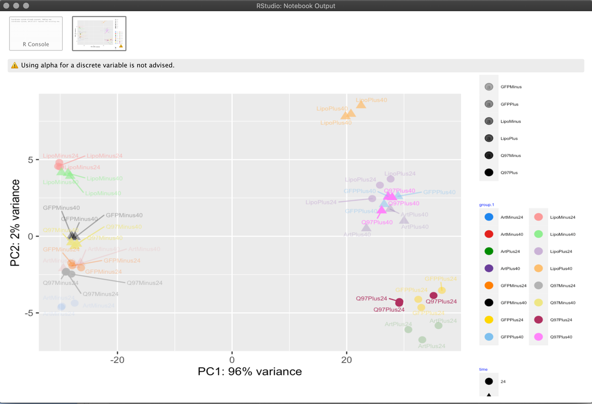
Amd I would like to visualize in my PCA plot the three categories - group, time and Short. But I can only think of color and shape in ggplot(aes(...) parameters. These are all categorical data (districte), so alpha is really a good solution.
Are there any other ideas out there, which one can use to create this kind of plot?
this is my command
ggplot(pcaData, aes(PC1, PC2, color=group.1, shape = time, alpha = Short) ) +
  geom_point(size=3) +
  scale_color_manual(values = c25) +
  geom_text_repel(aes(PC1, PC2, label = pcaData$name),size=2)  +
  xlab(paste0("PC1: ",percentVar[1],"% variance")) +
  ylab(paste0("PC2: ",percentVar[2],"% variance")) +
  coord_fixed() +
  guides(col=guide_legend(ncol=2  )) +
  theme(legend.text=element_text(size=4),
        legend.title = element_text(color = "blue", size = 4)) +
  coord_equal(ratio = 3)
and how the plot looks like at the moment
thanks in advance
Assa
0 answers
No answers yet.
Log in to answer this question.
Depending on the point shape that you are using, you can use
colorto color the margin of the points/dots andfillto color the dots/points: http://www.sthda.com/english/wiki/ggplot2-point-shapes (like 21 to 25). You can set the size of the points/dots as well as the margin to highlight better.Though 3 grouping variables sounds too much. If somehow they group together by any variable, I would highlight that through color background circle around the points/dots that belong to distinct groups, like some of the plots at the end: https://tem11010.github.io/Plotting-PCAs/
thanks, that with the
colorandfilloptions is a good solution