Here's one 'on the house', in part copied from 2 previous answers that I have given on this topic:
1, obtain input genes
rankedGenes <- c(1:20)
names(rankedGenes) <- c("BRCA1","BRCA2","TP53", "ATM", "ERCC1",
  "BRCC3", "TP63", "ERCC2", "ERCC3", "ERCC4", "TP63",
  "S100A2", "CXCL2", "CXCL3", "MS4A1", "MS4A2", "VCAM1",
  "VSX1", "CD8", "S100A2")

rankedGenes
 BRCA1  BRCA2   TP53    ATM  ERCC1  BRCC3   TP63  ERCC2  ERCC3  ERCC4   TP63
     1      2      3      4      5      6      7      8      9     10     11
S100A2  CXCL2  CXCL3  MS4A1  MS4A2  VCAM1   VSX1    CD8 S100A2
    12     13     14     15     16     17     18     19     20
So, in my genes, BRCA1 is ranked highest... S100A2 is lowest.
2, set-up the enrichment object based on your genes
require(topGO)
require(org.Hs.eg.db)

selection <- function(x) TRUE
allGO2genes <- annFUN.org(
  whichOnto = "BP",
  feasibleGenes = NULL,
  mapping = "org.Hs.eg.db",
  ID = "symbol")
GOdata <- new(
  "topGOdata",
  ontology = "BP", # also available are 'CC' and 'MF'
  allGenes = rankedGenes,
  annot = annFUN.GO2genes,
  GO2genes = allGO2genes,
  geneSel = selection,
  nodeSize = 5)
3, perform gene enrichment.
Here, we make use of the rank information by using the Kolmogorov-Smirnov (K-S) test on the enriched terms
results.ks <- runTest(GOdata, algorithm = "classic", statistic = "ks")
goEnrichment <- GenTable(
  GOdata,
  KS = results.ks,
  orderBy = "KS",
  topNodes = 100,
  numChar = 99)
goEnrichment$KS <- as.numeric(goEnrichment$KS)
goEnrichment <- goEnrichment[goEnrichment$KS < 0.05,] # filter terms for KS p<0.05
goEnrichment <- goEnrichment[,c("GO.ID","Term","KS")]
goEnrichment
4, generate a plot of the enrichment results
require(ggplot2)
library(scales)

ntop <- 30
ggdata <- goEnrichment[1:ntop,]
ggdata$Term <- factor(ggdata$Term, levels = rev(ggdata$Term)) # fixes order
gg1 <- ggplot(ggdata,
  aes(x = Term, y = -log10(KS), size = -log10(KS), fill = -log10(KS))) +

  expand_limits(y = 1) +
  geom_point(shape = 21) +
  scale_size(range = c(2.5,12.5)) +
  scale_fill_continuous(low = 'royalblue', high = 'red4') +

  xlab('') + ylab('Enrichment score') +
  labs(
    title = 'GO Biological processes',
    subtitle = 'Top 30 terms ordered by Kolmogorov-Smirnov p-value',
    caption = 'Cut-off lines drawn at equivalents of p=0.05, p=0.01, p=0.001') +

  geom_hline(yintercept = c(-log10(0.05), -log10(0.01), -log10(0.001)),
    linetype = c("dotted", "longdash", "solid"),
    colour = c("black", "black", "black"),
    size = c(0.5, 1.5, 3)) +

  theme_bw(base_size = 24) +
  theme(
    legend.position = 'right',
    legend.background = element_rect(),
    plot.title = element_text(angle = 0, size = 16, face = 'bold', vjust = 1),
    plot.subtitle = element_text(angle = 0, size = 14, face = 'bold', vjust = 1),
    plot.caption = element_text(angle = 0, size = 12, face = 'bold', vjust = 1),

    axis.text.x = element_text(angle = 0, size = 12, face = 'bold', hjust = 1.10),
    axis.text.y = element_text(angle = 0, size = 12, face = 'bold', vjust = 0.5),
    axis.title = element_text(size = 12, face = 'bold'),
    axis.title.x = element_text(size = 12, face = 'bold'),
    axis.title.y = element_text(size = 12, face = 'bold'),
    axis.line = element_line(colour = 'black'),

    #Legend
    legend.key = element_blank(), # removes the border
    legend.key.size = unit(1, "cm"), # Sets overall area/size of the legend
    legend.text = element_text(size = 14, face = "bold"), # Text size
    title = element_text(size = 14, face = "bold")) +

  coord_flip()


Hi, Do you have enrichment data in a tabular or something format? Not dotplots, but with Revigo you can make quick scatter, network and treemap plots. WARNING: it uses flash to plot in web browser (flash will die soon in chrome)! Another (nicer) tool is GOplot. But in this case you need basic R programming knowledge, like ClusterProfiler. Now, deppending on the format of results you have, you can simply make dotplots in excel and R. Let us see an example of your data format and also an example of the actual ClusterProfile plot you refered to
Hi Arsenal Thank you for your suggetions. I am talking about ploting a dotplot like this: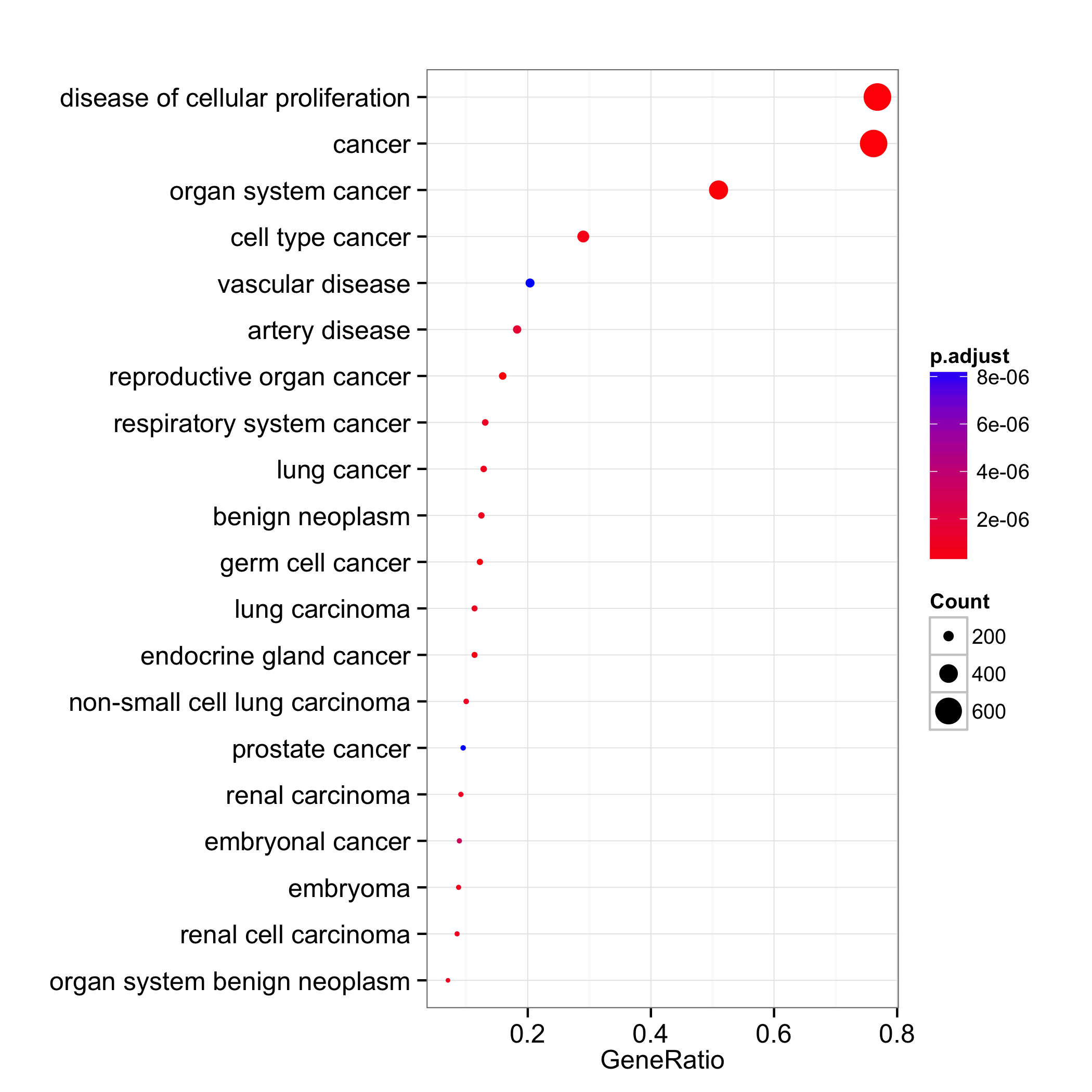
the data I got from topGO is basically a table showing top10 enriched GO tems with number of annotated genes belonging to each term in the initial gene list, the number of significant genes in the list, the number of expeced genes in the list and the p-value of fisher exact test. GO.ID Term Annotated Significant Expected classicFisher GO:0009834 plant-type secondary cell wall biogenesi... 12 12 4.53 8.10E-06 GO:0009768 photosynthesis, light harvesting in phot... 13 12 4.91 6.90E-05 GO:0018298 protein-chromophore linkage 13 12 4.91 6.90E-05 GO:0015979 photosynthesis 69 50 26.06 0.00015 GO:0052546 cell wall pectin metabolic process 14 12 5.29 0.00032 GO:0009251 glucan catabolic process 11 10 4.16 0.00042 GO:0007018 microtubule-based movement 11 10 4.16 0.00042 GO:0017144 drug metabolic process 149 81 56.28 0.0007 GO:0055085 transmembrane transport 258 126 97.46 0.0012 GO:0006073 cellular glucan metabolic process 38 24 14.35 0.00124
Well, If you need a simple plot like this, it is easily doable in R. If you send me the table I can show you a basic R script so you can do it yourself whenever you want.
the data I got from topGO which i wanna plot in a dotplot looks somrthing like this: GO.ID Term Annotated Significant Expected classicFisher GO:0009834 plant-type secondary cell wall biogenesi... 12 12 4.53 8.10E-06
GO:0009768 photosynthesis, light harvesting in phot... 13 12 4.91 6.90E-05 GO:0018298 protein-chromophore linkage 13 12 4.91 6.90E-05 GO:0015979 photosynthesis 69 50 26.06 0.00015 GO:0052546 cell wall pectin metabolic process 14 12 5.29 0.00032
Normally it would nice if I can plot the gene ratio which i think is the ratio of significant/Annotated p-value would be the classicFisher, but I m not sure what could be used for the gene count (maybe the significant ?).
Thank you for your help!
I guess the gene count is the sum of significant genes assigned to a specific GO term. I'll write a generic R script where you only need to input your tabular results. Have you tried ClusterProfile yet?
No I haven't tried it yet.
Thank you for the beautiful piece of code. I was wondering if there was a way to include BP, CC, and MF all in one dotplot graph as opposed to 3 different graphs. How would I do that?
Hey Osman, you are welcome. For that, I would generate a separate
goEnrichmenttable for each of CC, BP, and MF, and then just row-bind these (rbind()) before using in ggplot2.To use CC and MF, one just needs to change these:
Thank you so much for your quick response! I tried to include your suggestions onto the code by I get the following error "Error in rep(argl[[na]], length.out = nr) : attempt to replicate an object of type 'S4' " . Also, I want to apply this to single cell data and can't think of a way to visualize all the GOterms for each cell type in one figure. My code blew is what I currently have it is for only 1 cell type. Again, thank you so much for your help.
Hi Osman, from here, I cannot see which line of code is producing the error. Given how I have limited time each day, I therefore cannot go through this line by line trying to debug it. I suggest that you identify the line [of code] that is producing the error, learn how the particular function in question (that is, the one that's producing the error) inputs and uses data, and then work back a few steps before you identify what is causing the error.
For single cell data, I am not sure... I would be interested in seeing enrichment per cluster.
Fair enough Kevin, I understand. For the single cell data, I would like to see enrichment per cluster (cell type) also. Thats what I am trying to make a figure for.