This is a test version of Biostars. For the public version, visit https://www.biostars.org.
How to Make Dot Plots of GO Terms?

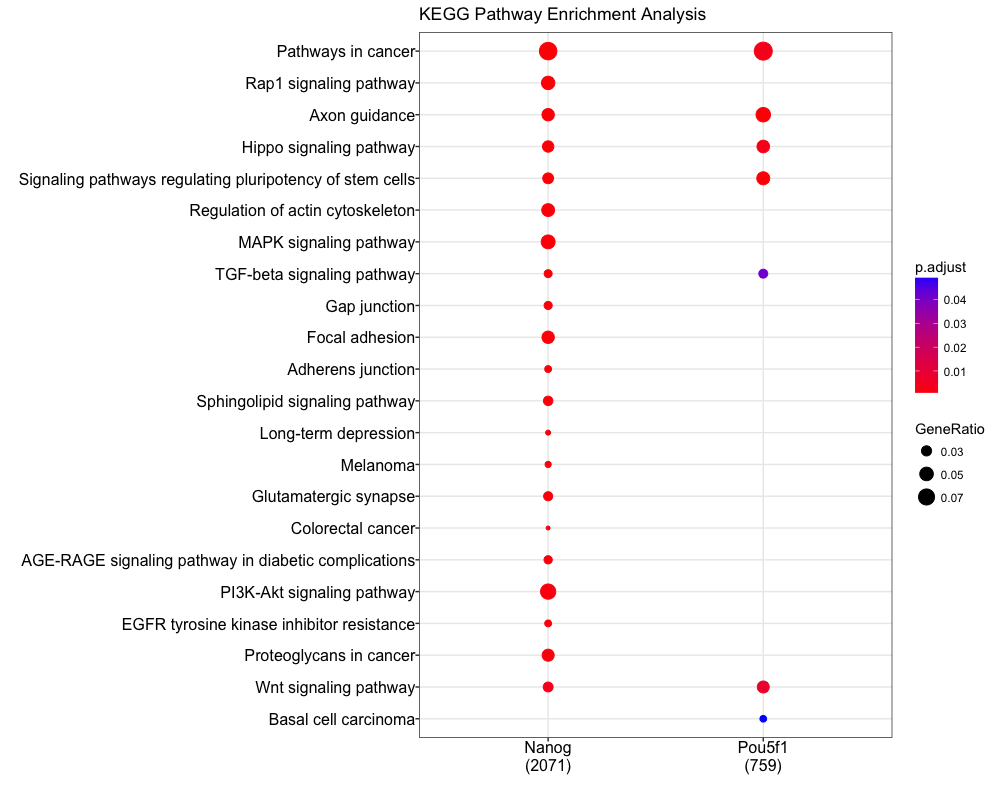
I'm looking for a way to make a dot plot like this with my own GO terms that I got using a program called HOMER. Does anyone know of any good tutorials/ have any advice on how to make a dot plot graph like the one below with your own GO terms in R? Chipseeker uses its own GO analysis to generate these plots. https://hbctraining.github.io/Intro-to-ChIPseq/img/compareCluster.png

r dot plot gene ontology

Clusterprofiler does that

2 answers

Hi,

If you have all the data with all the information that you need to make the plot, you can easily do it in R, with ggplot2.

# import package
library("ggplot2")

# create fake data
set.seed(1024) # keep reproducibility
go <- paste0("GO", sample(1000:2000, 5))
data <- data.frame("GOs" = rep(go, 2), 
                   "Condition" = rep(c("A", "B"), each = 5),
                   "GeneRatio" = 1 / sample(10, 10), 
                   "p.adjust" = 0.05 / sample(10, 10))

# plot: dot plot
ggplot(data = data, aes(x = Condition, y = GOs, 
                        color = `p.adjust`, size = GeneRatio)) + 
  geom_point() +
  scale_color_gradient(low = "red", high = "blue") +
  theme_bw() + 
  ylab("") + 
  xlab("") + 
  ggtitle("GO enrichment analysis")

In this case this fake data looks like:

      GOs Condition GeneRatio    p.adjust
   1  GO1980         A 0.1250000 0.050000000
   2  GO1213         A 0.1428571 0.025000000
   3  GO1308         A 0.1000000 0.010000000
   4  GO1396         A 0.2500000 0.006250000
   5  GO1351         A 1.0000000 0.008333333
   6  GO1980         B 0.3333333 0.007142857
   7  GO1213         B 0.1111111 0.005000000
   8  GO1308         B 0.1666667 0.016666667
   9  GO1396         B 0.2000000 0.005555556
   10 GO1351         B 0.5000000 0.012500000

And the plot like this:

enter image description here

The p.adjust usually is transformed into -log10(p.adjust) because it provides a better discrimination scale.

I can help a bit more if you provide the structure of your data.

I hope this helps,

António
Hello António, Thank you for this. The data I want to use is a table of GO terms (text file) that includes columns with the GOTermID, Enrichment, LogP, and Gene Ratio for each term.

The file looks like this in excel, but I do not have an adjusted p value column. Table of GO Terms

I have a table like this for each "condition", A or B in your example.

Hi cthangav,

You can import your data to R and then calculate the adjusted p value column there, by doing:

data <- read.table(file = "data.txt", header = TRUE) # where 'data.txt' is your table file

data$p.adjust <- p.adjust(p = data$pValue, method = "BH") # assuming that you've a 'pValue' column in your data

The code above will calculate the adjusted p-value/FDR using the Benjamini & Hochberg (1995) method. This will be added to your data frame above. Then just do the plot.

I hope this answers your question,

António

Have a look at dot plot with ggplot

To make the plot the original poster wants in ggplot2 it would be geom_point, not geom_dotplot. The bioconductor library clusterProfiler has a handy convenience function to make these plots quickly too.

I am looking for a way to make dot plot for gene onthology enrichment analysis using clusterProfiler, but my organism is rice (oryza sativa) so "DOSE" package doesn't work in my case. do you have any suggestion?

Log in to answer this question.