

Please try to post comments as comments rather than answers, as it makes conversation easier to follow. You can also always add more information to your original question by editing it. Additionally, please use the code formatting button (the one with 1's and 0's) to format code so that it's readable.
The last figure is analogous to CNVkit's scatter command. The other two will require a bit of thought and manual manipulation on your part. The first will require you to average the log2 ratio at each bin for all your samples, then it's basically just a bar plot split by chromosomes. The second will require you to have gain/loss at each bin for each sample and simply calculate the percentage of each for each bin. Both of those plots, maybe minus the annotation bar at the bottom, could be easily done in ggplot2. The karyotype addition at the bottom is something you'd have to figure out on your own.
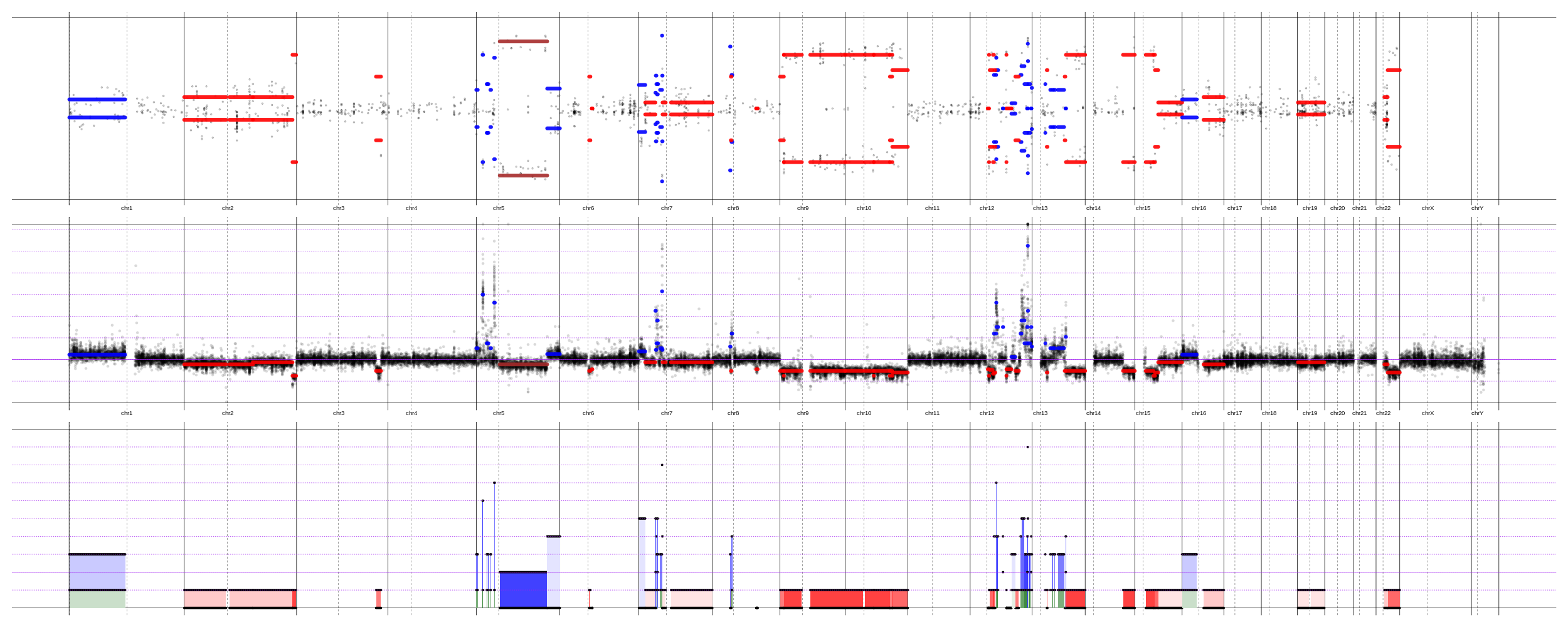 , but have to admit - it is easier and faster to run FACETS. And it works quite good.