Yes, sure it is for that! Thanks for your answer was perfectly clear!
• 0 views
•
link
Hi everyone,
I post today to ask for help in order to use ggplot2 package, but first the fundamental question:
Is possible to join in one plot multiple trendlines of different datasets?
The reason of this question is because I need to visualize in the same plot, the ratio of reads between 3 chipseq samples and 1 input using a trendline for each sample in a big intronic region. So far I've tried to do this with GenomeGraph R package but it was confusing for me to get this plot.
So I decided to do it with ggplot2 package. The input is a file that have almost 300 bins of this big intron and for each bin the number of reads of each sample:
iD          pol.t0   pol.t5  pol.t60  input
Intron279    11    10    5    17
Intron278    10    24    20    30
Intron277    17    58    20    41
Intron276    5    29    9    38
Intron275    5    16    6    29
Intron274    4    14    10    28
Intron273    11    33    17    28
Intron272    11    40    15    36
Intron271    8    18    4    36
Intron270    7    24    5    32
And this is my Rscript to plot the final trends in a separate plot each:
library(ggplot2)

t<-read.table("BigIntron_reordered.bed")

## Ratio Calculation
t2<-data.frame(t[,1],  (t[,2]/t[,5]), (t[,3]/t[,5]), (t[,4]/t[,5]))
colnames(t2)<-c("iD","pol.t0","pol.t5","pol.t60")

## No lose initial order of iDs
t2$iD<-factor(t2$iD, levels=unique(as.character(t2$iD)) )

## Plot trendlines for each sample
p1<-ggplot(t2[t2$pol.t0 != "Inf" & t2$pol.t0 != "NaN",], aes(x=iD, y=pol.t0)) + stat_smooth(method="loess",aes(group=1),size=2)
p2<-ggplot(t2[t2$pol.t0 != "Inf" & t2$pol.t0 != "NaN",], aes(x=iD, y=pol.t5)) + stat_smooth(method="loess",aes(group=1),size=2)
p3<-ggplot(t2[t2$pol.t0 != "Inf" & t2$pol.t0 != "NaN",], aes(x=iD, y=pol.t60)) + stat_smooth(method="loess",aes(group=1),size=2)

## Grid plot of everything together
grid.arrange(p1, p2, p3, nrow=3)
The final result is:

So is possible to join this trend lines all together in one plot?
Thanks for your help!!
Try the following - it's not quite what you wanted (intron label on the x-axis is lost), but it's all three curves in one plot)
First transform the dataframe:
require(reshape)
t2.1 <- melt(t2, id = "iD", variable_name = "series")
t2.1$iD <- rep(1:10,3) #Apparently the subsequent qplot() function does not like the characters in the iD column
Then plot it:
ggplot(t2.1, aes(iD, value)) + geom_smooth(method="loess", aes(colour = series))
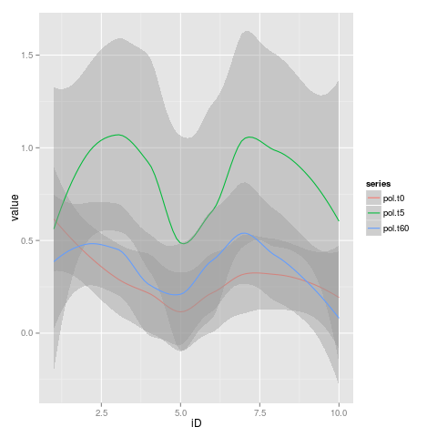
Self-Edit: Comment: I just used the lines of data provided in your question, I suppose that explains the different shapes of the curves?
Yes, sure it is for that! Thanks for your answer was perfectly clear!
Log in to answer this question.