thanks a lot, that looks exactly like what I need!
• 0 views
•
link
Hello everyone, I know there are already many posts about this but I'm quite new to R and I'm struggling to find which could be the best way to address my issue. I'm building an image, with R, with different chromosomes track of a non human genome, and I need to add, for each chromosome, a track with a heatmap relative to the GC percentage. I have a bed file with the GC percentage every 1000 bp on a zero to 1 scale (made with bedtools nuc); I want assign a color for the minimum , a color for the maximum and create a heatmap like this to highlight variation in the GC content across the chromosome. Does anyone have suggestions about the best function to use? Basically I need to reproduce in R something like the heatmap reported at the bottom of this link, relative to IGV
https://wiki.bits.vib.be/index.php/Create_a_GC_content_track
Thanks a lot, any suggestion is appreciated
Hi Charles G,
You could use the Bioconductor package karyoploteR for this. It has a function (kpHeatmap) for plots like this.
In this example I'm just using random numbers, but you can read the bed file with
gc.cont <- toGRanges("my_bed_file.bed")
To plot it you need to call plotKaryotype and specify your genome (karyoploteR can work with any other genome, including custom ones) and what part of the genome you want to plot, in this case the whole chromosome 1. After that, you'll have an empty genome plot where you can add new data, for example with kpHeatmap.
kp <- plotKaryotype(genome = "hg19", chromosomes = "chr1")
kpHeatmap(kp,data=gc.cont, y=gc.cont$gc, col=c("blue", "white", "red"))
and you'd get something like this

However, with a bit more tweaking or using other plotting functions you can represent the same values in other ways
 kp <- plotKaryotype(genome = "hg19", chromosomes="chr1", main="GC content in Chromosome 1")

  kpAddLabels(kp, labels = "Combined", r0=autotrack(1,4), label.margin = 0.04)
  kpAxis(kp, r0=autotrack(1,4), cex=0.8)
  kpBars(kp,data=gc.cont, y0=0.5, y1 = gc.cont$gc, r0=autotrack(1,4), col=colByValue(gc.cont$gc, colors = c("blue", "white", "red")), border=NA)

  kpAddLabels(kp, labels = "Heatmap", r0=autotrack(2,4), label.margin = 0.04)
  kpHeatmap(kp,data=gc.cont, y=gc.cont$gc, col=c("blue", "white", "red"),r0=autotrack(2,4))

  kpAddLabels(kp, labels = "Bars", r0=autotrack(3,4), label.margin = 0.04)
  kpAxis(kp, r0=autotrack(3,4), cex=0.8)
  kpBars(kp,data=gc.cont, y0=0, y1 = gc.cont$gc, r0=autotrack(3,4), col="blue", border=NA)

  kpAddLabels(kp, labels = "Line", r0=autotrack(4,4), label.margin = 0.04)
  kpAxis(kp, r0=autotrack(4,4), cex=0.8)
  kpLines(kp,data=gc.cont, y=gc.cont$gc, r0=autotrack(4,4))
and get an image like this one
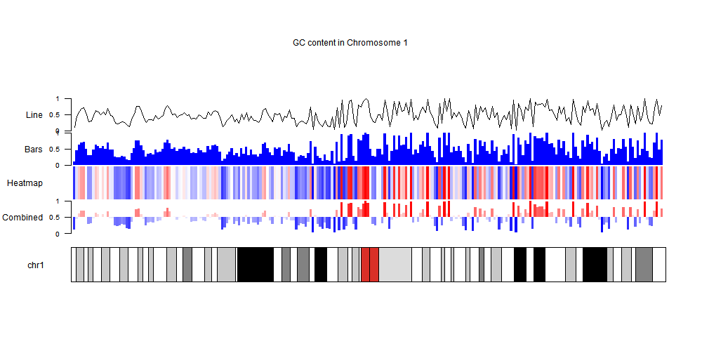
You can get more information on how to the package in the karyoploteR tutorial and the complete code for this answer on github.
thanks a lot, that looks exactly like what I need!
Hi @bernatgel, thanks again for sharing this very interesting package. Is it possible to "personalize" the assignment of the colors to specific numeric intervals decided by the user with this specific heatmap function? I don't find it in the tutorial. Thanks again!
Hi,
It's not currently possible to assign different colors to different values. Internally it uses colorRamp to interpolate between the given colors so the options are limited. You can, however, influence the color assignment by specifying the colors. For example, if instead of c("blue", white", "red") you give it c("blue", "white", "white", "red") you'll get a gradient with a larger white zone in the middle. But it's not possible to specify certain colors for certain values.
Ok I see thank you very much!
Log in to answer this question.
You can try Gviz or ggbio which both allow heatmaps over genomic positions. The case could be made for using a circos plot for this too, with the circlize library.
thank you very much