Hi Hamid Thanks this is for one column vs one row data. I do not know how to do it for 64 genes (rows) vs 88 patients (columns). I want patients is x axis and genes in y axis.
Hi friends I plotted this box-wisker for TCGA HTSeq data in R. I want to have harf of them as red and half as blue (control vs treatment groups). or is there any better way for boxplot? How can I do that? I just used simple code:
data <- read.table("mydata.csv", header=TRUE, row.names = 1)
library(DESeq2)
mat <- as.matrix(data)
log <- rlog(mat)
boxplot(log)
my plot: https://ibb.co/xXsHtC0
1 answer
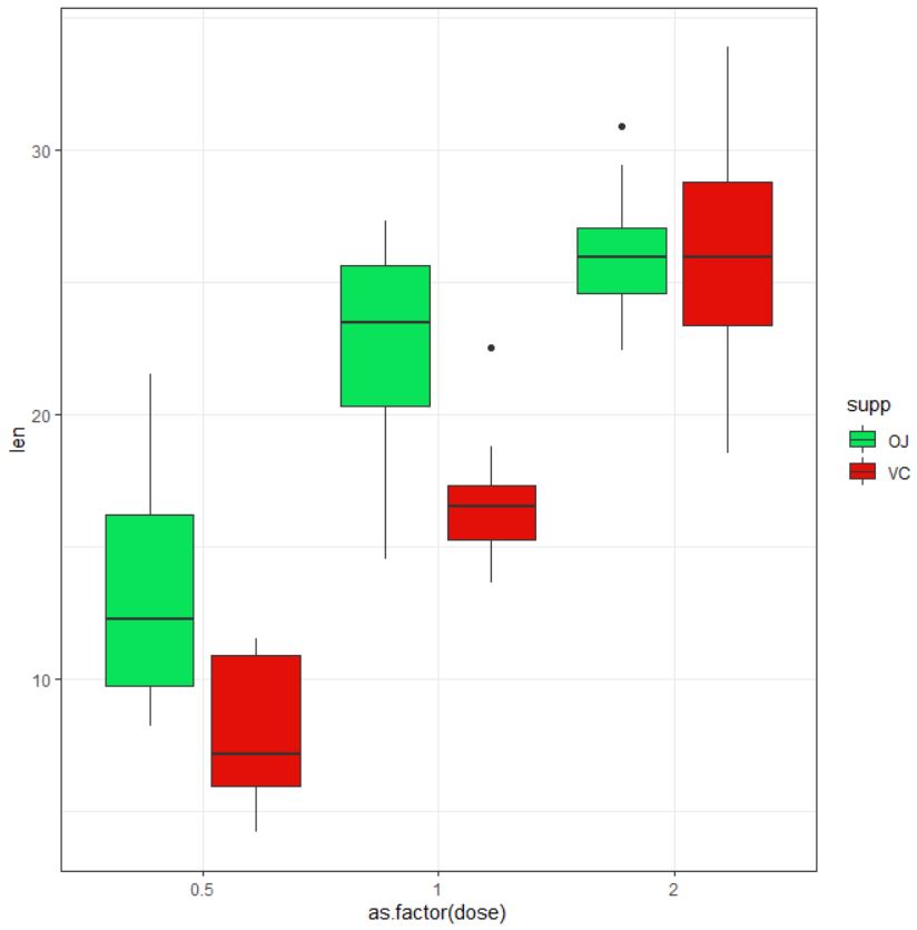
maybe this one? A dodged box plot?
I used "ToothGrowth" public data for this demonstration:
data("ToothGrowth")
library(ggplot2)
ggplot(ToothGrowth, aes(x = as.factor(dose), y = len)) +
geom_boxplot(aes(fill = supp), position = position_dodge(0.9)) +
scale_fill_manual(values = c("#09E359", "#E31009")) +
theme_bw()
Also, a dogged violin plot would be a very informative way to present expression data. Personally, I would rather use a split violin plot for expression data when I have many cases to be plotted. The codes for creating a split violin plot in python can be found on my GitHub, which I used to plot top DE genes from RNA-seq.
Ok then you need to use melt function from the reshape package to make a data frame with columns:
patient_id, pateint_group, expression_value, gene_name.
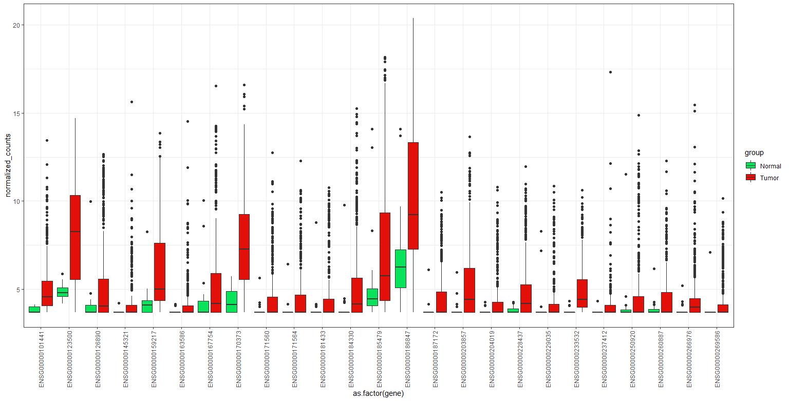
You may go through this (under section "Top 25 dysregulated gene") to see an example of how to create such dataframe out of a matrix with normalized gene count. Once created the dataframe, use this to make a paired(dogged) box plot. You can download the dataset I used for this example from here.
ggplot(dat, aes(x = as.factor(gene), y = normalized_counts)) +
geom_boxplot(aes(fill = group), position = position_dodge(0.9)) +
scale_fill_manual(values = c("#09E359", "#E31009")) +
theme_bw() +
theme(axis.text.x = element_text(angle = 90, vjust = 0.5, hjust=1))

Also you may want to try this:
ggplot(dat, aes(x = as.factor(gene), y = normalized_counts)) +
geom_boxplot(aes(fill = group), position = position_dodge(0.9)) +
facet_wrap(~ gene, scales = "free") +
scale_fill_manual(values = c("#09E359", "#E31009")) +
theme_bw()
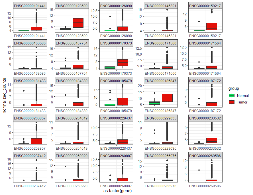
to make this plot:

Thank you Hamid. these are really informative. I dobnot see any RNA seq expression values in this dataset you used. it is just patient names and gene list. Is there any way to plot this for significant gene expression? I want to compare expression level in patients. I want each plot to have expression data for one patient.
The third column has "normalized_counts" which is coming from the RNA-seq experiment. Since they are not log-2 or z-score transformed data, the variation in expression plots is very significant. If you want to do a similar task, do the transformation, and then go for plotting. These data are from the top 25 DE genes list.
I want each plot to have expression data for one patient.
I am not sure about what you are going to do, but plotting data from a patient (only one ) for a gene (only one gene) won't be informative. Also plotting data from a patient for different genes in a plot! again won't be interesting.
Sorry I dont understand how the input data here is look like. I am not sure if my data format is appropriate for the code. patients in columns vs genes in rows( I know I should normalize and log2 transform). the problem is the appearance of my data and how can I have all the patients in x axis and genes in y axis. Also, how can I seperate these patiebts in two groups (treatment and control ) and show them with red and blue. my data looks like this:
Gene TCGA-DV-A4W0 TCGA-B0-5812 TCGA-CZ-4858 TCGA-CZ-5985 TCGA-B0-5706 TCGA-CW-5590 TCGA-CJ-5671 TCGA-BP-5180 TCGA-BP-4992 TCGA-BP-4167 TCGA-CJ-4901 TCGA-BP-4334
ENSG00000136546 4 11 8 1 0 3 1 2 1 2 13 0
ENSG00000115507 1 26 18 14 2 6 2 0 4 2 2 0
ENSG00000163207 0 0 0 0 0 1 0 4 3 3 0 0
ENSG00000123560 2 1 8 4 0 2 6 6 10 8 9 4
ENSG00000178462 0 2 0 1 0 1 1 1 51 18 3 0
ENSG00000071991 1 1 4 0 0 9 1 0 27 3 1 2
ENSG00000177354 0 0 0 0 1 1 0 0 1 1 0 152
ENSG00000081051 42 7 2 40 2 18 10 12 5 23 8 13
ENSG00000178919 1 0 5 0 0 4 0 1 0 0 1 0
ENSG00000144227 0 3 0 0 0 0 2 0 0 0 4 0
ENSG00000186910 0 0 4 0 0 0 0 2 0 0 1 1
ENSG00000043355 13 5 434 7 0 2 6 1 8 3 6 0
ENSG00000164756 0 0 0 1 0 5 1 1 43 0 2 0
ENSG00000140557 21 1 1 0 0 10 12 0 7 0 5 2
ENSG00000163825 0 1 1 5 0 0 0 2 2 4 0 0
ENSG00000131771 1 6 1 1 0 5 0 2 5 0 1 2
ENSG00000148965 0 0 0 175 0 0 1 4 3 4 8 0
ENSG00000138675 9 0 1 0 0 39 15 2 0 35 19 1
ENSG00000129654 2 16 0 0 0 27 0 0 10 4 11 4
ENSG00000172548 35 17 10 5 7 20 26 4 6 9 6 13
ENSG00000124143 3 4 3 3 0 1 0 1 32 3 28 2
ENSG00000102239 0 1 2 8 0 932 0 11 6 5 7 2
ENSG00000184905 1 31 4 1 3 6 3 1 2 2 3 5
ENSG00000148735 7 5 294 23 2 12 4 1 24 14 12 5
ENSG00000185290 0 2 1 0 0 1 2 0 1 0 1 2
ENSG00000047936 0 6 67 0 0 10 10 1 4 2 7 0
ENSG00000169213 2 10 10 12 15 4 75 11 20 118 50 77
ENSG00000083307 4 38 10 2 0 28 1 0 6 4 12 1005
ENSG00000130294 251 9 8 0 0 2 5 0 6 0 10 1
ENSG00000137648 5 274 92 3 7 17 1 4 17 14 5 747
ENSG00000162951 0 0 0 0 0 0 0 0 0 2 0 2679
ENSG00000187288 6 5 0 51 1 18 31 19 402 381 16 0
ENSG00000268964 4 1 2 274 0 2 0 0 8 0 8 3
ENSG00000010438 1 1 0 1 1 4 6 0 1 182 7 33
ENSG00000261701 1 1 3 5 0 0 1 7 8 4 4 0
ENSG00000115616 64 71 5 40 6 20 2 0 21 0 5 880
ENSG00000124882 65 21 39 6 5 2 3 10 26 0 31 3
ENSG00000072041 0 2 254 0 0 16 9 0 4 0 1 1
ENSG00000255071 4 0 0 1498 0 1 0 0 15 65 27 0
Assumed your data is a data frame namely dat , this code should work to melt your data:
melt.dat <-data.frame(reshape::melt(dat, id.vars = "Gene"))
You can find inofrmation about your patient from where you downloaded this data. The TCGA is well-documneted and it would be easy for you to find clinical data.
Thanks
I dont know why I get error:
data <- read.table ("data.txt",check.name = FALSE, row.names =1, header = T)
dat <- as.data.frame(data)
melt.dat <-data.frame(reshape::melt(dat, id.vars = "Gene"))
Error: id variables not found in data: Gene
Because you have not a column with "Gene" name. Indeed I used this label because in the table you provided, the first column is "Gene". Anyway, change this label to the column name of the gene column name. This should work. Also as a tip:
Error: id variables not found in data: Gene
Clearly stated that you have no "Gene" column. Reading errors will save lots of time
Thanks Hamid
I've tried plotting this and it works very well. However I have a question: If you had 200 genes that you would like to compare between the two groups (which is too much to visualise on a plot), how can you get the values that tells you if one group has a significantly differing median than the other group? When you have fewer genes, you can just manually look at if the notches don't overlap between the two groups. And also how to find which of the group that has the higher expression value compared to the other group when not looking at the plot? I'm new in R, sorry if this is a basic question.
Please post this as a separate question, I'm sure people will be happy to help, but hijacking this post is not the way to go about this.
Log in to answer this question.