Hi community!!! I am generating stacked barplots from mothur output data by phyloseq package. I have got around 60 genus (abundance >1%). I don't know how can I color all of them, because it requires 60 colors. And, it's very hard to differentiate between the colors in naked eye. Any suggestion from your side?
Thanks and regards, DC7
1 answer
Hi,
Theoretically you can plot 60 colors, but the figure will be unreadable. I mean you will not be able to identify most of the genera in the stack plot, because among the 60 colors it will be quite hard to distinguish between most of them. I would say that starts to be hard to distinguish more than 10 colors in a bar plot or any plot.
So, in this case what I recommend is to plot the 10/20 most abundant genera. Please have a look at the official documentation of phyloseq to see how to plot only the top n taxa: http://joey711.github.io/phyloseq/plot_bar-examples
I hope this helps,
António
Log in to answer this question.
well, if you are not hung upon barplot, you can plot dot plot where x axis would be samples and y-axis would be genera. Size of the dot can be reads/counts supporting genera. 60 genera image would be a large file. Example image would be like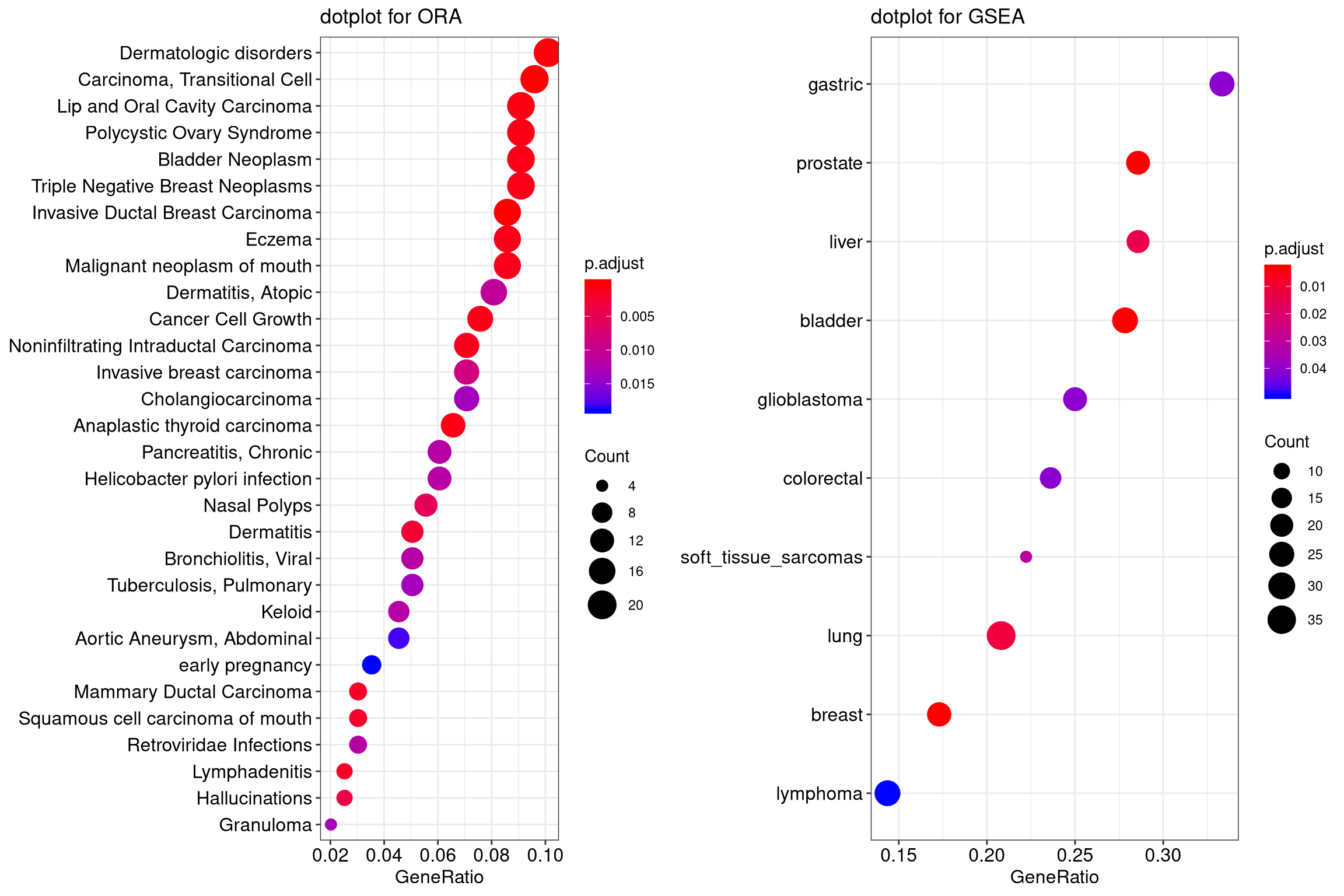
Instead of gene ratio, image will have sample names. Instead of disorders, image will have genera. You can accommodate both counts and p-value if any, within the plot.