how to adjust the value interval of axis of the bar chart created via barplot in R
hello there,
Since the values of different groups in my dataset are quite different (some are reaching hundred times larger than others), I'd like to creat a bar chart that could beautifully plot and display all data points with bars of similar height/length, for which uneven value interval in the axis should be set.
Right now I'm using barplot package, yet don't know which parameter I should specify to meet my goal. Or is there any other easier-manipulating packge able to be used in R? Welcome any suggestion.
Many thanks in advance.
• 189 views
•
link
0 answers
No answers yet.
Log in to answer this question.
Have you tried a line of R code yet? I.e. are you generating a bar plot that doesn't look like you envisioned it or are you generally asking how to obtain any barplot in R?
Hallo, yes, I've tried to build the barchart wiz 'barplot' package and the code I used is as below
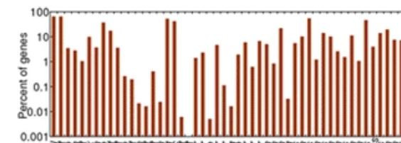
and consequently I got certain graph like this
and what do you not like about that plot?
Please post some example data.. For the graph, probably facet grid from ggplot may help you. Facet by group and use free scales