brilliant thank you very much!
• 0 views
•
link
I have single nucleotide variant calls in .txt format from individuals from a variety of species. For each sample I have a .txt file with a list of positions in the following format
contig start end reference_allele alternative_allele
chr1 34 35 A T
chr9 667 668 G C
For each species also have the reference fasta files genome.fa and genome .fa.fai which gives the coordinates for the chromosomes or contigs used for mapping.
I would like to visualise the distribution of variants along the genome for each sample to do a sanity check for how variants are distributed across the genome, I think rainfall plots would be ideal for this. It would be even better if each of the mutation types had its own colour to see whether there are any patterns there. But I am not familiar with a tool that can do this that is agnostic about the reference genome/is flexible to input from different species fasta files for the X axis coordinates.
I am particularly concerned about whether there are more mutations than expected falling in the shorter contigs that could be due to mapping issues in these regions. For this I was thinking of plotting contig size on the X axis and number of variants mapped to that contig on the Y axis. This should highlight any trend towards more variants than expected falling in shorter contigs. This is probably trivial to code but I was more wondering about the general visualisation of variants along the genome in the previous paragraph. I have come across visualisation tools that work well for the human genome but was wondering if there were any packages available suitable for this task when you are dealing with multiple assemblies, sometimes where there are thousands of contigs and so the standard plotting of 23 chromosomes will not work.
Thanks in advance for any suggestions.
Hi Rubai,
You can use karyoploteR to create your rainfall plots with any species, as long as you have the length of the contigs/chromosomes.
You can find a little tutorial on how to create rainfall plots in the karyoploteR tutorial
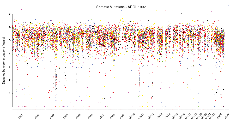
This is with human data, but you can use any genome or scaffold using custom genomes (basically, you need a bed-like file with the length of the chromosomes/contigs).
The plot is customizable and you can change pretty much everything, from the color schema to the size and shape of the dots or the axis scales and labels. You cal also combine it with other data you might have. For example, in the tutorial, there's a plot that combines a rainfall plot with the density of variants over the genome.
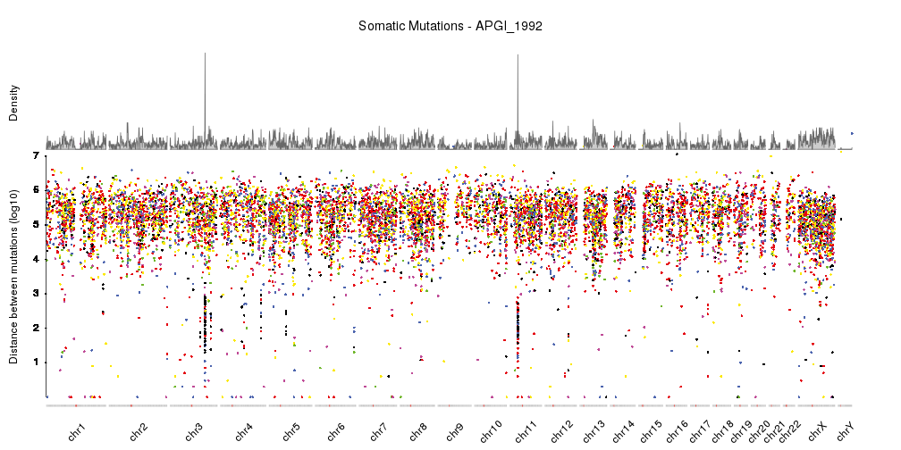
Hope this helps. If you have any problems with creating these plots or loading the data, feel free to ask.
brilliant thank you very much!
Log in to answer this question.