Hi,
I'm trying to understand profile plots for motifs. Homer has a function annotatePeaks.pl) to generate motif density profiles that looks like following (lifted from here)
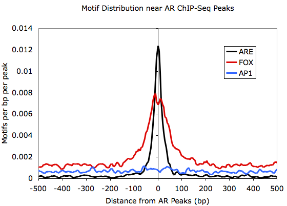
While I understand what these profile plots convey for ChIP-seq data (e.g. those generated by deepTools plotProfile), but I'm not sure what exactly is the y-axis in above plot.
So the question is, is it just the probability of finding given motif at each position (as MEME does here) in a set of given sequences or is it the actual count normalized to something?
I didn't find any explanation on homer website. It would be great if anyone can explain what exactly is going on in above plot.
Thank you.
1 answer
For future googlers, here is the response from lead author of HOMER, Chris Benner
The motif plots are normalized by taking the actual motif totals, then normalizing by the bin size used in the histogram (so that the motif densities are comparable across different bin sizes) and the total number of peaks/regions used to create the histogram (so that the motif densities are independent of the number of regions used to search).
Log in to answer this question.
Convert a BED file of motif positions to a bigWig with a 1 where there's a motif and a 0 otherwise and it's the same thing you'd then get with
plotProfileI think.I created a bigiwg ( using bedtools genomecov + kent utils) and plotted with plotProfile. The motif I'm interested in is has very sparse hits, applying loess fit on plotProfile output data is more/less looking closer to the above plot. I think I understood what's happening inside.