Entering edit mode

5.9 years ago
David_emir
▴
490
Hi All,
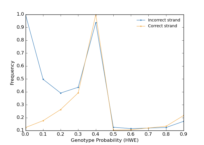
I am planning to detect possible strand issues by checking genotype frequencies against population allele frequencies. for this, I am using Plugin af-dist from BCFtools.
I am following all the steps as mentioned in manual HERE. But, I am not able to plot The genotype frequency distribution, in this case, the data is
PROB_DIST   0.000000    0.100000    100618
PROB_DIST   0.100000    0.200000    144103
PROB_DIST   0.200000    0.300000    214923
PROB_DIST   0.300000    0.400000    320721
PROB_DIST   0.400000    0.500000    817965
PROB_DIST   0.500000    0.600000    84027
PROB_DIST   0.600000    0.700000    86531
PROB_DIST   0.700000    0.800000    97986
PROB_DIST   0.800000    0.900000    108776
PROB_DIST   0.900000    1.000000    176755
please help me in plotting this, I am looking to plot something like This
Thanks a lot for your help
Have a great day,
Dave!


Please provide headers to your columns for others to understand
Please select a more meaningful title for your question.
In addition, see How to add images to a Biostars post