Anyone knows how to create a figure like this?

Horizontal axis indicate features on chromosomes. Y axis displays multiple chromosomes.
Thank you!
Best wishes,
Alexie Li
• 3,963 views
•
link
2 answers
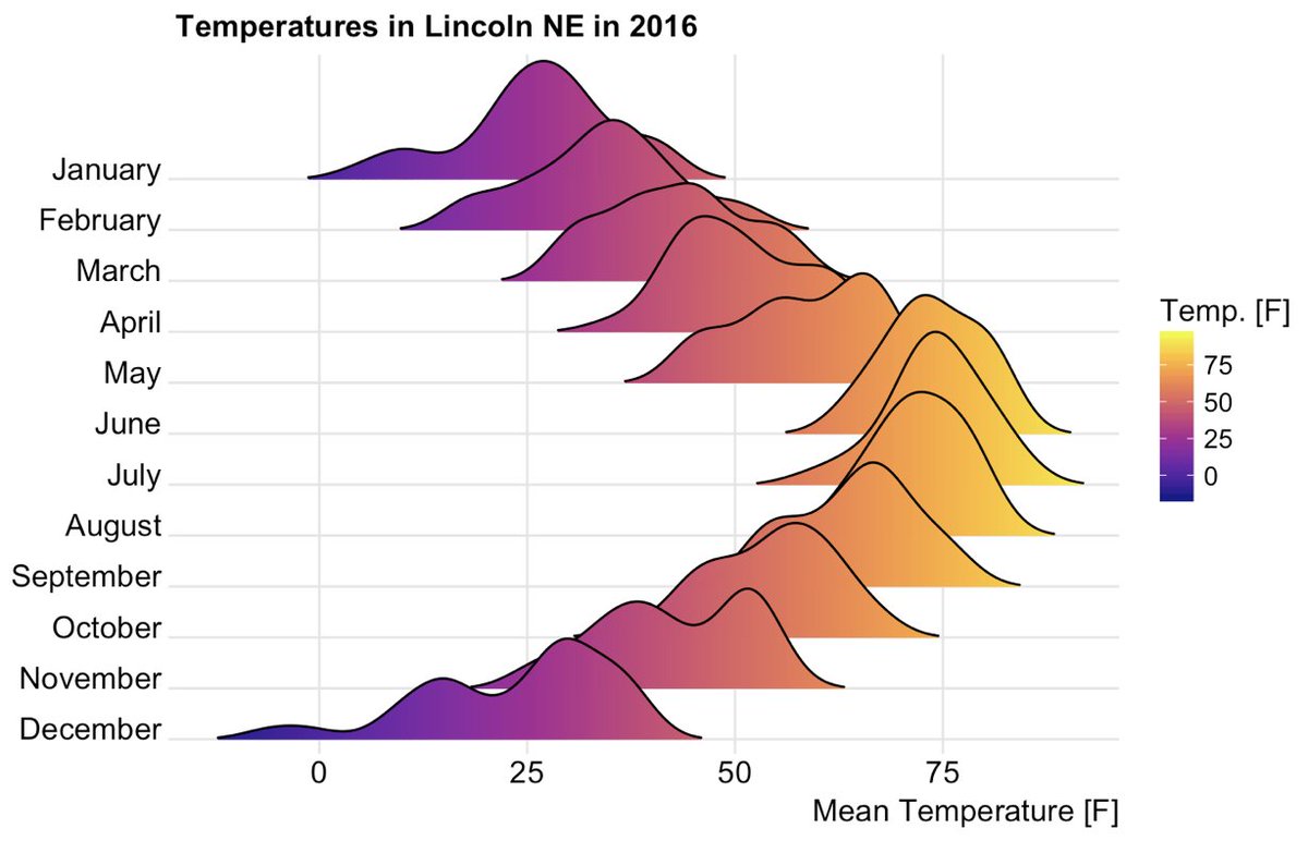
It wouldn't be the same, but you can make a similar plot with ggridges R package: https://cran.r-project.org/web/packages/ggridges/vignettes/introduction.html
One example:
• 0 views
•
link
Looks similar to a waterfall plot to me, but with more discrete data.

You can make nice 3d plots like this with plot_ly in R.
Its not totally clear to me what the Z axis is counts of, but it should be easy enough to plot.
• 0 views
•
link
Log in to answer this question.
Check this post from a few hours ago, providing a lot of links to previous posts on this.
EDIT: Never mind, a mod has edited your post and made the necessary changes. Please be aware of this procedure for future posts. Thank you!
Your image is not embedded properly. Please follow the steps below to correct this:
Click on the image option on the biostar edit toolbar (highlighted in red below), and paste the copied URL in the dialog box.
Thank you for the modification.
It's not a 2D plot, it's 3D. Maybe try plots allowing 3 axes including categorical data?
EDIT: nevermind, I see that a link was added above by ATpoint. We really need a way to promote in-line replies as the answer.
@ATPoint is only referring to a thread from earlier today which has several relevant links already posted.
If such replies answer the question, they can always be moved to an answer by a moderator.
Of course, but it seems this seldom happens. I'm guessing it's b/c doing so requires the submitter to request this of a moderator?
Once you have >200 rep (I think), you can moderate your own posts, including moving comments to answers etc.
Chris Fields : Mods keep a close watch but would be happy to know of any candidates that we may miss. You are welcome to join the biostar slack channel biostar.slack.com) and post those links in
#generalchannel.This is more of a comment, than an answer, but jrj.healey's answer is perhaps a better match than a typical "joy plot", as it renders the z-axis at an angle. However, another option that may be less confusing is a 2D heatmap. It doesn't rely on your audience guessing at the y-axis or "height" of the datapoint, which already has an ambiguous x-axis position, by shifting the z-axis off-center.
A 2D heatmap gives you a strict grid of chromosome rows, genomic position columns, and cells are colored from low to high saturation based on some normalized numerical scale (your example plot's antisense/sense ratio). A 2D heatmap may be less visually exciting than a modified joy-plot, but it will also be less ambiguous in terms of interpretation.
If this is from the publication, please provide the link to the paper, so we can see the context, then maybe we could suggest a better visualisation. At the moment, it looks like there is no need to make the y-axis tilted.