Thanks, I thought the same thing before posting my question. But I wonder that do you know how to create a column for CHR using my example data (for + facet_wrap(~CHR) usage ) ? Thank you.
How can I stack several manhattan plots in the same plot looks like this https://imgur.com/a/pj40c using R?
That plot is made using excel and not follow their real map position.
In my case I have 4 p-values from 4 different phenotypes. They are estimated from same SNPs. I want to stack them in the same plot but distinguish phenotypes by different colors.
# Input data format, example.
SNP CHR POS pval_1 pval_2 pval_3 pval_4
a 1 100 0.1 0.5 0.2 0.1
b 2 110 0.2 0.6 0.3 0.5
c 3 120 0.3 0.7 0.1 0.6
d 4 130 0.4 0.1 0.4 0.2
qqman is a very useful R package, unfortunately it is only allowed for single trait.
3 answers
With a bit of customization you could do it in R with ggplot:
library(dplyr)
library(ggplot2)
tmp <- data_frame(
POS=seq(1,10000),
pval1=1/runif(n = 10000, min=0, max=0.2),
pval2=1/c(runif(n = 9999, min=0, max=0.2), 1e-5),
pval3=1/runif(n = 10000, min=0, max=0.3),
pval4=1/runif(n = 10000, min=0, max=0.4))
tmp.tidy <- tmp %>% gather(key, value, -POS)
ggplot(tmp.tidy, aes(POS, value, color=key)) +
geom_point()
Example:
Use the + facet_wrap(~CHR) to create a graph per chromosome.
Using the facet_wrap you'll split your graph in as many chromosome as you have:
library(dplyr)
library(ggplot2)
tmp <- data_frame(
CHR=paste0("chr", sample(1:10, 1000, replace=T)),
POS=seq(1,1000),
pval1=1/runif(n = 1000, min=0, max=0.2),
pval2=1/c(runif(n = 999, min=0, max=0.2), 1e-5),
pval3=1/runif(n = 1000, min=0, max=0.3),
pval4=1/runif(n = 1000, min=0, max=0.4))
tmp.tidy <- tmp %>% gather(key, value, -POS, -CHR)
ggplot(tmp.tidy, aes(POS, value, color=key)) +
geom_point() + facet_wrap(~CHR, nrow=1)
With the facet_wrap() by chromosome:
You can now do it with karyoploteR.
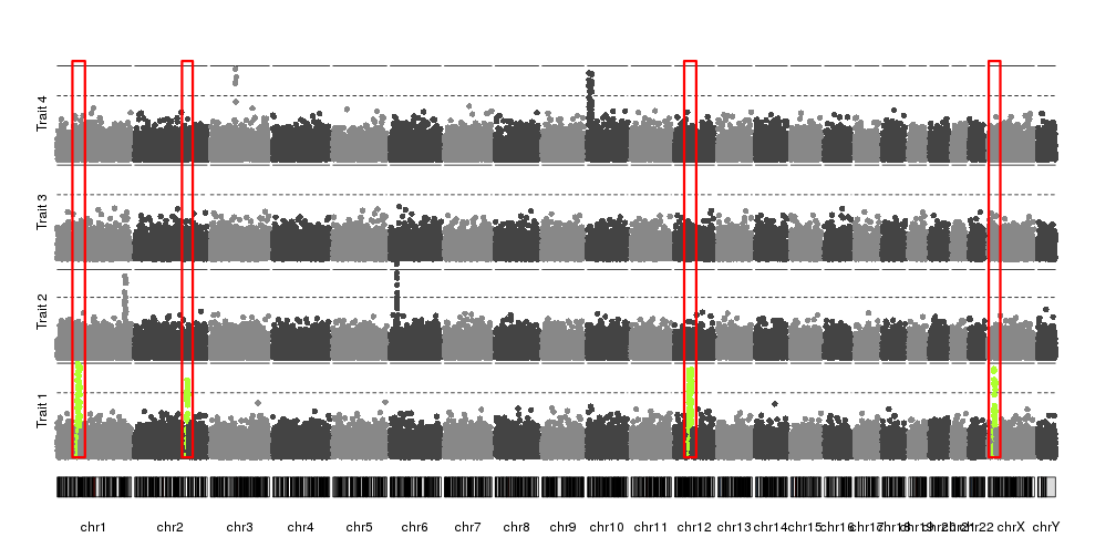
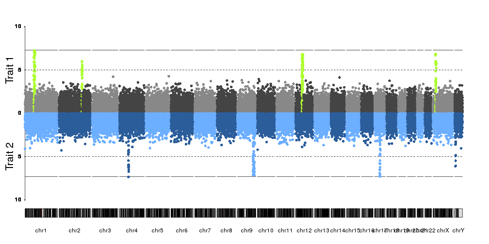
In the karyoploteR tutorial there's a specific page on how to create manhattan plots and it has different plots combining multiple manhattans in a single plot, but none of them is by overlaying them as you ask. To do that you would simply need to call kpPlotManhattan multiple times with different datasets and that would be it.
kp <- plotKaryotype(plot.type=4)
kpPlotManhattan(kp, data1, points.col="red")
kpPlotManhattan(kp, data2, points.col="blue")
kpPlotManhattan(kp, data3, points.col="black")
These are other example plots combining multiple manhattan plots.


CMplot R package. Very easy to use and plot multiple Manhattan plots!
See link: https://github.com/YinLiLin/CMplot
How can I plot several manhattan plots with different thresholds in a same plot? any help would be appreciated
Log in to answer this question.