Mirror Manhattan Plot
Does anyone know how to adapt the qqman Manhattan plot (or other function) to create a mirror image Manhattan plot as seen here (i.e. reverse the axis on the bottom plot): https://www.researchgate.net/figure/284888365_fig2_Fig-2-Manhattan-plot-of-the-Burmese-head-deformity-GWAS-and-SNPs-genotypes-within
• 10,169 views
•
link
3 answers
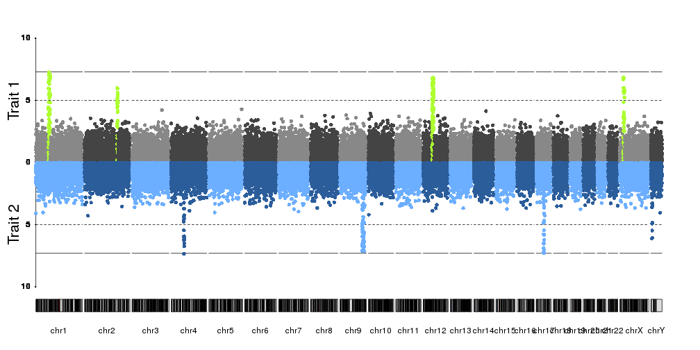
To plot mirrored manhattan plots you can use kpPlotManhattan from the karyoploteR Bioconductor package.
kp <- plotKaryotype(plot.type=4)
kpAddLabels(kp, labels = "Trait 1", srt=90, pos=3, r0=0.5, r1=1, cex=1.8, label.margin = 0.025)
kpAxis(kp, ymin=0, ymax=10, r0=0.5)
kp <- kpPlotManhattan(kp, data=ds$snps, highlight = ds$peaks, r0=0.5, r1=1, ymax=10)
kpAddLabels(kp, labels = "Trait 2", srt=90, pos=3, r0=0, r1=0.5, cex=1.8, label.margin = 0.025)
kpAxis(kp, ymin=0, ymax=10, r0=0.5, r1=0, tick.pos = c(5,10))
kp <- kpPlotManhattan(kp, data=createDataset()$snps, r0=0.5, r1=0, ymax=10, points.col = "2blues")
• 0 views
•
link
Hi,
You could do something similar to this
library(qqman)
par(mfrow=c(2,1))
par(mar=c(0,5,3,3))
manhattan(gwasResults,ylim=c(0,10),cex=2.2,cex.lab=2.5,font.lab=2,font.axis=2,cex.axis=1.6,las=2,font=4)
par(mar=c(5,5,3,3))
manhattan(gwasResults,ylim=c(10,0),cex=2.2,cex.lab=2.5,font.lab=2,font.axis=2,cex.axis=1.6,las=2,font=4,xlab="",xaxt="n")
dev.off()

• 0 views
•
link
You can try a ggplot-tidyverse solution based on ggfastman.
library(tidyverse)
library(ggfastman)
data("gwas_data")
gwas_data %>%
  mutate( gr= "Study 1") %>%
  mutate(pvalue=log10(pvalue)) %>%
  # rbind a second study with pvalues with other sign.
  bind_rows(., mutate(., gr= "Study 2",
                      pvalue = -pvalue)) %>%
  # plot the points
  fast_manhattan(., build = "hg18", speed = "fast",log10p = F, dodge_x = T,pointsize = 2.1, pixels = c(1000,500)) +
  # add significance line
  geom_hline(data= . %>% group_by(gr) %>% slice(1), aes(yintercept = ifelse(pvalue>0, -log10(5e-08),log10(5e-08))),color ="deeppink") +
  coord_flip()+
  scale_y_continuous(expression(-log[10](italic(p))),breaks= seq(-90,80,10), labels = abs(seq(-90,80,10)), expand = c(0.01, 0))+
  facet_wrap(~gr, scales = "free_x")+
  ggplot2::guides(y = guide_axis(n.dodge = 2), x = guide_axis())+
  theme_bw()

• 0 views
•
link
Log in to answer this question.
Did you try to invert the ylim option. Intead of c(0,10) for example, try c(10,0).
They are called Miami plot. (Because of the reflection of buildings on Miami biscayne bay)
Related SO post: