the link to your script was not valid anymore
• 0 views
•
link
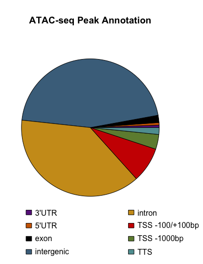
I am interested in creating a Pie charts of ChIP-Seq reads corresponding to annotated regions of the hg19 genome. I want to count the total number of peaks at given genomic locations were counted and standardize them to each region's occupancy of the human genome (for example, promoters only account for ~0.8% of the human genome).
NOTE: I'm aware that pie charts are often looked down by this the bioinformatics community, so if anyone has another visualization option please feel free to let me know.
How would I go about generating this type of pie chart?
You can try HOMER to annotate the peaks then plot it the way you want, or if you work in R/bioconductor, try ChIPPeakAnno. It can give you both pie and bar charts.
Log in to answer this question.
Most of the time, a bar chart will do the job for you. Pie charts are considered a bad way of conveying information, see this article for reasons why. The first example is compelling enough to drop pie charts entirely.