This is a test version of Biostars. For the public version, visit https://www.biostars.org.
Plotting overlapping lines in R

I am trying to plot in R my analyses, but in the plot I have overlapping lines.

How could I set an offset for the lines?

Thank you!

Here is my code and the plot:

mu <- 1.25e-8
gen <- 30
EA_S<-read.table("coal_output_E_S.final.txt", header=TRUE)
EA_WA<-read.table("coal_output_E_W.final.txt", header=TRUE)
S_CA<-read.table("cross_coal_S_CA.final.txt", header=TRUE)
S_WA<-read.table("cross_coal_S_WA.final.txt", header=TRUE)
WA_CA<-read.table("cross_coal_WA_CA.final.txt", header=TRUE)
EA_CA<-read.table("cross_coal_EA_CA.final.txt", header=TRUE)
plot(S_CA$left_time_boundary/mu*gen, 2 * S_CA$lambda_01 / (S_CA$lambda_00 + S_CA$lambda_11), xlim=c(1000,10000),ylim=c(0,1), type="n", xlab="Years ago", ylab="relative cross-coalescence rate")
lines(EA_S$left_time_boundary/mu*gen, 2 * EA_S$lambda_01 / (EA_S$lambda_00 + EA_S$lambda_11), type="s", col="red")
lines(S_CA$left_time_boundary/mu*gen, 2 * S_CA$lambda_01 / (S_CA$lambda_00 + S_CA$lambda_11), type="s", col="blue")
lines(S_WA$left_time_boundary/mu*gen, 2 * S_WA$lambda_01 / (S_WA$lambda_00 + S_WA$lambda_11), type="s", col="green")
lines(WA_CA$left_time_boundary/mu*gen, 2 * WA_CA$lambda_01 / (WA_CA$lambda_00 + WA_CA$lambda_11), type="s", col="grey")
lines(EA_CA$left_time_boundary/mu*gen, 2 * EA_CA$lambda_01 / (EA_CA$lambda_00 + EA_CA$lambda_11), type="s", col="orange")
lines(EA_WA$left_time_boundary/mu*gen, 2 * EA_WA$lambda_01 / (EA_WA$lambda_00 + EA_WA$lambda_11), type="s", col="violet")
legend("topright",legend=c("EA-S", "S-CA", "S-WA", "WA-CA", "EA-CA", "EA-WA"), col=c("red", "blue", "green", "grey", "orange", "violet"), lty=c(1,1))

enter image description here

plot overlap r

Fixing overplotting with lines is not straightforward. If possible, you might select a better way to get your point across. However, you could consider adding some custom jitter to the line values, as long as you make it absolutely clear that the values have been jittered for display purposes. There's no automatic way to set an offset, because this involves changing the data. If you're making a custom figure, and want to stick to the format above, you could consider adding custom annotations to indicate where overplotting is occurring (e.g. for one line, indicate all labels represented under that line). On the other hand, do you have to use lines? Can you use points instead? A jittered point approach might be easier to distinguish and explain.

Difficult to show so many overlapping lines, unless each sample is represented by individual line shapes and colors, but that would be confusing. You can try showing them in a different plane (3d).

Thank you all! Very helpful!

2 answers

ggplot2 and use dashed lines

A more explanatory answer would be helpful. Does ggplot have some special magic switch for overplotting? Lines with the same values will be plotted on top of each other, just as in base graphics. Lines with dashes plotted on top of each other will be indistinguishable.

These are good suggestions here and dashing together position_dodge may work. Another angle is ggplot2's position_jitter

 (ggplot2 code) ... + position_jitter()

This will work but you will need discrete time intervals on the x-axis. At present the graph uses a continuous variable so it will not work. To be honest there is only a single point on the x-axis so I don't see the issue here, the vertical lines will simply be scattered on the discrete time interval close to 4000 YA and then converge at around 0.96

The linked image looks messy, but in the OPs case will look cool because there are not many points involved and by gauging the size of the time intervals they will be able to control the scattering accurately.

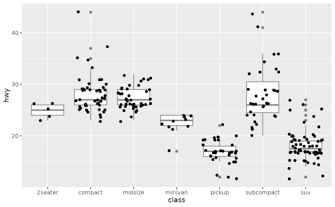
position jitter example

Finally, if you made a discrete interval on the y-axis, as well as the x-axis and added + position_jitter(), then you would have the affect sought where each line being visible throughout the the entirety of the plot.

However, I am not certain that position_jitter() operates on the y-axis ,

Yes, as @zx8754 suggested, position dodge is the magic sauce in ggplot, which will move the lines slightly:

library(ggplot2)
df <- data.frame(time=c(1:10,1:10,1:10), signal=c(sin(1:10), sin(1:10), cos(1:10)), 
                 sample=c(rep(c(letters[1:3]), each=10)))

ggplot(df, aes(x=time, y=signal, color=sample)) + geom_line(position = position_dodge(width = 0.2))

enter image description here

Two solutions I can think of:

  1. Try trimming the X-axis range to something smaller, and hope the lines get a little bit more distributed in this dimension. There's nothing you can do about the Y-axis. This solution goes out of the window if you cannot change the X-axis limits at all.

  2. Use ggplot2::facet_grid() or ggplot2::facet_wrap() to split each curve into its own panel, and present the entire thing as a multi-panel plot. You only have 6 curves worth of data, so that's a 2x3 or 3x2 (or whatever will you) panels. IMHO this is the right way to deal with this situation.

Here's a small working example for facet_wrap() with somewhat similar data:

#Generating some toy data.
mysig <- function(x){
  data.frame(x = x, y = 1/ ( 1+exp(x) ), stringsAsFactors = FALSE)
}

inps <- rep(seq(-10, 10), 6)

df <- mysig(inps)

df$samp <- rep(sample(letters, size = 6, replace = FALSE), each = 21)

#--------

#Plotting.
library(ggplot2)

#Without facet wrap.
ggplot(data = df, aes(x = x, y = y, color = samp)) + 
  geom_line()

#With facet wrap.
ggplot(data = df, aes(x = x, y = y, color = samp)) + 
  geom_line() + 
  facet_wrap(~samp)

#--------

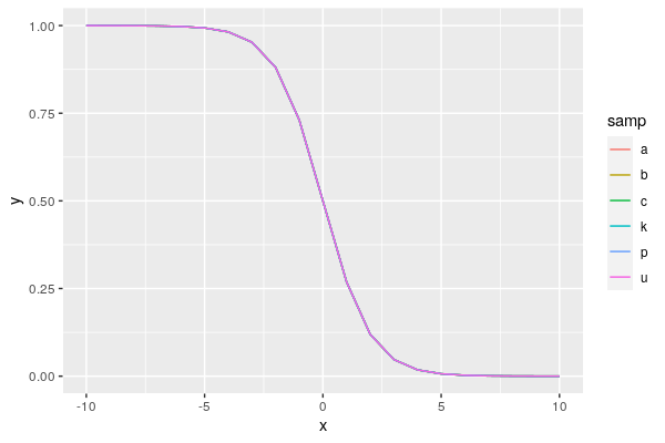
The unfaceted plot looks like this:

ggnofacet

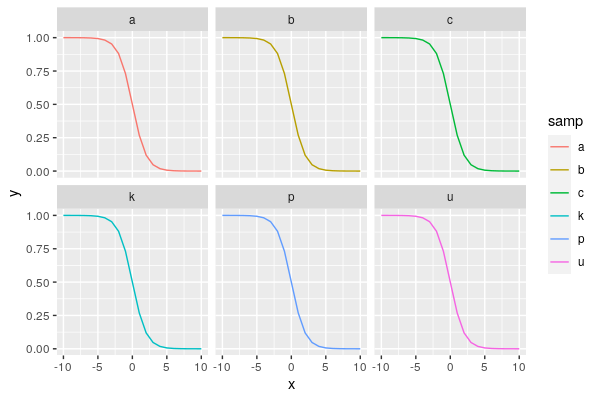
With paneling, it would look like this instead:

ggfacet

I'd say this is an acceptable compromise.

Log in to answer this question.