somehow it appears to be tricker than simple heatmap command in R. the prep of data is crucial I guess.
• 0 views
•
link
Hi!
Does anyone knows how to generate heatmaps of significantly enriched pathways/GO terms?
like the one here : http://openi.nlm.nih.gov/imgs/rescaled512/3009538_1471-2105-11-S1-S64-1.png
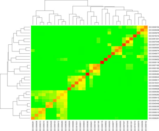
Something like this, but not exactly like this ;)
note: I have list of genes, and ofcourse some kind of correlation needs to be calculated either based on number of genes enriched in each term or p-values of terms.
Thank you
This appears to have been generated by the heatmap command in R.
What you need is a matrix of of values that list the correlation (or some other) value between any two pairs of GO terms.
somehow it appears to be tricker than simple heatmap command in R. the prep of data is crucial I guess.
I think this is simply the choice of the color scheme that makes this plot the way it does. People often "cheat" with that, and here it the data seems to be clustered both by rows and columns with a custom color scheme. Visually there does not seem to be a reason that would justify the red lining up so well along that diagonal, but I think this is simply the cells over/under a certain value are simply plotted as the same color of green whereas there may be more variation to them.
It is a common seen (some would say misleading) choice to limit the color-scheme in a way that leads to a visually striking pattern.
Use the modular enrichment analysis functionality of DAVID tool. For each identified cluster you will have a heatmap.
Log in to answer this question.
Is this a correlation plot? What do you have in your x axis? I assume, you will need samples!! Could you explain a bit more about your data?
you can also use
corrplotpackage!!!