This is a test version of Biostars. For the public version, visit https://www.biostars.org.
Interpration of ridgeplot in transcriptomic analysis

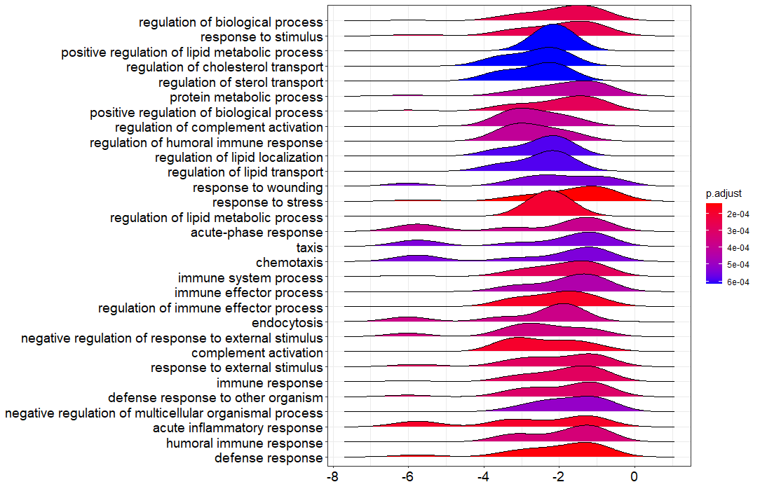
I have done the GSEA on my RNAseq data and I got the ridgeplot from the clusterProfiler bioconductor package. Could you guys help in interprating this figure?

figure

rna-seq

1 answer

Is the x-axis log2FC? If so, for each term it's providing a histogram/density of Log2FCs for genes in the term. The density appears to be below 0 for all terms, so those terms tend to be associated with downregulated genes.

Thank you for your comment. These are the LFC values indicated on the X-axis. I have the following concerns and i hope you will help:

  • The colors range from red to blue. Does it mean mean that the red color is significantly down/upregulated
  • Commend on the shape of the histograms

X-axis indeed indicates LFC values as reported earlier. The color describes the FDR/adjusted p-value as listed in the color bar, so only notifies you whether an enriched term is significant or not (e.g., p-value cutoff <0.05). To see whether a term is activated or suppressed you can use the enrichment score or NES (positive NES score == activated, negative NES == suppressed). The shape describes the density/number of genes with a specific LFC value, so it shows you the LFC distribution of genes in the gene set of an enriched term.

I now have a clear understanding of this result. Initially I thought that the X-axis values were just absolute numbers but I have realized that they have to be used in the interpretation of the results.

Log in to answer this question.