Thank you so much @zx8754, we can specify the red color in your code, but the other color cannot be specified. can I specify the other one as well? Thanks.
• 0 views
•
link
Hi there, I have such a dataset below, I try to draw a manhattan plot in R. Each chromosome has 2 different groups as Group 1 and Group2 and I try to show these groups in different colors (Group 1 blue and Group 2 red). I used qqman package in R (manhattan(mydf,col = c("red", "blue") )) but, I couldn't succeed, can anyone help me? You can see my expected output also below
Group  P_val  -log10_Pval CHR BP  SNP
    1     0.0153    1.8150   1   1   rs1
    2     0.0325    1.4881   1   2   rs2
    1     0.0478    1.3206   1   3   rs3
We could use highlight argument, try this example:
library(qqman)

#dummy data from qqman
d <- gwasResults

#add groups
set.seed(1); d$grp <- sample(1:2, nrow(d), replace = TRUE)

manhattan(d, col = "red", highlight = d[ d$grp == 2, "SNP"])
Thank you so much @zx8754, we can specify the red color in your code, but the other color cannot be specified. can I specify the other one as well? Thanks.
No, "green" is hardcoded. You could copy the code from GitHub and change it to any colour, see GitHub manhattan.R#L211
You can try my R package which is based on ggplot2 here
Then, try facets:
library(ggfastman)
library(tidyverse)
data("gwas_data")

gwas_data %>%
       mutate(pvalue = runif(n(),min = 0, max = 1),
                   Group = 1) %>%
       bind_rows(mutate(gwas_data, Group  =2)) %>%
       ggfastman::fast_manhattan(., speed = "fast", pointsize = 1.8) +
       facet_wrap(~Group, ncol = 1, scales = "free_y")
Or two colors, but this example isn't good since the the points of group 2 are completely overplotted by Group 1.
gwas_data %>%
  mutate(pvalue = runif(n(),min = 0, max = 1),
         Group = 1) %>%
  bind_rows(mutate(gwas_data, Group  =2)) %>%
  mutate(color = ifelse(Group ==1, "red", "blue")) %>%
 ggfastman::fast_manhattan(., speed = "fast", pointsize = 1.2)
Hi mag,
Another option would be to use karyoploteR to create your Manhattan plot. The plot will be a bit different since karyoploteR will plot each SNP in its correct position on the genome, by default on hg19 (note that karyoploteR can work with any genome, though).
To use it, you'll first need to convert your data into a GenomicRanges object, and change the chromosome names to UCSC style.
snps.gr <- toGRanges(dd[,c(4,5,5,6,1,2,3)])
seqlevelsStylesnps.gr) <- "UCSC"
And you are good to go. We'll create a plot with plotKaryotype, then add an axis with kpAxis and finally use kpPlotManhattan to actually plot the data. To give each point a color according to its group, we'll use the colByCategory function, and that's it.
kp <- plotKaryotype(plot.type=4)
kpAxis(kp, ymin = 0, ymax = 10)
kpPlotManhattan(kp, data = snps.gr, pval = snps.gr$`-log10_Pval`, logp = FALSE, ymin=0, ymax=10,
                points.col=colByCategory(snps$group, colors = c("red", "blue")))
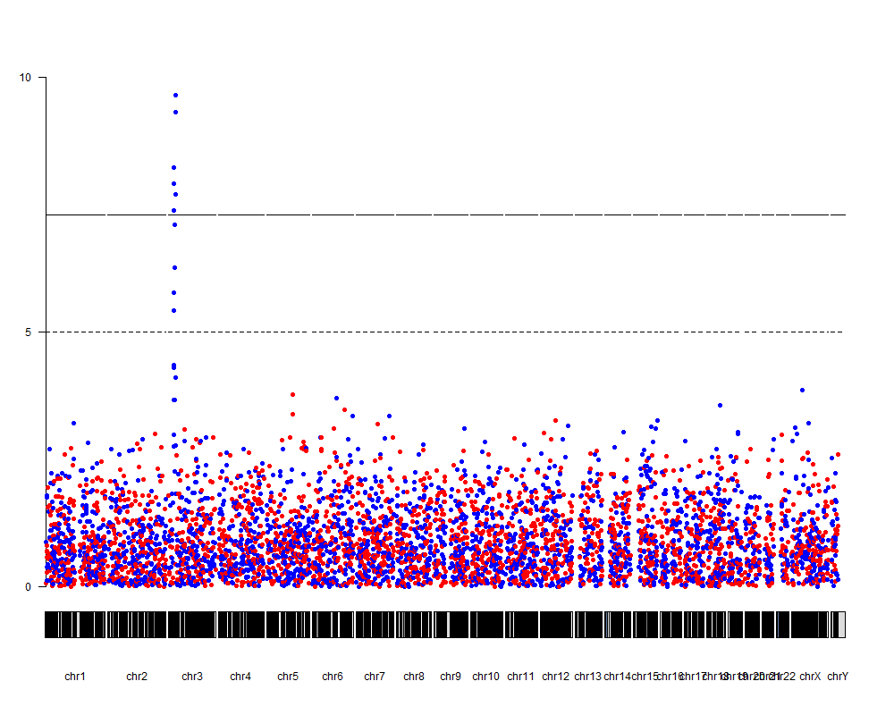
With a few additional tweaks we can improve the plot and annotate the top snps, for example.
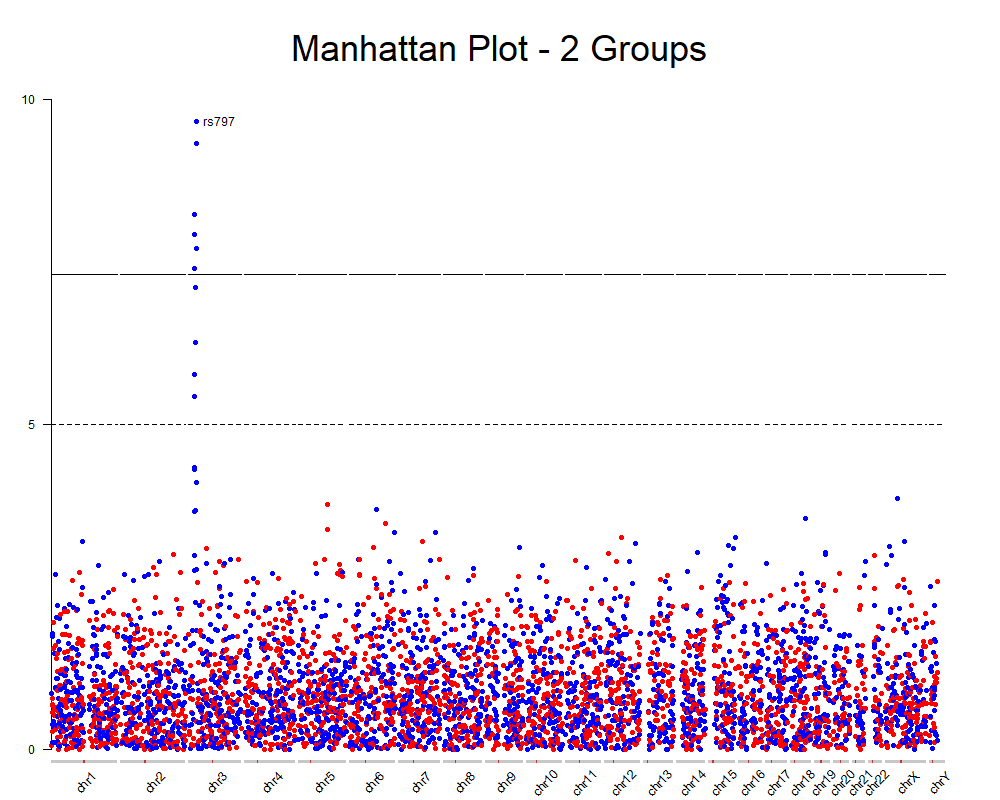
You can find the complete code for this on github and all the instructions on how to create Manhattan plots with karyoploteR and how to add additional data into a Manhattan plot on the karyoploteR tutorial.
Hope this helps
Log in to answer this question.
Please see How to add images to a Biostars post to add your images properly. You need the direct link to the image or the HTML embed code, not the link to the webpage that has the image embedded (which is what you have used here)
str(my_data)orhead(my_data)?see if this is what you want: