How do I boxplot each row in a dataset in R?
In the dataset below, I want to plot RF.CMS1.posteriorProb, RF.CMS2.posteriorProb, RF.CMS3.posteriorProb and RF.CMS4.posteriorProb for each GSM sample in column X. So separate boxplots for each row in column X, in R.
Appreciate any help in this regard.Many thanks.
    head(GSE14333_pheno_new)
          X Location DukesStage Age Gender DFSTime DFS_group DFSCens AdjXRT AdjCTX
1 GSM358387   Rectum          B  54      M    9.96      poor       0      Y      Y
2 GSM358392    Right          B  38      F   17.95      poor       1      N      Y
3 GSM358395    Right          B  78      F   22.02      poor       1      N      Y
4 GSM358396     Left          B  65      F   22.38      poor       0      Y      Y
5 GSM358397     Left          B  65      F   22.38      poor       0      Y      Y
6 GSM358399     Left          B  56      F   25.21      poor       0      Y      Y
  RF.CMS1.posteriorProb RF.CMS2.posteriorProb RF.CMS3.posteriorProb RF.CMS4.posteriorProb
1                  0.20                  0.34                  0.40                  0.06
2                  0.46                  0.06                  0.03                  0.45
3                  0.76                  0.02                  0.03                  0.19
4                  0.10                  0.78                  0.00                  0.12
5                  0.01                  0.95                  0.04                  0.00
6                  0.35                  0.42                  0.22                  0.01
  RF.nearestCMS RF.predictedCMS predict.label2 dist.to.template dist.to.cls1.rank  nominal.p
1          CMS3            <NA>         CRIS-B        0.7331209                68 0.00019996
2          CMS1            <NA>         CRIS-A        0.8965833                52 0.00739852
3          CMS1            CMS1         CRIS-B        0.8559375                80 0.00019996
4          CMS2            CMS2         CRIS-C        0.7944693               111 0.00019996
5          CMS2            CMS2         CRIS-C        0.8465627               120 0.00179964
6          CMS2            <NA>         CRIS-D        0.9366855               148 0.00719856
        BH.FDR Bonferroni.p
1 0.0006725928    0.0369926
2 0.0102143750    1.0000000
3 0.0006725928    0.0369926
4 0.0006725928    0.0369926
5 0.0026849469    0.3329334
6 0.0100130350    1.0000000
4 answers
It depends on how many samples you have, if it will fit in your plot. But lets say you have only 6 samples like in your example, you could get a boxplot like this:
boxplot(t(GSE14333_pheno_new[,11:14]))
or
boxplot(t(GSE14333_pheno_new[1:6,11:14]))
Using ggplot, we need to convert from wide-to-long format, then plot, see example:
library(tidyverse)

# reproducible example data
set.seed(1); dat <- data.frame(X = paste0("sample", 1:6),
                               c1 = runif(6),
                               c2 = runif(6),
                               c3 = runif(6))

# convert wide-to-long format
plotDat <- gather(dat, key = "key", value = "value", -X)

# plot
ggplot(plotDat, aes(X, value)) +
  geom_boxplot()

base plotting with long format above:
$ boxplot(value ~ X,  data=plotDat) # for plain boxplot
$ boxplot(value ~ X,  data=plotDat,col=rainbow(length(levels(plotDat$X)))) # add some colors
I usually work with LATTICE for this multivariate kind of analysis. I have rearranged the data as follows:
sample <- c(rep("GSM358387",6), rep("GSM358392",6),
            rep("GSM358395",6), rep("GSM358396",6))
type <- c(rep(c("RF.CMS1.posteriorProb", "RF.CMS2.posteriorProb",
                "RF.CMS3.posteriorProb", "RF.CMS4.posteriorProb"),6))
response <- c(0.2, 0.46, 0.76, 0.1, 0.01, 0.35,
              0.34, 0.06, 0.02, 0.78, 0.95, 0.42,
              0.40, 0.03, 0.03, 0.00, 0.04, 0.22,
              0.06, 0.45, 0.19, 0.12, 0.00, 0.01)
X <- data.frame(sample, type, response)

> X
      sample                  type response
1  GSM358387 RF.CMS1.posteriorProb     0.20
2  GSM358387 RF.CMS2.posteriorProb     0.46
3  GSM358387 RF.CMS3.posteriorProb     0.76
4  GSM358387 RF.CMS4.posteriorProb     0.10
5  GSM358387 RF.CMS1.posteriorProb     0.01
6  GSM358387 RF.CMS2.posteriorProb     0.35
7  GSM358392 RF.CMS3.posteriorProb     0.34
8  GSM358392 RF.CMS4.posteriorProb     0.06
9  GSM358392 RF.CMS1.posteriorProb     0.02
10 GSM358392 RF.CMS2.posteriorProb     0.78
11 GSM358392 RF.CMS3.posteriorProb     0.95
12 GSM358392 RF.CMS4.posteriorProb     0.42
13 GSM358395 RF.CMS1.posteriorProb     0.40
14 GSM358395 RF.CMS2.posteriorProb     0.03
15 GSM358395 RF.CMS3.posteriorProb     0.03
16 GSM358395 RF.CMS4.posteriorProb     0.00
17 GSM358395 RF.CMS1.posteriorProb     0.04
18 GSM358395 RF.CMS2.posteriorProb     0.22
19 GSM358396 RF.CMS3.posteriorProb     0.06
20 GSM358396 RF.CMS4.posteriorProb     0.45
21 GSM358396 RF.CMS1.posteriorProb     0.19
22 GSM358396 RF.CMS2.posteriorProb     0.12
23 GSM358396 RF.CMS3.posteriorProb     0.00
24 GSM358396 RF.CMS4.posteriorProb     0.01
Then I used the bwplot funtion from Lattice:
library(lattice)
bwplot(
    sample ~ response|type,
    X,
    groups = type
)
and I got this: Plot I guess you can re-arrange the values and groups as you like playing around with the parameters, but I think this should do.
Are you sure about this? It seems you divide data of 6 samples over 4 samples now...
You plot every "RF.CMSX.posteriorProb" separtely, but each sample has only one value for each, so 4 boxplots wouldn't make sense. I think OP wants one boxplot for all 4: RF.CMS1.posteriorProb-RF.CMS4.posteriorProb per sample.
it might be how I have written down the dataframe: each sample has 6 entries but there are only 4 types of response. with this configuration:
sample <- c(rep(c("GSM358387",  "GSM358392",
            "GSM358395",    "GSM358396"),6))
type <- c(rep(c("RF.CMS1.posteriorProb", "RF.CMS2.posteriorProb",
          "RF.CMS3.posteriorProb", "RF.CMS4.posteriorProb"),6))
response <- c(0.2,  0.46,   0.76,   0.1,    0.01,   0.35,
              0.34, 0.06,   0.02,   0.78,   0.95,   0.42,
              0.40, 0.03,   0.03,   0.00,   0.04,   0.22,
              0.06, 0.45,   0.19,   0.12,   0.00,   0.01)
X <- data.frame(sample, type, response)

library(lattice)
bwplot(
    sample ~ response|type,
    X,
    groups = type
)
there is a boxplot per sample:
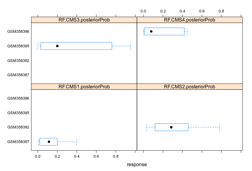 Lattice facilitates the clustering of data. Changing the parameters allows to cluster the data to fit the demand.
I agree that you make nice plots, but they are not correct. In OP's example we have 6 samples, each have 4 entries. But in your first example you have 4 samples, some samples have more entries than others... They are mixed up. In your second example You have 4 samples, each seem to have 6 entries of just one type. For example GSM358395 has only data for RF.CMS3.posteriorProb. I hope you understand what I am talking about...
Sorry, I placed the dataframe to show how I built it since it was difficult to parse it in R. Now the dataframe I built is:
> X
      sample                  type response
1  GSM358387 RF.CMS1.posteriorProb     0.20
2  GSM358392 RF.CMS1.posteriorProb     0.46
3  GSM358395 RF.CMS1.posteriorProb     0.76
4  GSM358396 RF.CMS1.posteriorProb     0.10
5  GSM358397 RF.CMS1.posteriorProb     0.01
6  GSM358399 RF.CMS1.posteriorProb     0.35
7  GSM358387 RF.CMS2.posteriorProb     0.34
8  GSM358392 RF.CMS2.posteriorProb     0.06
9  GSM358395 RF.CMS2.posteriorProb     0.02
10 GSM358396 RF.CMS2.posteriorProb     0.78
11 GSM358397 RF.CMS2.posteriorProb     0.95
12 GSM358399 RF.CMS2.posteriorProb     0.42
13 GSM358387 RF.CMS3.posteriorProb     0.40
14 GSM358392 RF.CMS3.posteriorProb     0.03
15 GSM358395 RF.CMS3.posteriorProb     0.03
16 GSM358396 RF.CMS3.posteriorProb     0.00
17 GSM358397 RF.CMS3.posteriorProb     0.04
18 GSM358399 RF.CMS3.posteriorProb     0.22
19 GSM358387 RF.CMS4.posteriorProb     0.06
20 GSM358392 RF.CMS4.posteriorProb     0.45
21 GSM358395 RF.CMS4.posteriorProb     0.19
22 GSM358396 RF.CMS4.posteriorProb     0.12
23 GSM358397 RF.CMS4.posteriorProb     0.00
24 GSM358399 RF.CMS4.posteriorProb     0.01
In this figure, there are 6 samples with one entry for each of the 4 groups RF.CMSX.posteriorProb:
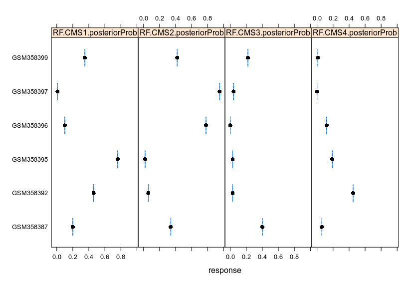
This looks more like it, but as you can see only 1 datapoint per entry per sample, so no boxes can be drawn (only a point with its mean the blue bar).
that's because there is only one entry per sample per group. For instance, I read that GSM358387 has a single value of 0.20 for RF.CMS1.posteriorProb. With multiple entries per sample the boxes will grow correspondingly, as illustrated in the previous figures.
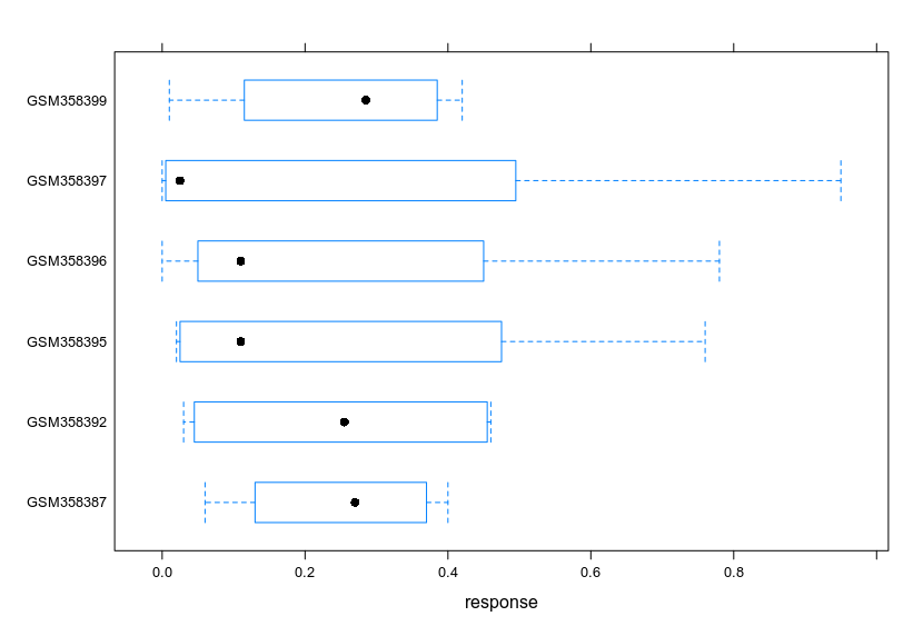

@OP, if x-axis titles are not necessary, withapply function:
par(mfrow=c(1,nrow(GSE14333_pheno_new)))
apply(GSE14333_pheno_new[,c(11:14)],1,boxplot)
Log in to answer this question.
bio94 : If an answer was helpful, you should upvote it; if the answer resolved your question, you should mark it as accepted. You can accept more than one if they work.
