The large number of p=1 observations is due to p-values being "rounded up". For example, if count=200 and each row/column sums to 100, the central {50, 50} {50, 50} table has a ~11.2% chance of being observed under the null hypothesis. This table corresponds to p-value=1; the adjacent {49, 51} {51, 49} and {51, 49} {49, 51} tables correspond to p-value ~0.888, etc.
To avoid this upward bias, you can use the "mid-p value". In the example above, the most-central table has a mid-p value of ~0.944: the center, instead of the upper end, of the probability interval it corresponds to. The mid-p value has the nice property that, under the null hypothesis, the Q-Q plot should stay near the main diagonal.
(The same things are true for the binomial test you asked about earlier.)
Incidentally, I posted JavaScript Fisher's exact test and binomial test calculators up at https://www.cog-genomics.org/software/stats several years ago; the FET includes an option for turning the mid-p adjustment on/off, if you want to see more examples of the difference it makes.
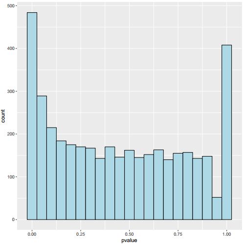
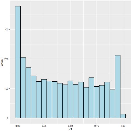
Why do you think it should be uniform?
I've just modified the content, I expect it to be, maybe it actually not. I just cannot understant the U shape.
Your comment does not add any information. I personally have too little of a statistical background to formulate expectations about p-value distributions. You should ask yourself if your statistical knowledge is sufficient to do so. As this is a pure statistics question, you might consider to post it on StackExchange. If you do, you can enhance your chance of a good response by following the guildelines on How To Ask Good Questions On Technical And Scientific Forums, because right now, your question lacks any details on what the experimental setup was.
Thank you ATpoint, I made the post in a hurry just now, sorry for that. I will read the guidelines carefully and do better next time. And I will post this on stackExchange to see if I can get some help.
Aifu.
Hi- See if this blog post helps you http://varianceexplained.org/statistics/interpreting-pvalue-histogram/ . To get better answers, it would be good to give some background about what you are testing as the U-shape may or may not be anything to worry about.
Thank you dariober, I've already seen this post, it is clear but the solution it provides could not solve my problem.