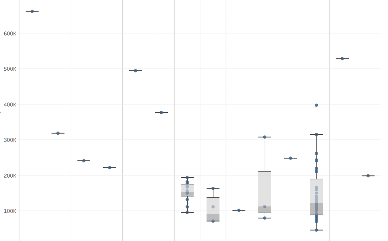
I would only go for a heatmap in case you have hundreds or thousands of genes. The point with z-scoring is that you "penalize" lowly or highly expressed genes for the sake of vizualisation or for reducing the complexit of a large pool of genes. If you only have 20 genes, I find it much more natural and intuitive to show the actual arithmetic or log2 expression values and also visualize the replicates (boxplots, violins, bargraph with SD...).
I have expression matrix of 20 genes in 5 replicates in healthy vs disease animals treated with a drug. I want to show that the expression level between healthy vs diseased animals ids different. Is there a suggestion how I can put in a figure this information? I can either show correlation but that has to be one gene per fig. Any suggestion?
3 answers
In fig. 4 of the paper you cite, there is a heatmap with 48 genes... They also use z-scores. Nothing wrong with that, is my opinion.
Heatmaps are a valid approach, don't get me wrong. I just think that for this purpose, they are not the best choice because they hide replicate information and make it harder to really see the actual differences between the single genes upon treatment.
Well thanks for sharing your personal preference. Heatmaps are probably the most used figure to summarize gene expression. I would personally not use violin plots, most people don't know what they are or how they work, I would then rather prefer to use a beeswarm instead. Especially with only 5 reps. But that is all a matter of personal taste.
I agree with WouterDeCoster that violins are suitable here, especially because you only have 20 genes, so there is IMHO no need for a heatmap and z-scoring (which would be the choice if you have hundreds or thousands of genes). I would go for a 4x5 violin plot in a box-like design like they did here in figure 3a (think this is made with R::lattice). Given the small number of genes (which most likely are the core of the message you want to deliver) and given that you seem to have primary sample material, showing any kind of replicate-variance information is I think crucial.

Heatmap and violin are very good options. In addition to internal data, we analyzed a lot of public data, therefore each genomic experiment yields different numbers of replicates, comparisons, etc. So we use boxplots and scientists seem to digest the data a little bit better when compared to some less commonly known options.

Log in to answer this question.
please post some data.
Violin plots are good to show one gene in multiple groups, with replicates. Volcano plots are good to show the differential expression of all genes, but you don't show replicates any more.
Thanks for all suggestions. The purpose of the figure is that I want to show that these 20 genes are deferentially expressed in diseased cases when treated with drug while the same genes are affected to lesser extent or are not affected by drug treatment in healthy animals.
Please use
ADD COMMENTorADD REPLYto answer to previous reactions, as such this thread remains logically structured and easy to follow. I have now moved your reaction but as you can see it's not optimal. Adding an answer should only be used for providing a solution to the question asked.If an answer was helpful you should upvote it, if the answer resolved your question you should mark it as accepted.

My advice is to make more plots, like violin plots, heatmaps, beeswarms, MA plots, volcanoplots, etc. And then see which one would best represent your data.