Thanks a lot. there is no "ggplot" for R anymore .. it is now ggplot2 I think .. does it work in this context?
thanks much
• 1 views
•
link
Hello everyone, I would like to have gene names added to volcano plot obtained from DEseq2 ... I have the following matrix:
                 baseMean log2FoldChange      lfcSE       stat        pvalue          padj
Aats-phe       1439.85510     -0.3915108 0.10641530  -3.679084  2.340731e-04  8.682721e-03
achi           1114.41542     -0.4206245 0.10794425  -3.896682  9.751936e-05  4.128319e-03
Act42A        25233.52971     -0.4144380 0.07727588  -5.363096  8.180730e-08  8.283542e-06
Ada             514.03083     -0.6321073 0.13696097  -4.615236  3.926483e-06  2.724179e-04
ade5           3620.63094      0.8756724 0.12531134   6.987974  2.788849e-12  5.804679e-10
Adgf-A         4432.04719     -0.3219797 0.08413694  -3.826854  1.297917e-04  5.173027e-03
alphaTub84B   22505.94872     -0.3424581 0.09110146  -3.759085  1.705361e-04  6.423805e-03
Ama             198.23454     -2.0373321 0.21461357  -9.493026  2.244235e-21  1.401338e-18
Ance           1513.97966     -0.3010685 0.09949477  -3.025973  2.478346e-03  4.876555e-02
as you see DEseq2 doesn't add an identifier to the gene name column (is there any option to do so?) .. and I used the following line to generate volcano plot:
with(subset(res, padj<.05 ), points(log2FoldChange, -log10(pvalue), pch=20, col="red", xlim=c(-10,10))).
now I would like to add gene names to the significantly DE genes.
thanks for your help
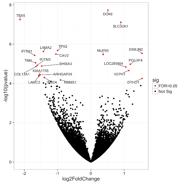
You probably want to use something like the following:
library("ggplot2") #Best plots
library("ggrepel") #Avoid overlapping labels

mutateddf <- mutate(yourdataframe, sig=ifelse(output$padj<0.1, "padj<0.1", "Not Sig")) #Will have different colors depending on significance
input <- cbind(gene=rownames(mutateddf ), mutateddf ) #convert the rownames to a column
volc = ggplot(input, aes(log2FoldChange, -log10(pvalue))) + #volcanoplot with log2Foldchange versus pvalue
    geom_point(aes(col=sig)) + #add points colored by significance
    scale_color_manual(values=c("black", "red")) +
    ggtitle("Your title here") #e.g. 'Volcanoplot DESeq2'
volc+geom_text_repel(data=head(input, 20), aes(label=gene)) #adding text for the top 20 genes
#ggsave("Volcanoplot.jpeg", device="jpeg") #In case you want to easily save to disk
volc
Let me know if something doesn't completely work out as you like.
Thanks a lot. there is no "ggplot" for R anymore .. it is now ggplot2 I think .. does it work in this context?
thanks much
It's indeed ggplot2, that was a typo :) will edit my post. Good catch!
Hi Wouter DeCoster I am interested to associate the size of the dot in the volcano plot to a value. Any suggestion for it? Thank you in advance
Follow this geom_point
I'm getting the error:
Error in mutate_impl(.data, dots) : Evaluation error: object 'output' not found.
What is the purpose of the output object?
Better late than never...
Volcano plot function here (utilises ggrepel too): https://github.com/kevinblighe/EnhancedVolcano

This is very nice. But I have done differential analysis with edgeR. The column names are different. It looks like this after differential analysis.
GeneSymbols logFC   unshrunk.logFC  logCPM  PValue  FDR
AC008870.3  4.721779828 4.732947693 7.040264571 6.92E-42    6.74E-38
TLX1NB  7.751264946 9.975489207 3.543554213 6.22E-38    3.03E-34
LINC00511   5.021658258 5.027933421 8.152433547 1.08E-36    3.50E-33
PRC1-AS1    3.829764672 3.831783654 8.605278483 7.32E-36    1.78E-32
AC022784.1  6.403421254 6.460040058 6.407583259 3.37E-30    3.64E-27
AL161431.1  9.174183718 9.324360691 7.805663652 4.04E-30    3.93E-27
Do I need to change the column names to make the plot with your code?
You can either change the column names to match those that are required by the function, or you can just edit the function itself. You will just have to edit:
line 4:
toptable$Significance[(abs(toptable$log2FoldChange) > FCCutoff)] <- "FC"
to:
toptable$Significance[(abs(toptable$logFC) > FCCutoff)] <- "FC"
line 6:
toptable$Significance[(toptable$padj<AdjustedCutoff) & (abs(toptable$log2FoldChange)>FCCutoff)] <- "FC_FDR"
to:
toptable$Significance[(toptable$FDR<AdjustedCutoff) & (abs(toptable$logFC)>FCCutoff)] <- "FC_FDR"
line 10:
plot <- ggplot(toptable, aes(x=log2FoldChange, y=-log10(padj))) +
to:
plot <- ggplot(toptable, aes(x=logFC, y=-log10(FDR))) +
lines 58 and 59:
geom_text(data=subset(toptable, padj<LabellingCutoff & abs(log2FoldChange)>FCCutoff),
aes(label=rownames(subset(toptable, padj<LabellingCutoff & abs(log2FoldChange)>FCCutoff))),
to:
geom_text(data=subset(toptable, FDR<LabellingCutoff & abs(logFC)>FCCutoff),
aes(label=rownames(subset(toptable, FDR<LabellingCutoff & abs(logFC)>FCCutoff))),
In addition, you should set the rownames of your object as the gene names.
Yes, I changed the function. I have a dataframe "DEG" with genes as rows and [logFC unshrunk.logFC logCPM PValue FDR] as columns. I gave like following but its not working.
tr <- glmTreat(fit, contrast=contrast.matrix, lfc=log2(5))
tab2 <- topTags(tr,n=Inf)
keep <- tab2$table$FDR < 0.05
DEG <- tab2$table[keep,]
Now "DEG" has a total of 400 differential expressed genes with logfc |5| and FDR < 0.05.
pdf("volplot.pdf")
EnhancedVolcano(toptable = DEG, AdjustedCutoff = 0.05, LabellingCutoff = 0.05, FCCutoff = 5 , main = 'Plot')
dev.off()
Is it producing anything? Your genes are definitely as rownames of DEG?
It didn't produce anything and there is no error also.
Sincere apologies about that. I should have explained that the function just creates a ggplot object, which then has to be plotted (edit:I've now modified it so that it will just plot itself with just the function call)
df
           GeneSymbols    logFC unshrunk.logFC   logCPM   PValue      FDR
AC008870.3  AC008870.3 4.721780       4.732948 7.040265 6.92e-42 6.74e-38
TLX1NB          TLX1NB 7.751265       9.975489 3.543554 6.22e-38 3.03e-34
LINC00511    LINC00511 5.021658       5.027933 8.152434 1.08e-36 3.50e-33
PRC1-AS1      PRC1-AS1 3.829765       3.831784 8.605278 7.32e-36 1.78e-32
AC022784.1  AC022784.1 6.403421       6.460040 6.407583 3.37e-30 3.64e-27
AL161431.1  AL161431.1 9.174184       9.324361 7.805664 4.04e-30 3.93e-27

source("Escritorio/EnhancedVolcanoEdgeR.R")

EnhancedVolcanoEdgeR(toptable=df, AdjustedCutoff=0.05, LabellingCutoff=0.05, FCCutoff=2.0, main="EdgeR")

I'm now adding separate functions for output from DESeq2 and EdgeR
Thank you very much. It is working now. Is Nominal cutoff necessary when I'm selecting DEGs with logfc 5 and FDR < 0.05. Generally What should be the Nominal cutoff?
And to select top candidates among DEG's should I consider p-value?
There are no standard cut-offs. Using the FDR Q (adjusted P) value is advisable, though. There really is no standard set of thresholds, though.
The nominal p-vale has no function, currently. I kind of left it there in case anybody wanted to instead plot the negative log10 unadjusted p-values on the y-axis. Some people prefer that, but it requires editing the code.
May I know whats wrong in this
tr <- glmTreat(fit, contrast=contrast.matrix, lfc=log2(5))
tab2 <- topTags(tr,n=Inf)
DEG <- as.data.frame(tab2)
DEG <- data.frame("GeneSymbols"=rownames(DEG), DEG)

EnhancedVolcanoEdgeR(toptable=DEG, AdjustedCutoff=0.05, LabellingCutoff=0.05, FCCutoff=5.0, main="EdgeR")
In the plot it didn't show genes with LogFC > |5|. For FDR<0.05 & LogFC > |5| it showed only few genes unregulated. But When I saved my results it have more than 150 unregulated genes.
The function only labels as many genes as can reasonably fit into the plot window. That is the part of the function that makes it different from others. In others, if you attempt to label all genes, the plot looks messy because labels overlap each other.
Did you check this post from Getting Genetics Done?
My answer might use some of his code ya :-p
I see, the problem is that the matrix doesn't contain a column named "gene"
The gene names in your matrix are not explicitly given in a column but they are stored as row names. To add the gene column you need your matrix to be in fact a data frame so it can store other data types than just numbers :
results=as.data.frame(res) # convert matrix in data frame
results$gene=row.names(res) #create a gene column
I get this error when i try to run the code
dds <- DESeq(dds)
res <- results(dds)
res
summary(res)
the above is my code sequence so basically i would be using the res data frame ..I passing the data frame may be im doing it wrong
Error in UseMethod("mutate_") :
  no applicable method for 'mutate_' applied to an object of class "c('DESeqResults', 'DataFrame', 'DataTable', 'SimpleList', 'DataTable_OR_NULL', 'List', 'Vector', 'Annotated')"
I'm certainly doing something wrong im not sure what it is...any help would be highly appreciated
@krushnach, The res object you generated above is not a data.frame. mutate will data.frame. You can convert res object class to data.frame with as.data.frame function. (If I remember correct, DESeq2 manual contains this part while exporting results to files)
P.S. I think this was already clear in @Carlo's comment that it should be converted to data.frame.
With only base R, you can try using the text() function to add text to your plot. Something like :
sign.genes=which(res$padj<0.05)
text(x=res$log2FoldChange[sign.genes] , y=-log10(res$pvalue[sign.genes]), label=row.names(res)[sign.genes], cex=0.5)
To have only to top 20 gene names (with ties) plotted, you can use the same text() function but modify the sign.genes like this :
cutoff=sort(res$padj)[20] #the 20th smallest value of res$padj
sign.genes=which(res$padj <= cutoff)
Thanks Carlo, it works ... any modification by which we can plot the top 20 gene names only?
My code does that. Also, you could probably try slicing res as in label = head(row.names(res)[sign.genes], 10)
Note that the head() trick works only if your table is sorted by significance. Otherwise the first 10 genes of the table are random significant genes, not the real top10.
You can just modify sign.genes (that are the indexes of the gene names you want to plot). I edited my answer to account for that.
Log in to answer this question.
Can you append the output of
dput(res)so we can easily recreate the matrix?i would appreciate if you offer a script to do so. I am new in the field ,... that is why i don't want to make any miss