How to plot a matrix with numbers in the matrix colored using ggplot2 or other ways in R?
2
2
Entering edit mode
5.7 years ago
DanielC ▴ 170

Dear Friends,

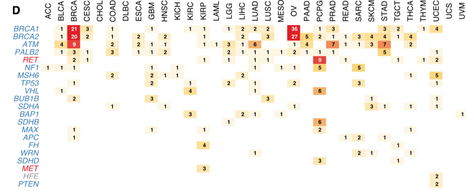
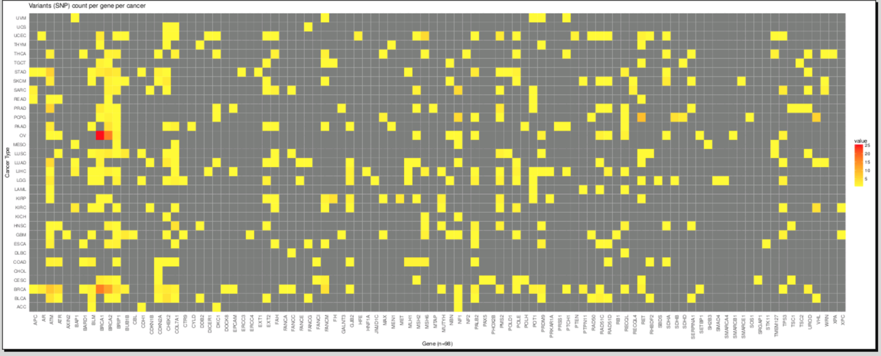
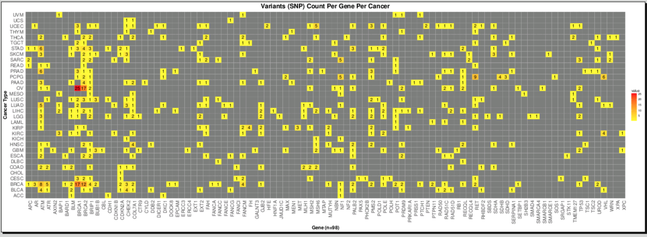
I have a matrix like this:

Gene      BRCA         THYM         TGHJ
ACC         23          21           7
XTG         12          13           9
CFG         45          4            8

The numbers are the snp count from vcf file.

I want to plot this in the form of a matrix with numbers colored based on their count; for example the highest number is colored in "Red" and then gradually the intensity of the color decreases with the decrease in number, so in this 45 is colored "Red" and 4 is colored with a very light color. Please let me know if am clear.

I am looking to plot this matrix using ggplot2, but other ways in R are also very welcome. A matrix like this:

enter image description here

SNP ggplot2 vcf matrix R • 12k views
ADD COMMENT
0
Entering edit mode

Thank you everyone for your informative suggestions and solutions which made this post a success :-).

ADD REPLY
6
Entering edit mode
5.7 years ago
library(tidyr)
df2=gather(df1, Symbol,Count, -Gene)
library(ggplot2)
ggplot(df2, aes(Gene,Symbol, size = Count, label = Count)) +
    geom_text(size = df2$Count, aes(colour=df2$Count))+
    scale_colour_distiller(palette="RdYlGn")+
    theme_bw()

Rplot

ADD COMMENT
1
Entering edit mode

Avoid using $ within ggplot, try this instead:

ggplot(df2, aes(Gene, Symbol, label = Count, colour = Count, size = Count)) +
  geom_text()+
  scale_colour_distiller(palette = "RdYlGn")+
  theme_bw() +
  scale_size_identity()
ADD REPLY
0
Entering edit mode

Thanks @ zx8754

ADD REPLY
3
Entering edit mode
5.7 years ago
zx8754 11k

I remember seeing a package for this exact task, but can't find it. So here is the starting steps, it will require more work to make it as pretty as you have in your example plot:

# example input
df1 <- read.table(text = "
Gene      BRCA         THYM         TGHJ
ACC         23          21           7
XTG         12          13           9
CFG         45          4            8", header = TRUE)


library(ggplot2)
library(dplyr)
library(tidyr)

plotDat <- gather(df1, key = "Gene2", value = "value", -Gene)

ggplot(plotDat, aes(Gene, Gene2, col = value, fill = value, label = value)) +
  geom_tile() +
  geom_text(col = "black") +
  theme_minimal() +
  scale_fill_gradient2(low = "white", mid = "yellow", high = "red") +
  scale_color_gradient2(low = "white", mid = "yellow", high = "red")

enter image description here

ADD COMMENT
0
Entering edit mode

Thanks! it gives me error:

Mapping must be created by aes() or aes_()".Could you please let me know what could be the issue? I have 100 genes to plot. Thanks!

ADD REPLY
0
Entering edit mode

You're probably missing a parenthesis somewhere. Can you check if you formatted the code properly?

ADD REPLY
0
Entering edit mode

This is my code; can you please let me know what could be wrong here?

This is my code

ADD REPLY
1
Entering edit mode

Posting screenshots of code is not useful for others to help debug the code. Please copy/paste actual text using the code formatting button.

ADD REPLY
0
Entering edit mode

You see how zx8754 used white space to write readable code? You can use a similar approach too - it is always better to write code in smaller, more logical chunks per line.

ADD REPLY
0
Entering edit mode

I want to write, or at least copy-paste, but the platform am working on does not allow me to copy-paste, otherwise I will have to write the whole code here from scratch. Can you see if there is any error that is causing problem? Thanks.

ADD REPLY
0
Entering edit mode

In the image, you wrote some text ( variant counts per....) inside geom_tile (2nd line in image.) That is the problem @ DK

ADD REPLY
0
Entering edit mode

Thanks much! I have come to a point where I am getting the plot; however, I dont see the numbers in the matrix: enter image description here

And, my code is: enter image description here

Could you please let me know how can I make the numbers visible in the matrix? Thanks!

ADD REPLY
1
Entering edit mode

R is lazy. Plot tiles first, next text. You are plotting tile at the end. Move it before geom_text @ DK

ADD REPLY
0
Entering edit mode

Thanks! it works :)

ADD REPLY
0
Entering edit mode

cpad, is there a go-to reference for the order to be used? How do you determine what goes first and what goes after?

ADD REPLY
0
Entering edit mode

@ Ram It is just rendering order . Think them of layers (as in Adobe flash). Within layer, there seems some kind of geom preference, which I am not sure of.

ADD REPLY
0
Entering edit mode

layers (as in Adobe flash)

I usually think of them as OHP slide transparencies. Really old school, I know. The analogy doesn't hold up to how data is shared either.

ADD REPLY
2
Entering edit mode

I am not sure what you meant by data sharing. However, following is my primitive understanding about ggplot: I think data is shared both globally and locally within ggplot. If one passes the data to main function ggplot (ggplot function), that would stay in entire plot and all the geoms has access to that data. If it is used a geom, it is restricted to that geom only. If both main data and geom share different data/visualization for some reason, geom will have more preference, at least for aes, in rendering the plot. Ram

ADD REPLY
1
Entering edit mode

add this to your theme (theme options) at the end plot.title = element_text(hjust = 0.5). This would center justify the title of your plot @ DK

ADD REPLY
0
Entering edit mode

Yes, I made the plot: :) enter image description here

ADD REPLY
1
Entering edit mode

DK @ intimidating and nice plot

ADD REPLY
1
Entering edit mode

DK : You should accept @cpad0112's answer below as well (you can accept more than one). It provided you with the core to get started.

ADD REPLY

Login before adding your answer.

Traffic: 2581 users visited in the last hour
Help About
FAQ
Access RSS
API
Stats

Use of this site constitutes acceptance of our User Agreement and Privacy Policy.

Powered by the version 2.3.6