
Hi,
I have a dataset I would like to cluster and represent in a heatmap. I have a list of genes with expression data for 4 experiments. However, I only have data for all of them in one experiment, some genes do not have data in the other experiments. Moreover, I have a few datapoins with extreme values, skewing the representation (I think I have solved that).
I want to reorder the rows so that genes with the same expression pattern in the four experiments are represented together. It is a problem similar to the one in this post, but as I have missing values I cannot do the reordering suggested.
I am giving you the whole process I have followed, in case I have missed something along the way.
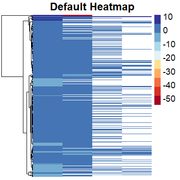
First, I am able to import my data and generate a heatmap by:
mat = as.matrix(read.delim("ForClustering.txt",row.names=1,header=T))
pheatmap(
mat               = mat,
color             = brewer.pal(10, "RdYlBu"),
border_color      = NA,
cluster_cols = FALSE,
show_colnames     = FALSE,
show_rownames     = FALSE,
drop_levels       = TRUE,
fontsize          = 14,
fontsize_row = 2,
main              = "Default Heatmap")
Obtaining the "skewed" heatmap:
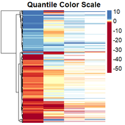
Then, I am able to change the scale to quantile values by:
quantile_breaks <- function(xs, n = 11) {
breaks <- quantile(xs, probs = seq(0, 1, length.out = n), na.rm=T)}
mat_breaks <- quantile_breaks(mat)
pheatmap(
    mat               = mat,
    color             = brewer.pal(length(mat_breaks - 1), "RdYlBu"),
    breaks            = mat_breaks,
    border_color      = NA,
    cluster_cols = FALSE,
    show_colnames     = FALSE,
    show_rownames     = FALSE,
    drop_levels       = TRUE,
    fontsize          = 14,
    fontsize_row = 2,
    main              = "Quantile Color Scale"
)
Obtaining the rescaled heatmap:
However, genes with similar expression patterns are not grouped together. I have tried to redo the clustering, but as I have missing data in some columns, the only way I have found is by generating a file in which I change all the positive values to 1, missing values to 0, and negative values to -1. Then I cluster them, and "force" the clustering into the heatmap. I dont think this is the right solution so any suggestion is welcome.
mat2 = as.matrix(read.delim("ForClustering_1and0s.txt",row.names=1,header=T))
distance = dist(mat2, method = "manhattan")
cluster = hclust(distance, method = "ward.D2")
pheatmap(
    mat               = mat,
    color             = brewer.pal(length(mat_breaks - 1), "RdYlBu"),
    breaks            = mat_breaks,
    border_color      = NA,
    cluster_cols = FALSE,
    cluster_rows = cluster,
    show_colnames     = FALSE,
    show_rownames     = FALSE,
    drop_levels       = TRUE,
    fontsize          = 14,
    fontsize_row = 2,
)
Obtaining this:
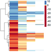
However, here they are only ordered by positive/negative values, and I wanted them to be ordered by similarity of expression pattern.
My question is, is there a way of clustering the genes when there are missing values? I would like to have them clustered first by positive/negative values, and then, each of the clusters by similarity in their expression pattern (i.e. genes with highest expression in the four experiments clustered together, then genes with low (but positive) expression in the 4 experiments, etc.).
Thanks in advance!


Can you upload the data file ?
Sure, you can find it here.
Hey, not exactly sure what you want(?). The typical heatmap function in gplots don't allow missing values like pheatmap does. I would normally scale the data matrix to the Z scale and then 'impute' the missing values as zeros. You can then re-order the dendrogram by some mathematical function as you saw in my other thread.
I have not used pheatmap that much but you can use a function called dendsort (from dendsort package) in order to manipulate your hierarchical clustering object after you have created it, like this:
There is also a parameter to pheatmap called cluster_callback, which you may use.
Hi Kevin,
Thank you so much for taking the time to reply.
What I meant is that I want to cluster my genes (rows) by the pattern they show in the four experiments (columns). You can see in the attached image that there are some clusters far apart with the same pattern. I guess it is because their similarity in the same experiment has more "weight" in the clustering. (i.e. genes with high values in the first experiment are far from genes with lower values, even if their pattern in the 4 experiments is similar).
I am reading about different ways to calculate distances and linkage in hierarchical clustering to give more weight to the similarity among experiments, but any suggestion is welcome.
Chirag's solution may very well be of assistance to you. CAn you take a look? In addition, if you could convince yourself to move to
heatmap.2orComplexHeatmap, then I would be able to help more. I never quite learned the finer details ofpheatmap!Hi,
I was using pheatmap because it was recommended by a lab mate, but I have no preference, I can use heatmap.2 too to generate my heatmap, but still do not get the expected results.
I will try to modify the reorderfun to rearrange the clusters.
I think the problem is in the way I calculate the distance and linkage for clustering. I am going to try Hellinger, Species Profile and Chord distance, and also do it via seriation.
Thanks again for taking time to look at my questions.
Just be careful though because it's easy to fall into the trap of trying everything and then picking the one that just looks best and/or suits your hypothesis. You don't come across as that type of person, but just something to keep in the back of your mind. I had a supervisor once who kept saying tome that biology never follows the rues and that 'perfection' (like segregation of samples via clustering) just doesn't happen in reality. In fact, perfection in biology must be questionable!
It's not readily clear to me why you are so keen to get the ordering in the heatmap to be a certain way, when one could easily just explain the heatmap in a figure legend, for example (?).