Visualization for ChIP-seq analysis
4
6
Entering edit mode
6.6 years ago
nvucic ▴ 70

Hello guys,

from your experience with chip-seq analysis what would be the most useful visual representations of chip-seq results? I am particularly interested in your opinion on visualizations of motif discovery, annotation and differential binding analysis and your experiences with various bioinformatics tools that you' ve been using for this purpose.

Cheers, Nemanja

chip-seq motif detection differential analysis • 12k views
ADD COMMENT
2
Entering edit mode

Gviz R package is a good option. good luck

ADD REPLY
0
Entering edit mode

Looks really good, especially chromosome ideogram feature. Thanks.

ADD REPLY
7
Entering edit mode
6.6 years ago
Rory Stark ★ 2.0k

If you have a lot of samples (including replicates), it can be very useful to visualize sample clustering. Examples include heatmaps with hierarchical clustering and PCA. The DiffBind package in Bioconductor provides clustering and PCA plots, as well as MA, box, and volcano plots after performing the differential analysis. You can then feed the differential sites into some of the excellent tools above.

ADD COMMENT
0
Entering edit mode

Thanks Rory, I am using DiffBind for differential ChIP-seq analysis. I usually have two samples with 2-3 replicates, but I have troubles performing analysis on samples without replicates. Therefore, I create replicates by calling peaks with different peak callers (MACS2 and SPP) and perform differential analysis using DiffBind afterward. I noticed when analyzing replicates created with different peak callers for each sample, there is no intrasample variance and DESeq2 crashes, so I use edgeR for differential binding affinity analysis. Do you think that this is a valid approach?

ADD REPLY
14
Entering edit mode
6.6 years ago

Visualisation

For general visualisations and viewing differential binding, the UCSC Genome Browser is very powerful and allows you to produce some very nice figures for peak regions. Go to the main browser page and locate the add custom tracks button. For example, It allows you to upload your aligned BAM and even performs normalisation of the data for you (if needed). It also allows you to subtract other sample peak values from your test sample. With the UCSC, you can also save a session by merely copying the URL when you're finished, and then share this with collaborators so that they can also view. Finally, you can save figures using the View link at the top of the browser page. The UCSC is also recommended by deepTools (http://deeptools.readthedocs.io/en/latest/content/tools/bamCoverage.html) and HOMER (http://homer.ucsd.edu/homer/ngs/ucsc.html), and possibly other ChIP-seq analysis programs. UCSC

Density plots and heatmaps

For density plots/heatmaps, use deepTools: http://deeptools.readthedocs.io/en/latest/content/tools/plotHeatmap.html I previously did this manually without realising that deepTools already had a function for this. Density Heatmap

Motif analysis

HOMER, then, has some nice visualizations for motif analyses: http://homer.ucsd.edu/homer/motif/ Motif

Good luck!

Kevin

PS - all figures are from either the program webpages or my own published work

ADD COMMENT
1
Entering edit mode

Wow, thanks Kevin this is awesome.

ADD REPLY
0
Entering edit mode

Absolutely no problem - best of luck with the work.

ADD REPLY
4
Entering edit mode
6.6 years ago

All of Kevin's suggestions are excellent - I'll add a few others for the sake of completeness (and to expose others to some great tools they may not know exist!).

Motif Analyses

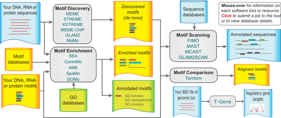
For motif discovery, scanning, and enrichment, there is the MEME suite, which contains over a dozen tools that deal with TF motifs. All of the MEME suite tools are available as webservers as well as command-line utilities, making them quite convenient and very easy to try out. In addition, its documentation is excellent and its very well supported.

MEME Schema

Visualization/Annotation

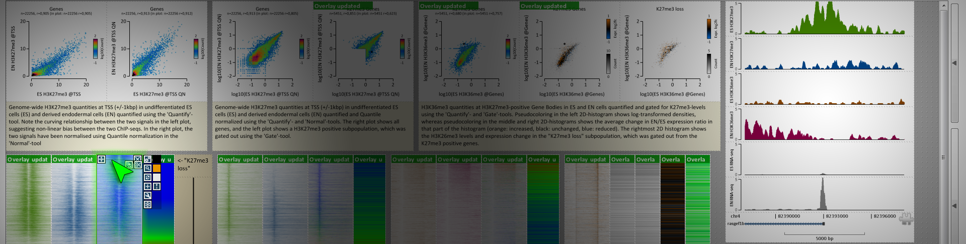
For really wading through your data and getting a feel for it, it's hard to beat genome browsers like Kevin mentioned. There is one program I've found really useful for generating figures for all of my differentially bound regions/loci in a high-throughput manner - EaSeq. It's a Windows only program, but it generates figures very quickly and easily for given regionsets (like differentially bound peaks). It's also good for annotating said peaks, calling peaks, normalizing your data in a variety of ways, and generating genome-wide summary figures. It also has an integrated instant-messaging system where you can get help from other users or the very active developer. And it automatically creates figure legends that list what data is in the figure and how it was treated/transformed up to that point. Overall, it's very slick and more high-throughput for figure generation of many loci than genome browsers.

EaSeq Screenshot

Similar to Kevin, my images are all screenshots from the program websites.

ADD COMMENT
0
Entering edit mode

Thanks Jared! I'm certainly bookmarking this thread for my next ChIP study!

ADD REPLY
0
Entering edit mode

Thank you Jared, I am more interested in Command Line tools but EaSeq really caught my attention and I'll definitely give it a try.

ADD REPLY
2
Entering edit mode
6.5 years ago

For TF motif analysis you can use GimmeMotifs. It uses an ensemble of different programs (including Homer, MEME and BioProspector which are, in my experience, the top performing programs) for de novo motif discovery.

Fluff contains some nice options for ChIP-seq visualization.

Disclaimer: I developed both tools so I'm pretty biased...

ADD COMMENT

Login before adding your answer.

Traffic: 2975 users visited in the last hour
Help About
FAQ
Access RSS
API
Stats

Use of this site constitutes acceptance of our User Agreement and Privacy Policy.

Powered by the version 2.3.6